The kitchen has evolved into the heart of modern homes, where culinary creativity meets social gatherings and family bonding. Choosing the right color palette for this essential space is not merely about aesthetics—it’s about creating an environment that inspires cooking, encourages conversation, and reflects your personal style. The colors you select will influence the mood, perceived size, and overall functionality of your kitchen for years to come.
Understanding color psychology and design principles is crucial when planning your kitchen renovation or refresh. Different hues evoke distinct emotions and can dramatically alter how you experience this vital space. Whether you’re drawn to calming neutrals, bold statement colors, or timeless classics, the perfect palette balances visual appeal with practical considerations like lighting, cabinet finishes, and architectural features.
This comprehensive guide explores six essential strategies for selecting a kitchen color palette that enhances both beauty and function. From understanding color temperature to coordinating finishes, these expert insights will empower you to make confident decisions. You’ll discover how to create a cohesive look that complements your home’s overall aesthetic while ensuring your kitchen remains a welcoming, energizing environment where memories are made.
1. Understand Color Temperature and Its Impact
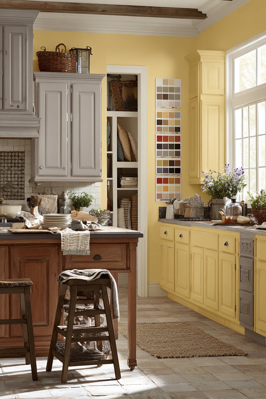
Color temperature fundamentally affects how your kitchen feels throughout the day. Warm colors like reds, oranges, and yellows create inviting, energetic atmospheres that stimulate appetite and conversation. These hues work exceptionally well in kitchens with limited natural light, as they compensate for the absence of sunshine. Cooler tones such as blues, greens, and grays promote calmness and visual spaciousness, making them ideal for smaller kitchens or those with abundant natural light.
The direction your kitchen faces plays a crucial role in color selection. North-facing kitchens receive cooler, indirect light and benefit from warmer color palettes that add coziness. South-facing spaces enjoy warm, bright light throughout the day, allowing you to experiment with cooler tones without the room feeling cold. East-facing kitchens glow with morning sunshine, while west-facing ones come alive in the afternoon, requiring balanced color choices that transition well between different lighting conditions.
Consider how your chosen palette interacts with both natural and artificial lighting. Test paint samples on multiple walls at different times of day to observe how colors shift. What appears perfect in morning light might look completely different under evening task lighting. This thorough evaluation ensures your final selection performs beautifully in all lighting scenarios.
- Use warm colors to counterbalance cool natural light in north-facing kitchens
- Choose cooler tones for south-facing spaces to prevent overwhelming warmth
- Test color samples in morning, afternoon, and evening light conditions
- Consider LED lighting’s cool tone when selecting warm paint colors
- Balance natural and artificial lighting effects in your color decisions
- Account for seasonal light variations in your planning process
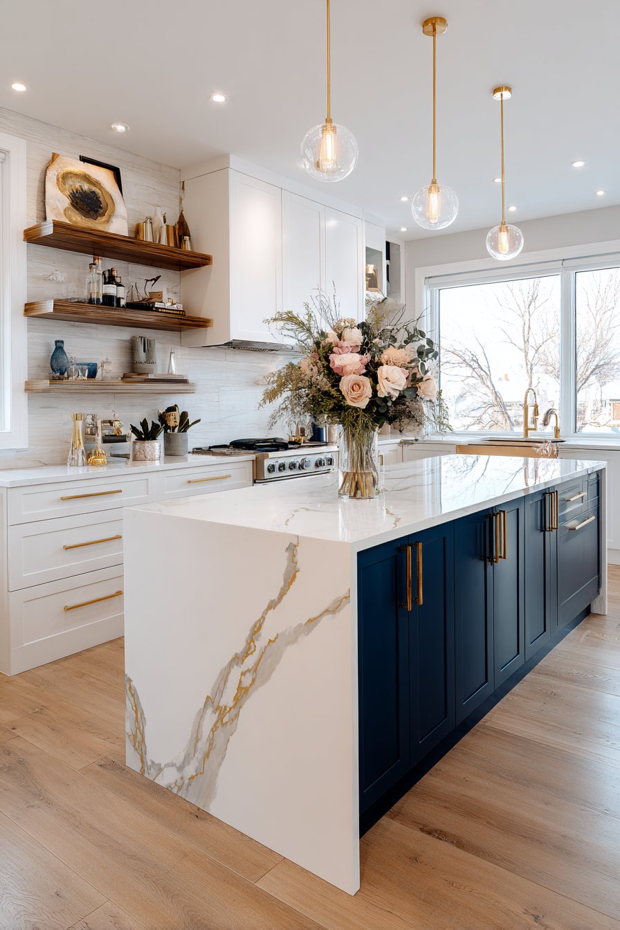
2. Create a Cohesive Three-Color Formula
Professional designers rely on the 60-30-10 rule to create balanced, visually appealing color schemes. This proven formula allocates 60% to your dominant color, typically walls or large cabinet sections. The secondary color, comprising 30%, appears in medium-sized elements like kitchen islands or countertops. Your accent color, representing 10%, adds personality through accessories, hardware, and decorative elements.
This proportional approach prevents color overwhelm while maintaining visual interest. Your dominant color establishes the room’s overall mood and should be relatively neutral to ensure longevity. The secondary color adds depth and dimension, creating focal points that guide the eye. Accent colors inject personality and can be easily updated as trends evolve or your tastes change, offering flexibility without major renovation.
Implementing this formula requires careful planning across all kitchen elements. Consider cabinetry, backsplashes, flooring, appliances, and fixtures as part of your color distribution strategy. This systematic approach ensures harmony while preventing the common mistake of incorporating too many competing colors that create visual chaos.
- Allocate 60% to dominant wall or cabinet colors for stability
- Use 30% secondary color on islands, counters, or feature walls
- Reserve 10% for accent colors in hardware, textiles, and accessories
- Keep dominant colors neutral for timeless appeal and versatility
- Choose secondary colors that complement without competing visually
- Use accent colors to inject personality and seasonal updates
3. Consider Your Cabinet Finish First
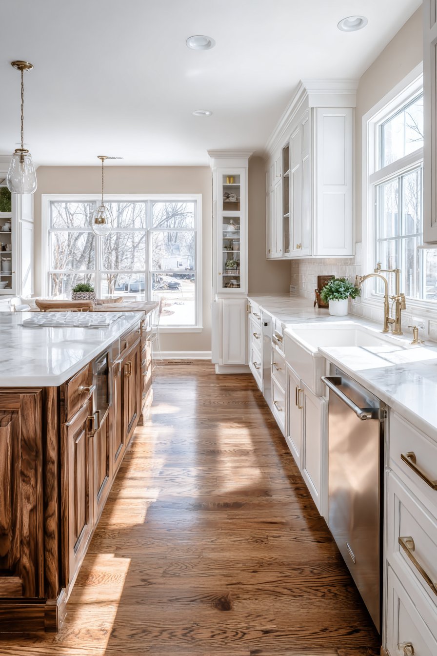
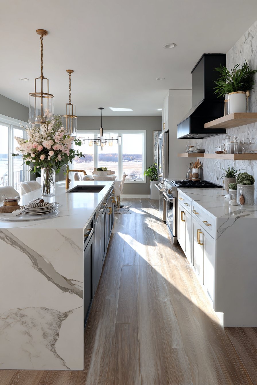
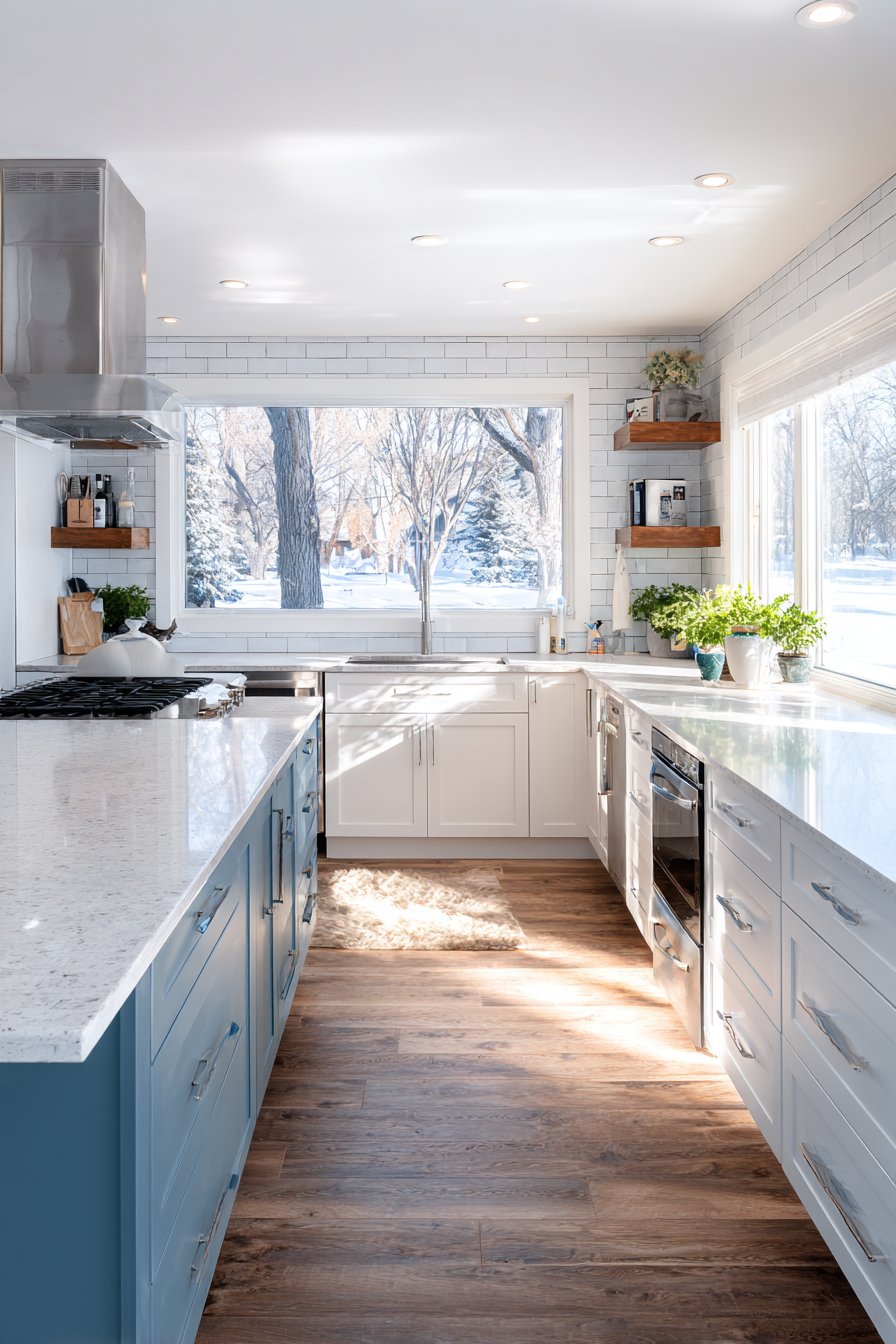
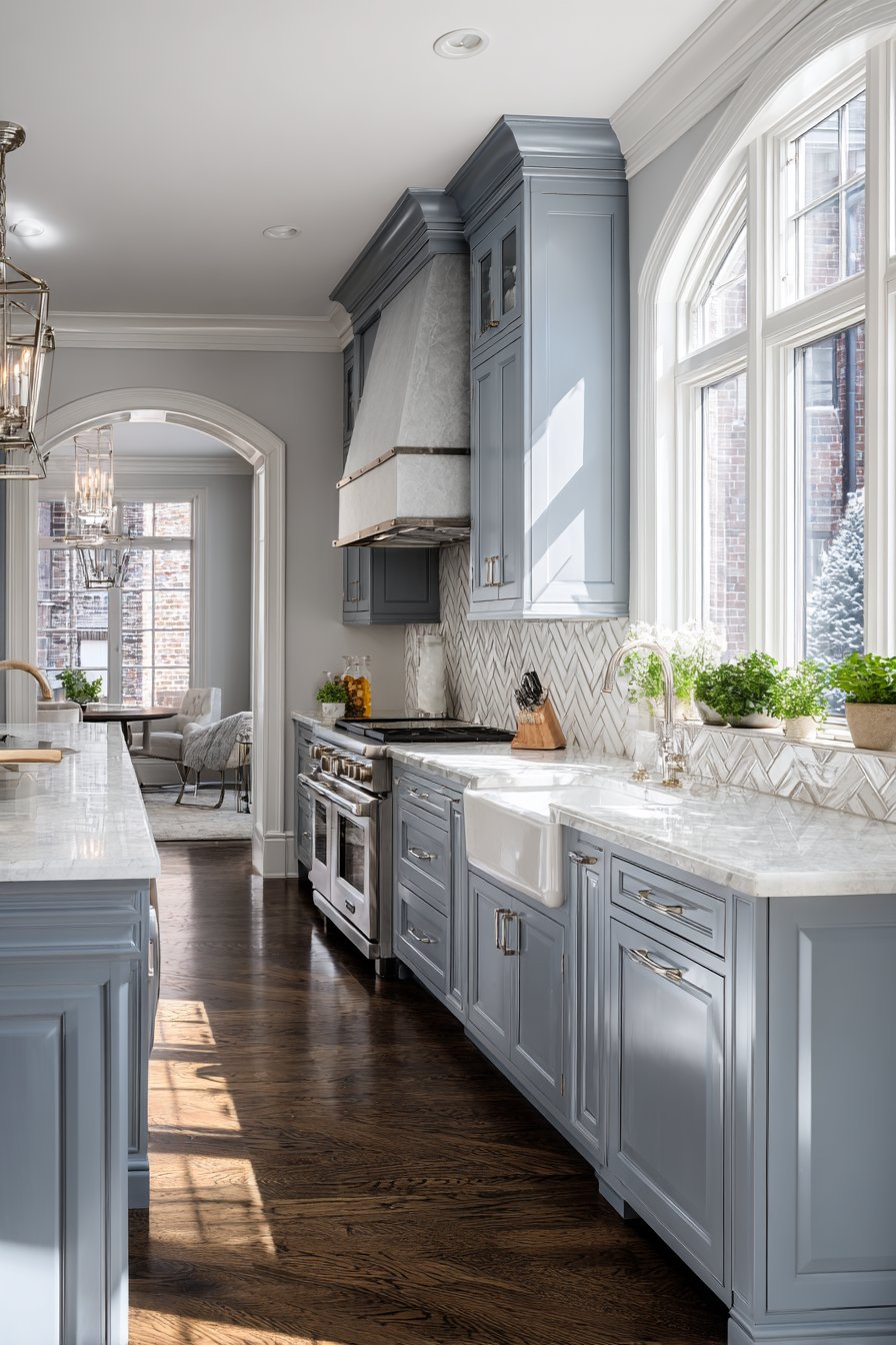
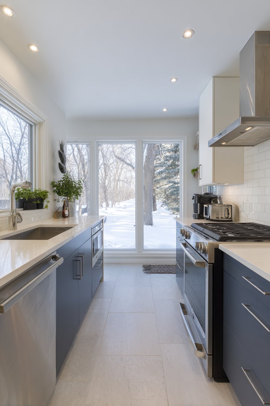
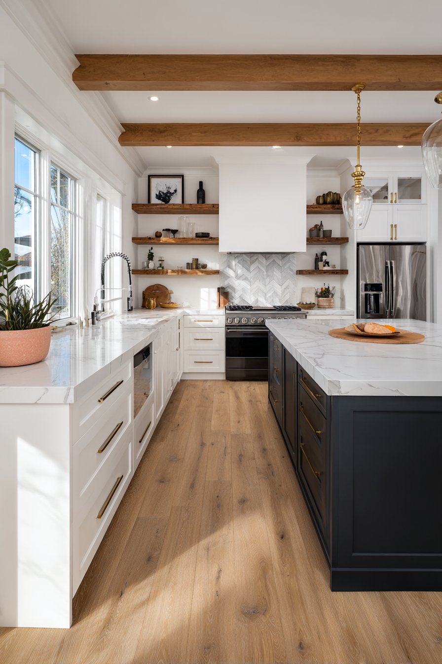
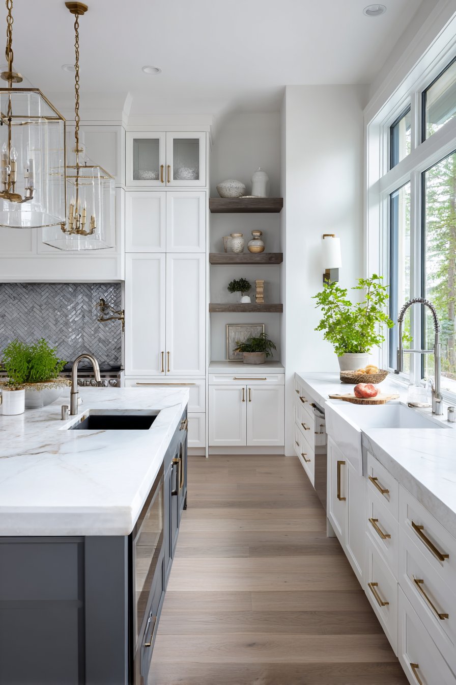
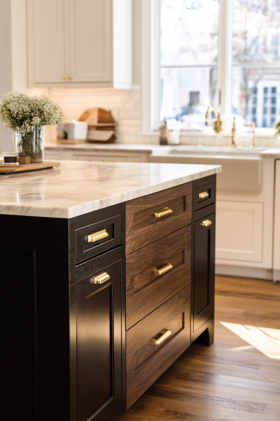
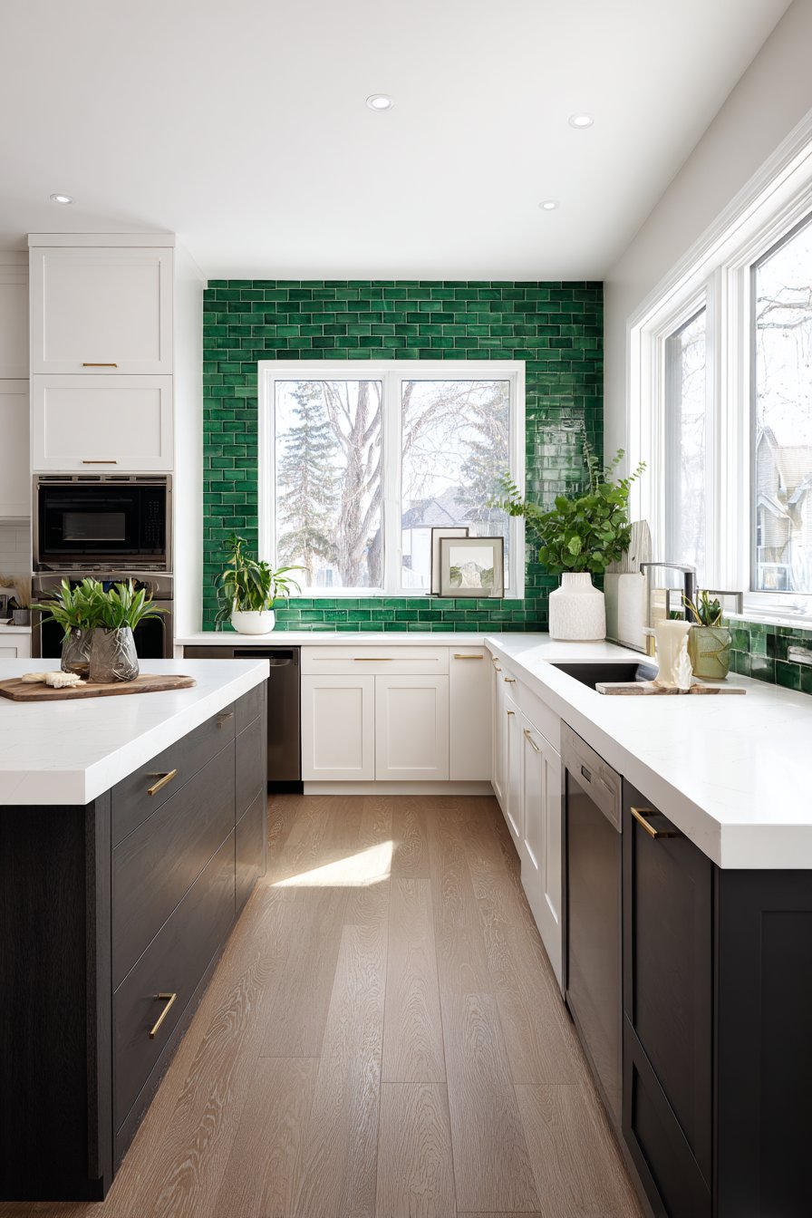
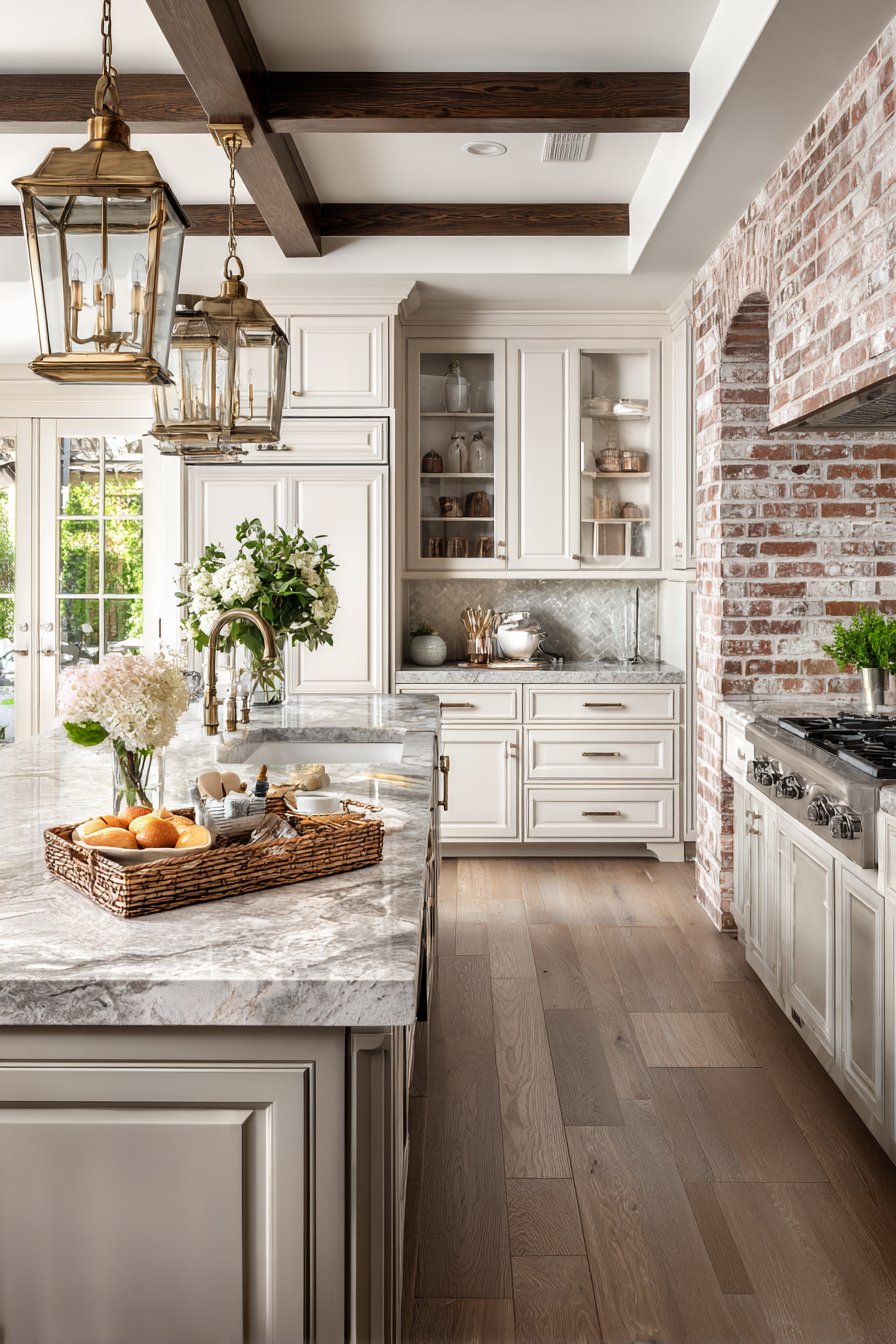
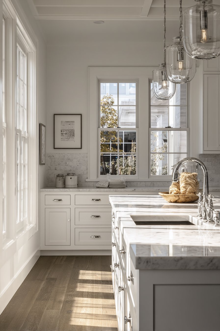
Kitchen cabinets occupy the largest visual space in most kitchens, making them the logical starting point for color selection. Whether you’re keeping existing cabinets or installing new ones, their finish dictates the palette’s direction. White cabinets offer maximum flexibility, pairing beautifully with virtually any wall color or backsplash. Dark wood tones create richness and depth, requiring complementary colors that don’t overwhelm their natural beauty.
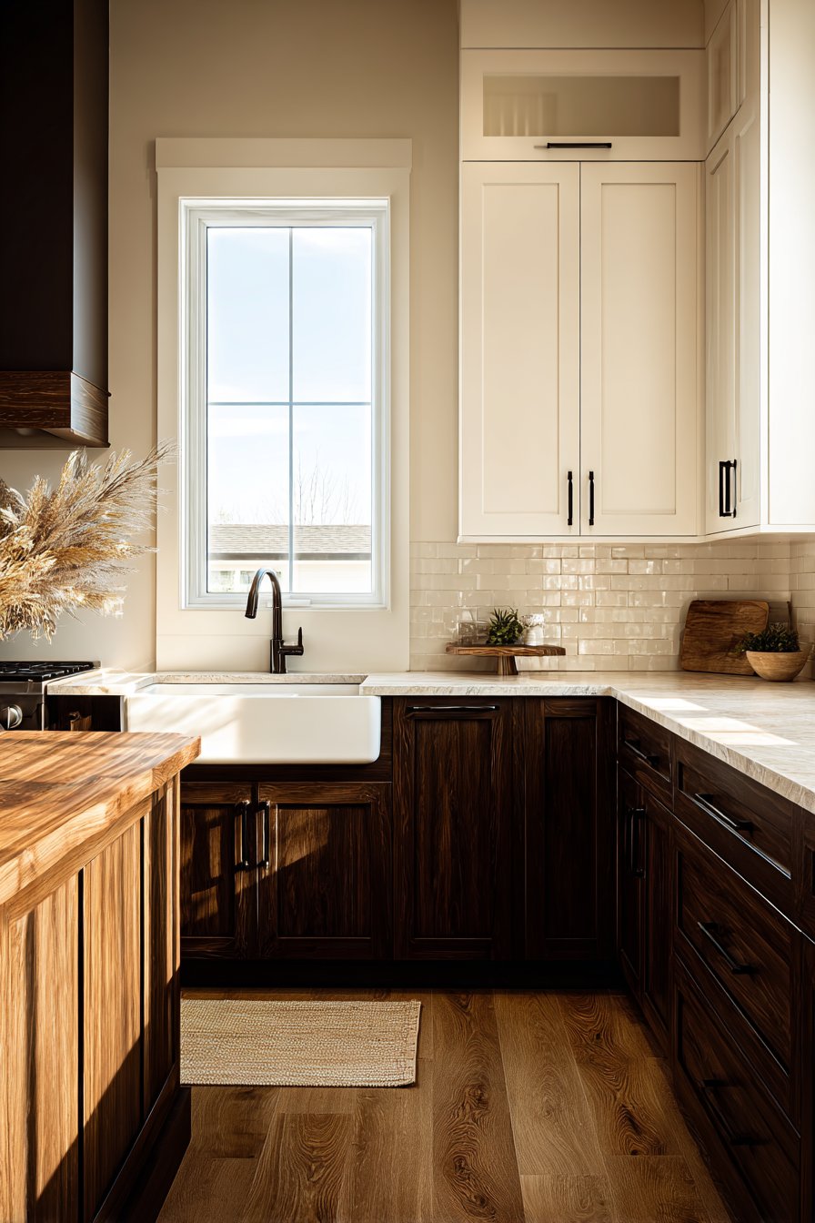
Two-toned cabinet schemes have gained popularity for adding visual dimension without overwhelming the space. This approach typically features darker lower cabinets for grounding and lighter uppers for airiness. When selecting wall and backsplash colors, ensure they bridge these cabinet tones harmoniously. Consider the undertones in wood finishes—some lean warm with honey or red notes, while others appear cool with gray undertones—and choose coordinating colors accordingly.
The cabinet finish’s sheen level also influences color perception and coordination. Matte finishes absorb light, making colors appear deeper and more saturated. Glossy or semi-gloss finishes reflect light, potentially intensifying colors and affecting how adjacent hues appear. Factor in these reflective properties when selecting your complete palette.
- Start with cabinet color as your palette foundation and anchor
- Identify undertones in wood finishes to guide complementary selections
- Use two-toned cabinets to add depth without color chaos
- Consider how cabinet sheen affects surrounding color perception
- Choose wall colors that enhance rather than compete with cabinetry
- Test backsplash samples against cabinet doors before committing
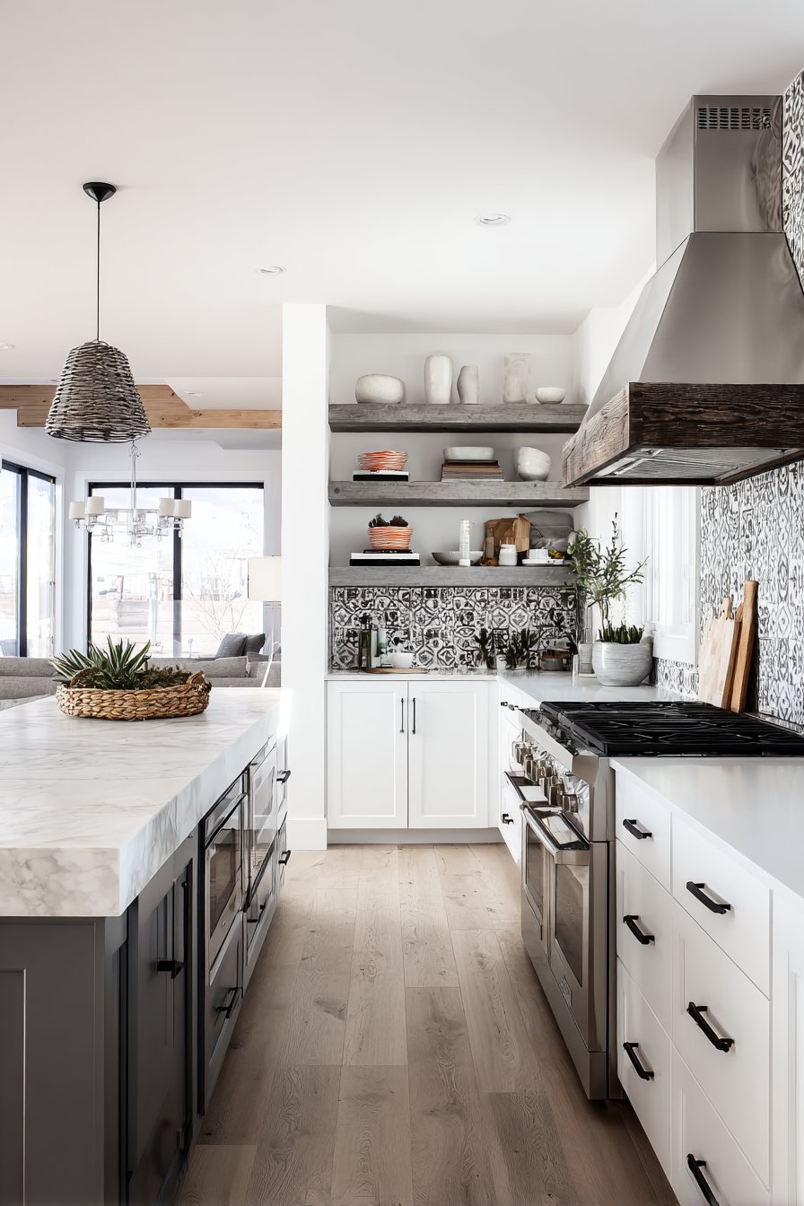
4. Balance Bold and Neutral Elements
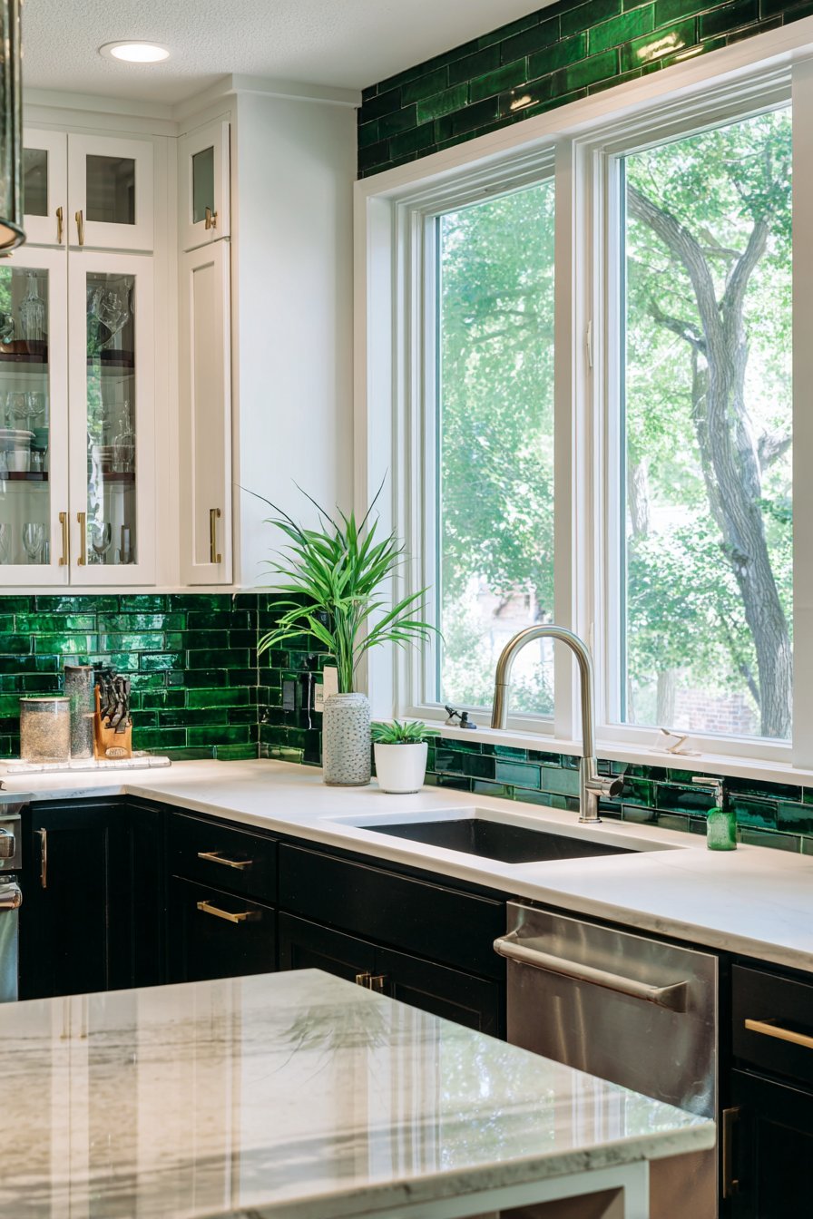
Creating a successful kitchen palette requires strategic tension between statement colors and calming neutrals. Bold colors energize spaces and express personality, but too much intensity can feel overwhelming in a room where you spend significant time. Neutrals provide visual rest, enhance natural light, and ensure your kitchen doesn’t feel dated as trends evolve. The key is achieving equilibrium that feels both exciting and comfortable.
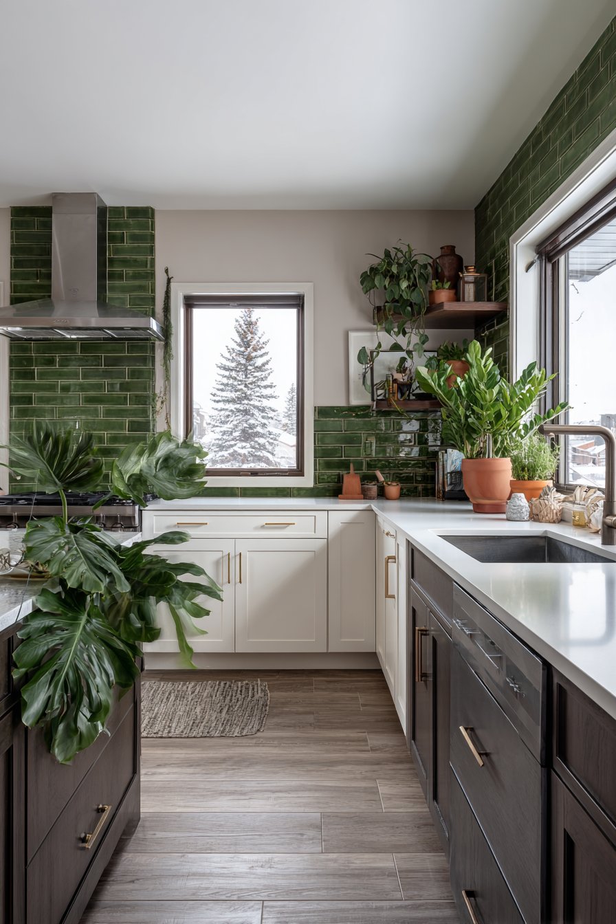
If you’re drawn to vibrant hues, introduce them through easily changeable elements rather than permanent fixtures. A bold backsplash tile creates impact without dominating the entire space. Colorful lower cabinets paired with neutral uppers offer drama while maintaining openness. Accent walls provide statement-making opportunities without overwhelming the room’s proportions or making it feel smaller.
Neutrals aren’t boring when thoughtfully selected and layered. Various shades of white, from warm ivory to cool snow, create sophisticated depth. Greiges blend gray and beige for contemporary warmth. Charcoal and navy serve as neutral alternatives to black, offering drama without harshness. These versatile foundations allow bold elements to shine while ensuring long-term satisfaction.
- Use bold colors sparingly on one or two focal elements maximum
- Layer multiple neutral shades for sophisticated depth and interest
- Choose easily changeable elements for bold color applications
- Balance dark and light values throughout the space thoughtfully
- Consider greige, navy, or charcoal as neutral alternatives to beige
- Test bold colors in small areas before committing to large applications
5. Coordinate with Existing Architectural Features
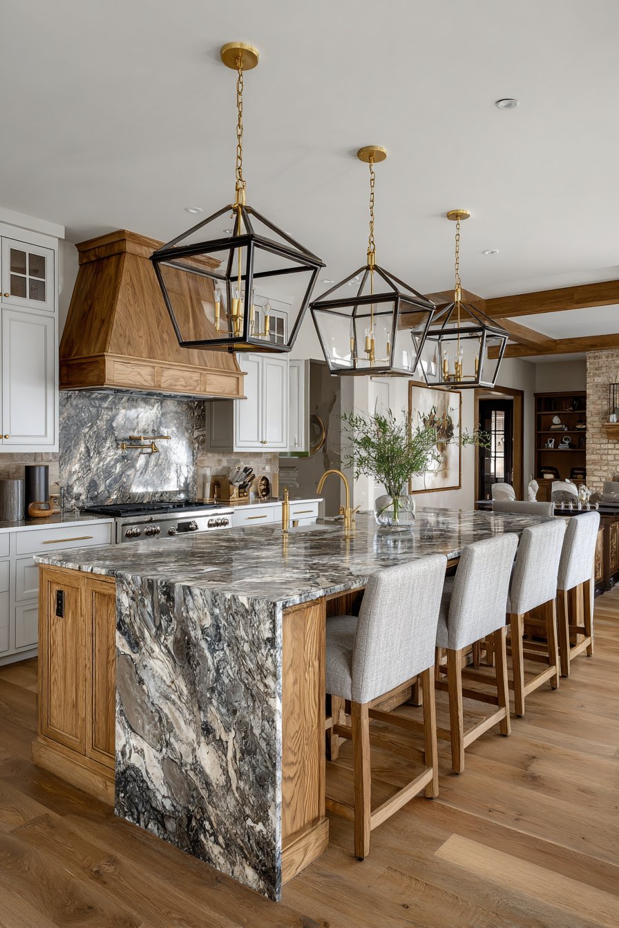
Your kitchen’s existing architecture and permanent fixtures significantly influence effective color choices. Countertop materials, whether granite, quartz, or butcher block, contain multiple colors and undertones that should guide your palette. Flooring materials establish foundational tones that walls and cabinets must complement. Architectural elements like exposed beams, brick, or tile work deserve consideration in your color planning process.
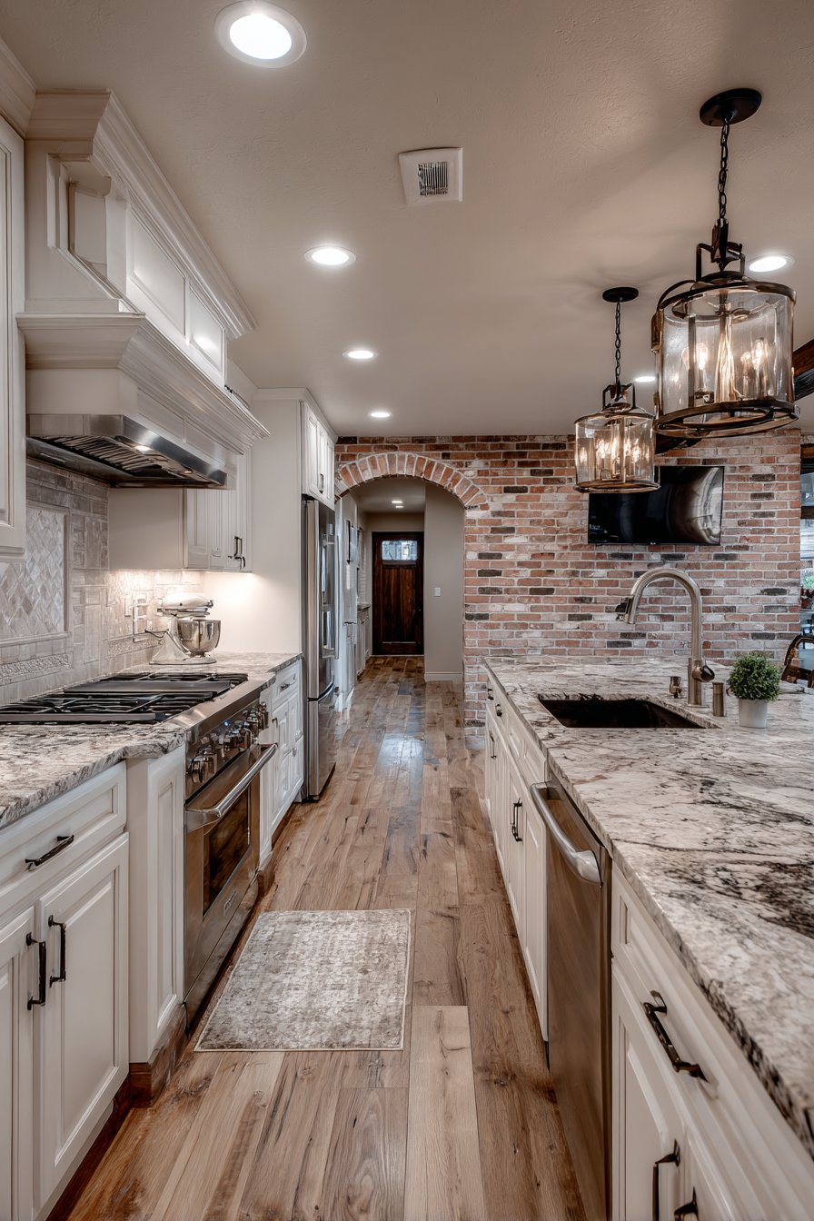
Examine your countertops closely to identify their dominant and accent colors. Granite often contains flecks of multiple hues—pull one or two for your wall or cabinet colors. Marble countertops with gray veining pair beautifully with cool-toned palettes. Warm-toned quartz benefits from complementary warm wall colors that create cohesion rather than conflict.
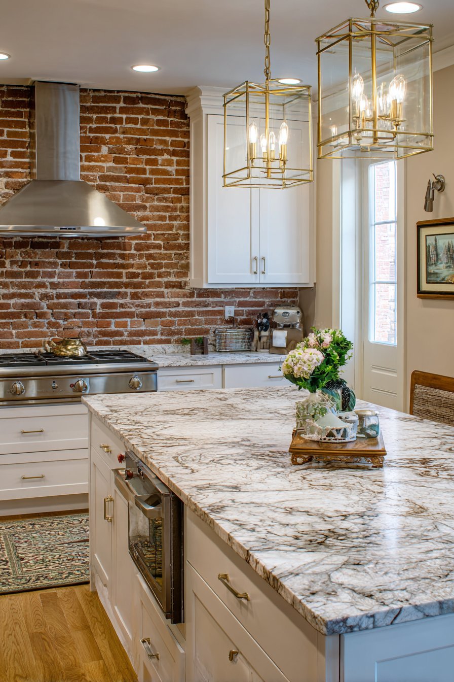
Fixed appliances and hardware finishes also play crucial roles in palette coordination. Stainless steel appliances have cool undertones that harmonize with blues, grays, and true whites. Brass or gold fixtures demand warmer palettes in creams, beiges, or warm grays. Black appliances create bold contrast against lighter palettes while complementing darker, moody color schemes beautifully.
- Pull accent colors from existing countertop patterns and veining
- Match wall color undertones to flooring for seamless flow
- Coordinate hardware finishes with overall color temperature choices
- Consider appliance finishes when selecting palette undertones
- Work with rather than against permanent architectural features
- Use existing elements as inspiration rather than limitations
6. Test Colors in Your Actual Space
The single most important step in selecting the perfect kitchen palette is thorough testing in your actual environment. Paint chips and digital renderings never accurately represent how colors will appear in your specific lighting conditions, alongside your fixtures, and at different times of day. Professional designers always test samples before making final decisions, and you should too, regardless of how confident you feel about your selections.
Purchase sample sizes of your top color choices and apply them directly to your kitchen walls in large swatches—at least two feet square. Paint samples on poster board or cardboard that you can move around, testing them near cabinets, counters, and in different lighting conditions. Observe these samples for several days, noting how they appear in morning light, afternoon sun, evening artificial light, and even on cloudy days when conditions change dramatically.
Include all palette components in your testing process, not just wall colors. Gather backsplash tile samples, fabric swatches for window treatments, and hardware options to view together. This comprehensive approach reveals how elements interact and whether your chosen palette creates the cohesive harmony you’re envisioning or requires adjustment before you commit to permanent installations.
- Apply large paint samples directly to kitchen walls for accuracy
- Observe test colors for at least three to five days minimum
- Test colors in morning, afternoon, and evening lighting conditions
- Place samples near cabinets, counters, and backsplash areas specifically
- Gather all palette components together for comprehensive evaluation
- Trust your instincts after thorough testing rather than rushing decisions
Conclusion
Selecting the perfect kitchen color palette combines artistic vision with practical consideration of lighting, architecture, and lifestyle needs. By understanding color temperature, applying professional formulas, starting with your cabinet finish, balancing bold and neutral elements, coordinating with existing features, and thoroughly testing your choices, you create a kitchen that’s both beautiful and functional.
Remember that your kitchen should reflect your personality while serving as a welcoming space for years to come. Don’t rush the decision-making process—invest time in testing and evaluation to ensure your final palette truly enhances your daily life. With these expert strategies, you’re now equipped to create a kitchen color scheme that inspires culinary creativity, encourages gathering, and brings lasting joy to your home’s most important room.