Transforming your living room with a fresh coat of paint might seem straightforward, but rushing into this decision can lead to costly mistakes and disappointing results. The living room serves as the heart of your home, where families gather and guests receive their first impression of your interior style. Making informed choices about wall color, finish, and preparation ensures you create a space that’s both beautiful and enduring.
Selecting the right paint color involves far more than choosing your favorite shade from a color wheel. Professional interior designers understand that successful wall painting requires careful consideration of lighting, existing furnishings, architectural features, and long-term lifestyle needs. Each decision you make affects not only the room’s aesthetic appeal but also its perceived size, mood, and functionality. The investment of time in planning prevents regrettable outcomes and saves money in the long run.
This comprehensive guide explores six essential factors to evaluate before painting your living room walls. From understanding how natural light influences color perception to considering the practical implications of different paint finishes, these insights will empower you to make confident decisions. Whether you’re refreshing a single accent wall or reimagining your entire space, thoughtful preparation creates results you’ll love for years to come.
1. Natural and Artificial Lighting Conditions
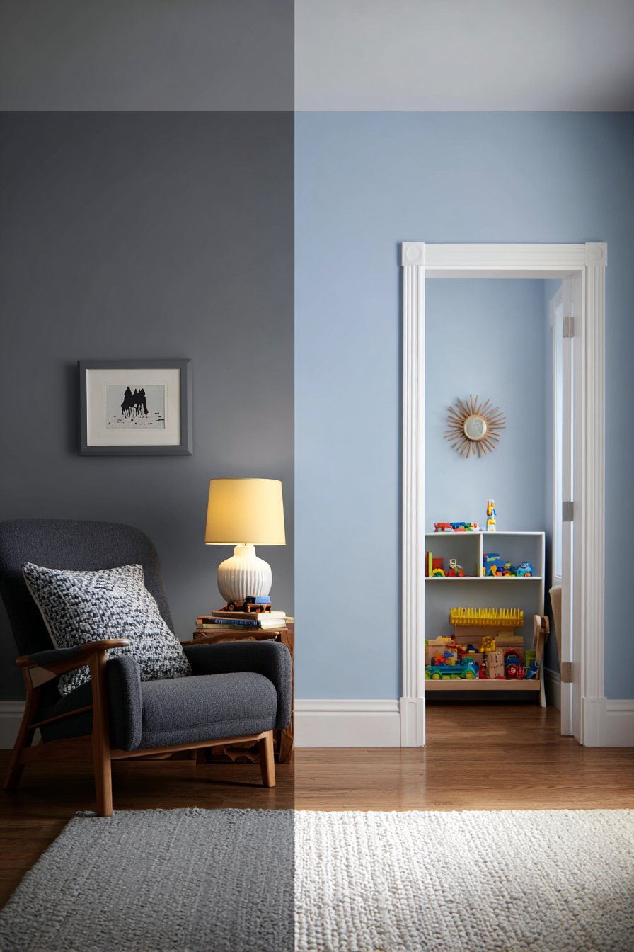
The way light interacts with paint color dramatically transforms how walls appear throughout the day. North-facing rooms receive cooler, indirect light that can make colors appear muted or gray, while south-facing spaces enjoy warm, consistent illumination that enhances most hues. Understanding your room’s light exposure prevents the common disappointment of colors looking different after application than they did on sample cards.
Artificial lighting adds another layer of complexity to color selection decisions. Incandescent bulbs cast warm yellow tones that intensify reds and oranges while dulling blues and greens. LED lights offer variable color temperatures ranging from cool white to warm amber, each affecting wall colors differently. Testing paint samples under both natural daylight and your evening lighting conditions reveals the true character of your chosen shade.
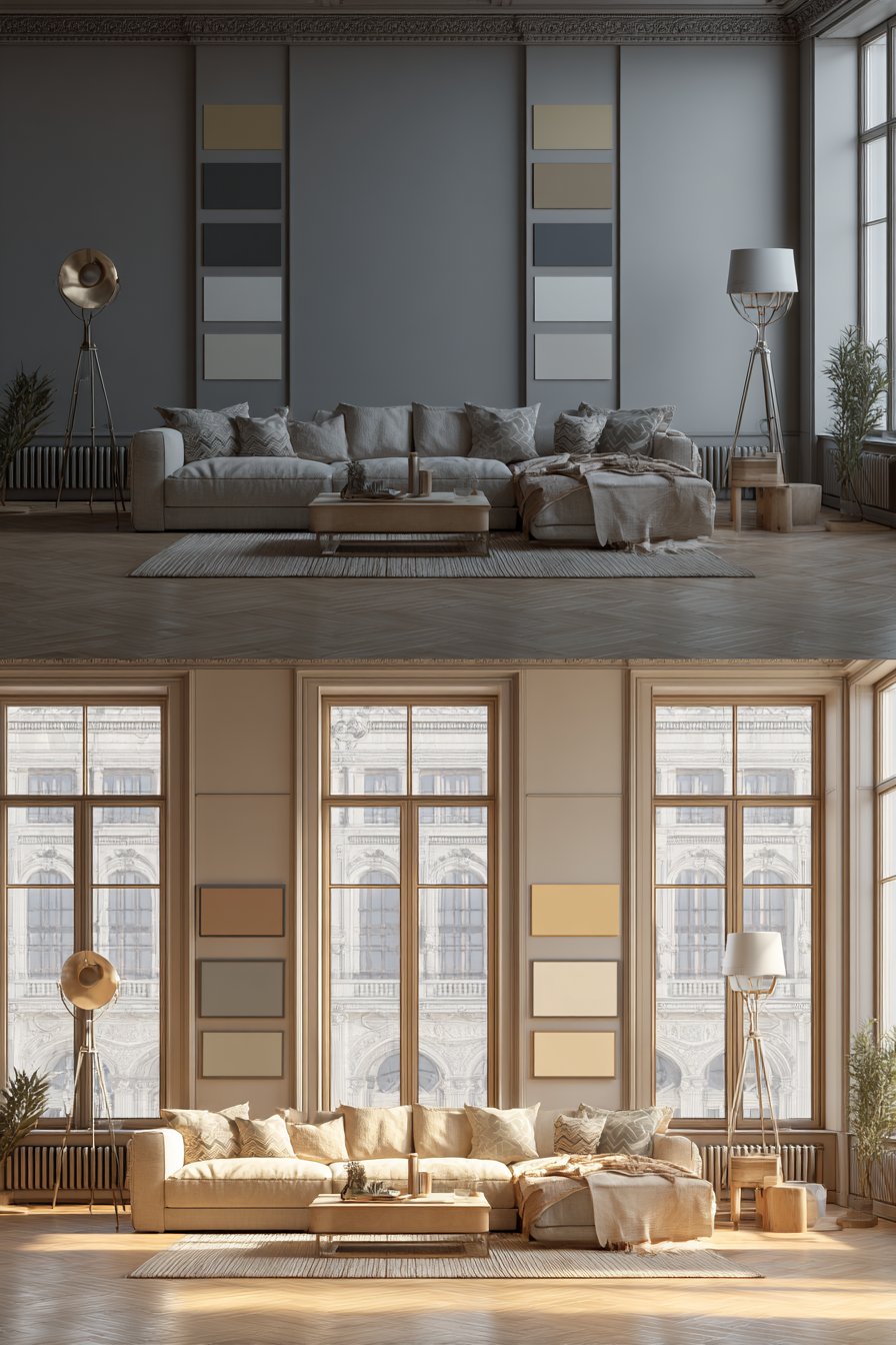
The intensity and direction of light sources also influence color saturation and shadow depth. Rooms with large windows may experience dramatic shifts from morning to afternoon, requiring colors that perform well under changing conditions. Consider how pendant lights, floor lamps, and recessed fixtures will interact with your walls when planning your color scheme.
- Paint large sample swatches (at least 2×2 feet) on different walls to observe light variations
- Test samples for minimum 48 hours to see colors in morning, afternoon, and evening light
- Consider how seasons affect natural light intensity and duration throughout the year
- Account for exterior elements like trees or neighboring buildings that filter sunlight
- Evaluate how reflective surfaces (mirrors, glass tables) bounce light onto walls
- Remember that darker colors absorb more light while lighter shades reflect and brighten spaces
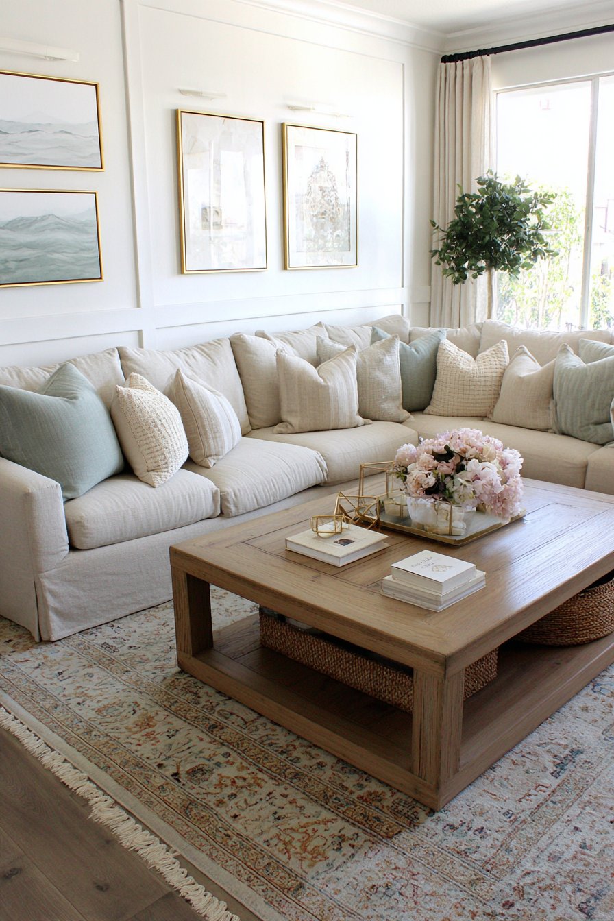
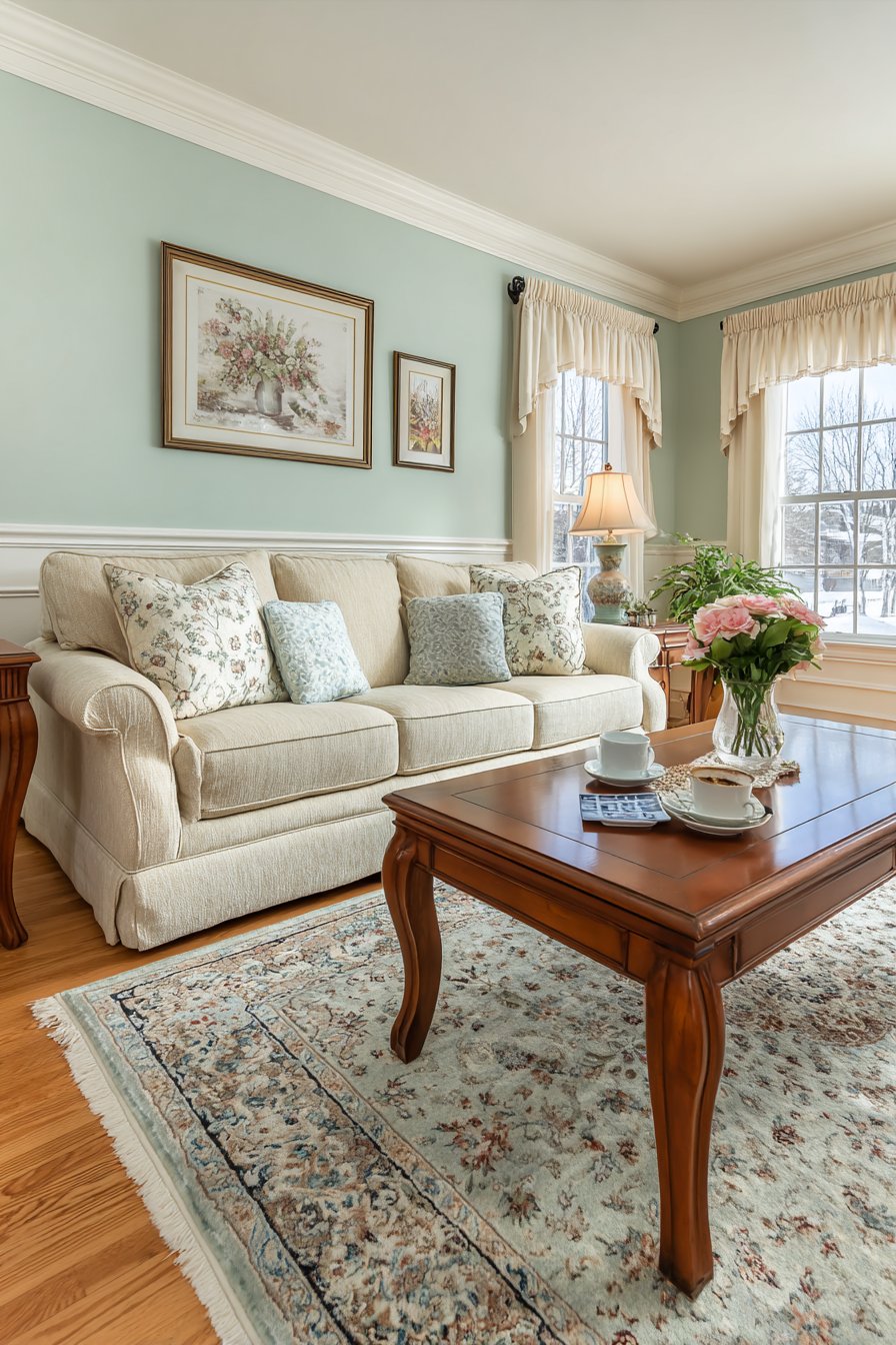
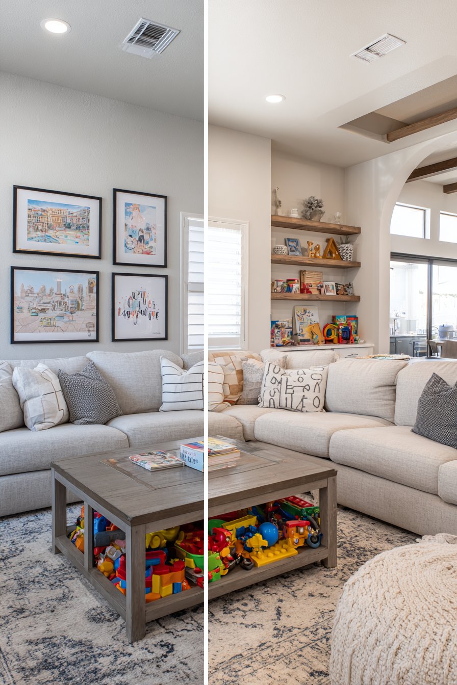
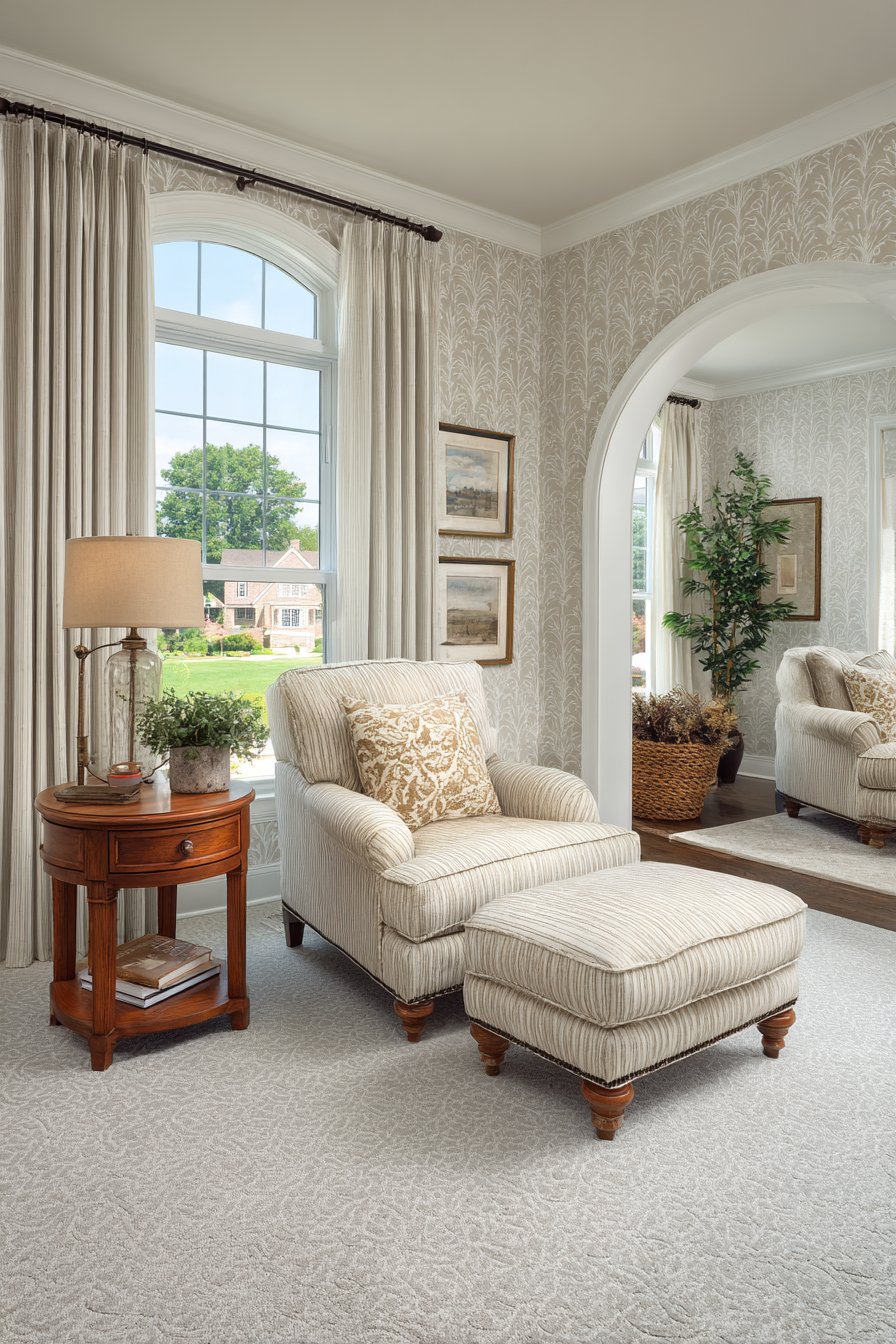
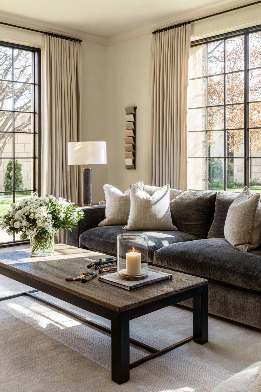
2. Existing Furniture and Decor Coordination
Your current furnishings create color constraints that smart paint selection must acknowledge and complement. A bold sofa or treasured artwork may be staying in the room, making it essential to choose wall colors that enhance rather than clash with these existing elements. Complementary color schemes using opposite hues on the color wheel create vibrant energy, while analogous palettes with neighboring colors offer harmonious sophistication.
The undertones in your furniture fabrics significantly impact how wall colors appear in context. A beige sofa might have pink, yellow, or gray undertones that become more pronounced against certain wall colors. Testing paint samples directly next to your furniture reveals whether undertones harmonize or create unwanted color casts. This simple step prevents the disappointment of discovering conflicts after painting entire walls.
Consider the visual weight and proportion of your furnishings when selecting color intensity. Dark, substantial furniture pieces benefit from lighter wall colors that prevent the room from feeling heavy or oppressive. Conversely, minimal or light-colored furniture allows for bolder wall treatments without overwhelming the space. Balance creates comfortable, well-designed rooms that feel intentional rather than chaotic.
- Collect fabric swatches from sofas, curtains, and rugs to compare with paint samples
- Photograph your room and apply digital color overlays to visualize different options
- Consider whether you plan to replace furniture soon, allowing more color freedom
- Use the 60-30-10 rule: 60% dominant wall color, 30% secondary furniture color, 10% accents
- Account for wood tones in flooring, trim, and furniture finishes
- Remember that neutral walls provide flexibility for changing decor over time
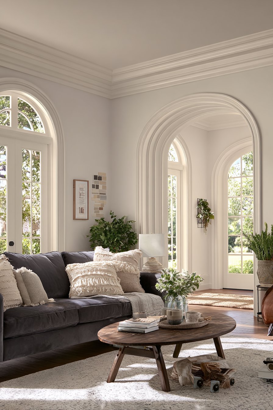
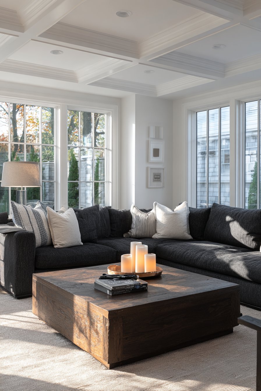
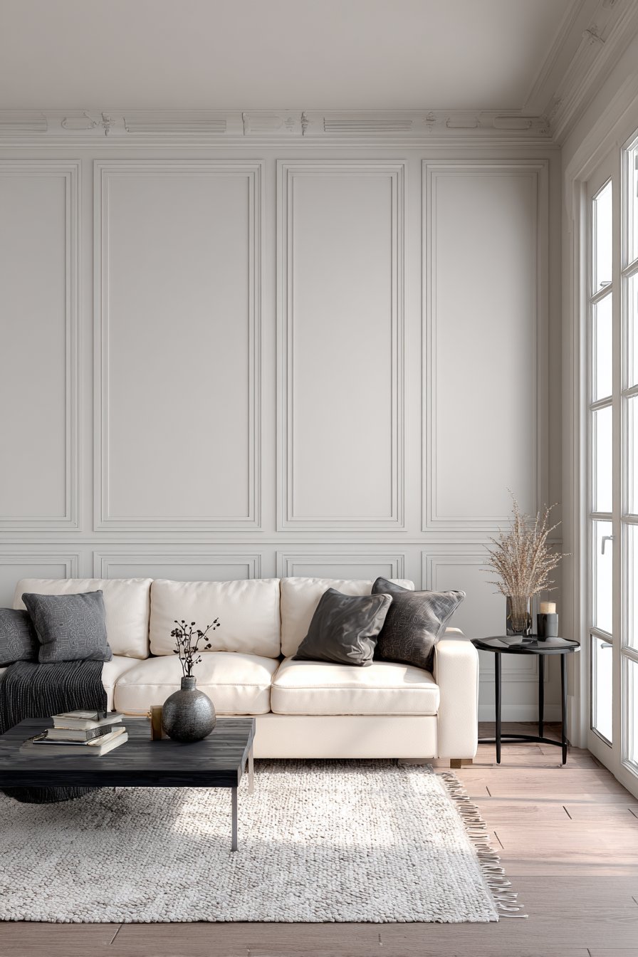
3. Room Size and Architectural Features
Paint color possesses the remarkable ability to alter perceived dimensions, making rooms feel larger or cozier depending on your selection. Light colors reflect more light and create visual expansion, ideal for compact living rooms where spaciousness matters. Dark, saturated hues absorb light and draw walls inward, creating intimate atmospheres perfect for large rooms lacking coziness.
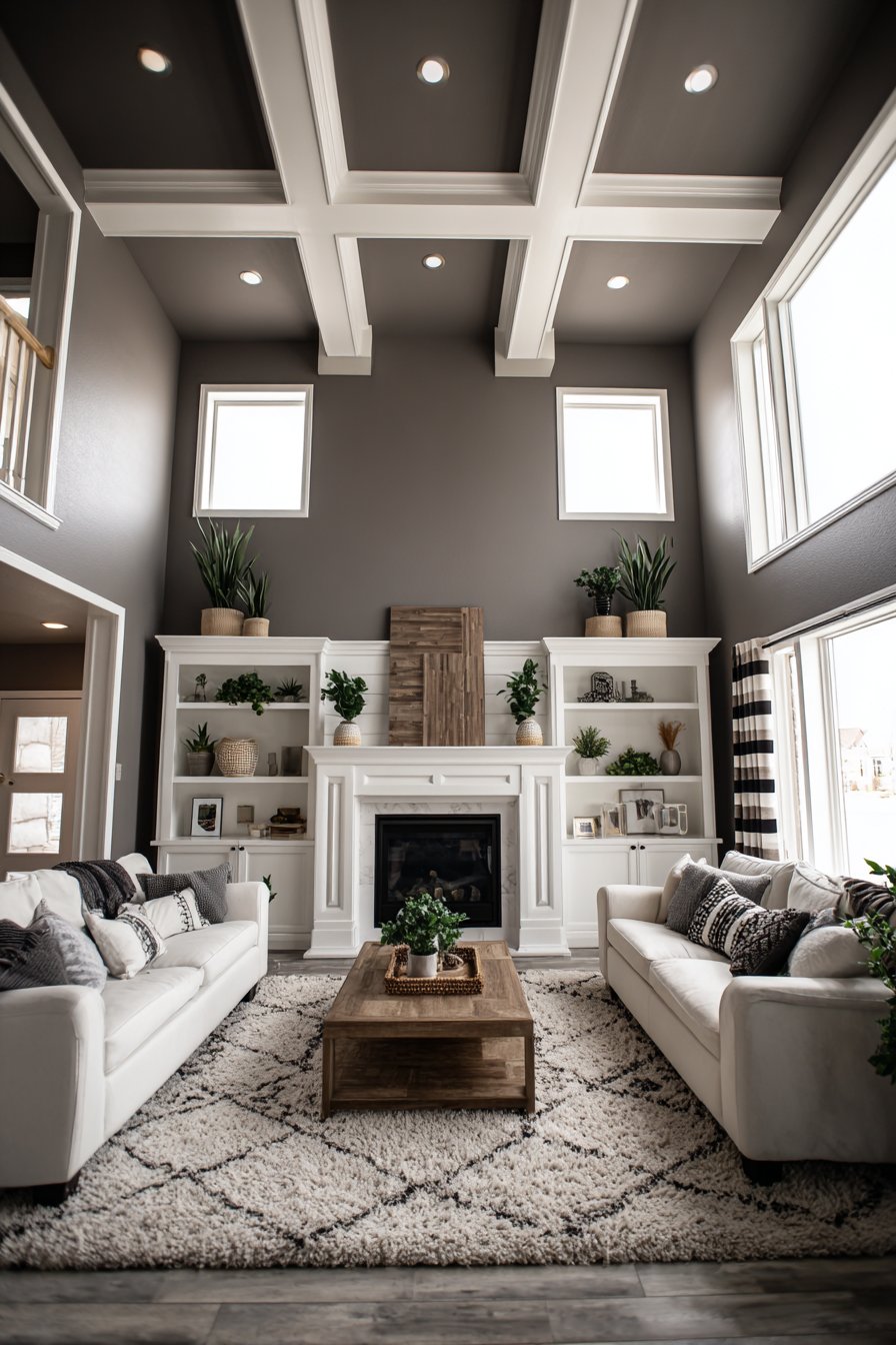
Architectural details deserve special consideration when planning your painting strategy. Crown molding, chair rails, and built-in shelving can be highlighted with contrasting trim colors or blended seamlessly with walls for modern minimalism. Ceiling height influences color choices too—painting ceilings slightly lighter than walls draws the eye upward and creates the illusion of additional height. Conversely, darker ceiling colors lower visual height in rooms where coziness trumps spaciousness.
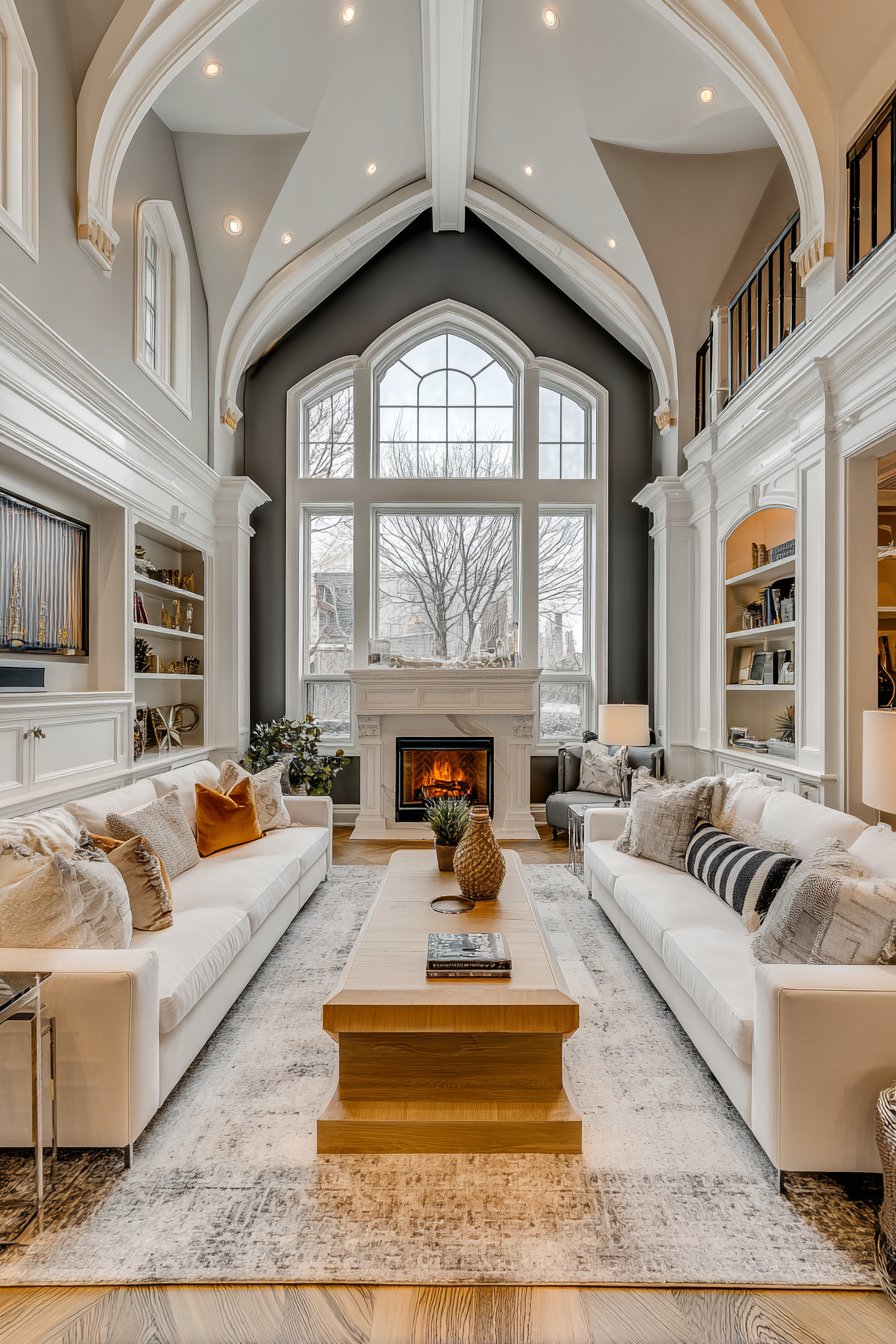
Awkward architectural elements like exposed beams, odd angles, or structural columns require strategic color treatment. Accent walls can redirect attention toward attractive features while downplaying less desirable elements. Using the same color on walls and challenging features helps them recede visually, creating unified coherence rather than distracting fragmentation.
- Measure your room dimensions to determine if expansion or contraction is desired
- Identify architectural features worth highlighting versus those to downplay
- Consider painting just one accent wall in bold color while keeping others neutral
- Use vertical stripes on walls to create the illusion of higher ceilings
- Paint trim and molding in high-gloss finish to create sophisticated contrast
- Remember that continuous color across walls and trim creates seamless, expanded feel
4. Paint Finish and Durability Requirements
Selecting the appropriate sheen level impacts both aesthetics and practicality in your living room. Flat or matte finishes offer sophisticated, non-reflective surfaces that hide wall imperfections beautifully but show marks and scuffs easily. Eggshell and satin finishes provide subtle luster while remaining washable, making them ideal for family living rooms with moderate traffic and occasional cleaning needs.
High-traffic living rooms with children or pets demand durable paint formulas that withstand repeated cleaning without losing color or developing shiny patches. Semi-gloss and gloss finishes offer maximum washability but amplify every wall imperfection, requiring excellent surface preparation. Consider your lifestyle honestly—a beautiful flat finish serves no purpose if constant fingerprints and marks frustrate you daily.
Modern paint technology offers specialized formulas addressing specific concerns like stain resistance, antimicrobial properties, and low-VOC emissions for healthier indoor air. Investing in premium-grade paint typically provides better coverage, richer color, and longer-lasting results than budget alternatives. The difference between two and four coats of cheap paint versus two coats of quality paint affects both your time and final results.
- Choose flat finish for low-traffic formal living rooms with adult-only usage
- Select eggshell or satin for balanced appearance and moderate washability
- Consider semi-gloss for high-traffic areas, trim, or homes with young children
- Test paint durability by cleaning dried samples with damp cloth and mild soap
- Invest in quality primers, especially when covering dark colors or stained walls
- Remember that higher-quality paints require fewer coats and last 3-5 years longer
5. Color Psychology and Mood Creation
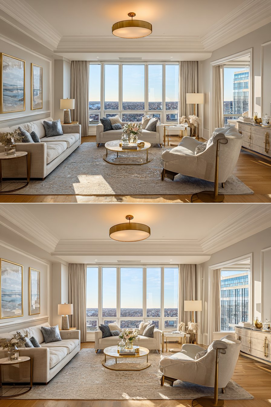
Colors profoundly influence emotional responses and behavioral patterns within living spaces. Cool colors like blues and greens promote relaxation and calmness, making them excellent choices for living rooms focused on unwinding and conversation. Warm colors such as reds, oranges, and yellows stimulate energy and social interaction, perfect for entertaining-focused spaces where lively gatherings occur regularly.
The intensity of color saturation affects mood as dramatically as the hue itself. Fully saturated bold colors create dramatic statements but can feel overwhelming in large doses or small rooms. Muted, toned-down versions of the same colors maintain color personality while offering more livable, versatile backgrounds. Consider your stress levels and desired atmosphere—some people find bold colors energizing while others find them exhausting.
Cultural associations and personal experiences shape individual color preferences beyond universal psychological principles. A color that reminds you of happy childhood memories creates positive associations regardless of traditional color theory. Trust your instincts while considering how family members and frequent guests might respond to your choices, especially in shared spaces like living rooms.
- Use blue tones for tranquil, serene living rooms focused on relaxation
- Choose warm terracotta or golden hues for welcoming, sociable gathering spaces
- Consider neutral grays and beiges for sophisticated, timeless appeal
- Add energy with accent walls in bolder colors while keeping main walls subdued
- Remember that natural earth tones create grounding, comfortable environments
- Test how colors make you feel by living with large samples for several days
6. Long-Term Maintenance and Future Flexibility
Anticipating your design evolution prevents premature repainting and wasted resources. Trendy colors may excite you now but feel dated within two years, requiring costly updates to maintain contemporary appeal. Classic neutrals and timeless colors provide longevity and adapt easily to changing decor preferences, accessories, and furniture updates without requiring wall color changes.
Surface preparation quality directly impacts paint longevity and appearance over time. Properly filled holes, sanded imperfections, and primed surfaces ensure paint adheres correctly and ages gracefully. Skipping preparation steps to save time creates disappointing results that show every flaw and require premature repainting. Professional-quality preparation work pays dividends through years of beautiful, durable walls.
Consider your repainting tolerance and available budget for future updates. Some homeowners enjoy refreshing wall colors every few years as design trends evolve, while others prefer decade-long permanence. Your personality and resources should influence whether you choose adventurous colors requiring frequent updates or safe, enduring neutrals that age gracefully with minimal intervention.
- Choose colors you genuinely love rather than following fleeting trends
- Keep paint color information and leftover paint for future touch-ups
- Consider removable wallpaper for accent walls, allowing easy style changes
- Evaluate whether bold color choices align with your long-term design vision
- Budget for repainting every 5-7 years for high-quality, well-maintained walls
- Remember that neutral foundations allow affordable updates through accessories and textiles
Conclusion
Painting your living room walls represents a significant investment of time, money, and effort that deserves thoughtful consideration. By evaluating lighting conditions, coordinating with existing furnishings, understanding spatial implications, selecting appropriate finishes, considering psychological effects, and planning for longevity, you create successful outcomes that enhance your home’s beauty and functionality. Each factor contributes to the overall success of your project, preventing common pitfalls and regrettable decisions.
The perfect wall color emerges from balancing aesthetic desires with practical realities. Trust the planning process, test samples thoroughly, and don’t rush decisions that will impact your daily living experience for years. Your living room deserves the care and attention that transforms ordinary painted walls into extraordinary backdrops for the life you live and the memories you create within those walls.