The kitchen has evolved from a purely functional space into the heart of the modern home—a place where culinary creativity meets social connection and personal expression. In this transformation, color plays a pivotal role in shaping not just the aesthetic appeal but also the emotional atmosphere of these essential spaces. Among the spectrum of possibilities, orange emerges as a particularly compelling choice, offering warmth, energy, and an undeniable personality that can elevate a kitchen from ordinary to extraordinary. This vibrant hue, ranging from soft peachy tones to deep burnt oranges, has the remarkable ability to stimulate appetite, encourage conversation, and infuse spaces with an optimistic vitality that makes every moment spent cooking or gathering feel more joyful.
Orange kitchens represent a bold departure from the neutrals that have dominated interior design for decades, yet they offer surprising versatility when implemented thoughtfully. Whether you’re drawn to the retro charm of mid-century coral, the rustic warmth of terracotta, or the contemporary sophistication of tangerine lacquer, orange provides endless possibilities for creating a kitchen that truly reflects your personality. The key lies in understanding how to balance this energetic color with complementary materials, textures, and design elements that prevent overwhelming the space while maximizing its impact.
This comprehensive guide explores ten distinctive approaches to incorporating orange into kitchen design, each offering unique aesthetic directions and practical applications. From full-scale cabinet commitments to strategic accent placements, these designs demonstrate how orange can work beautifully across various style preferences—whether your tastes lean toward Scandinavian minimalism, industrial edge, Mediterranean warmth, or retro nostalgia. Each concept has been carefully crafted to showcase not only the visual appeal of orange in kitchen environments but also the technical considerations that ensure these spaces remain functional, comfortable, and timeless despite their bold color choices.
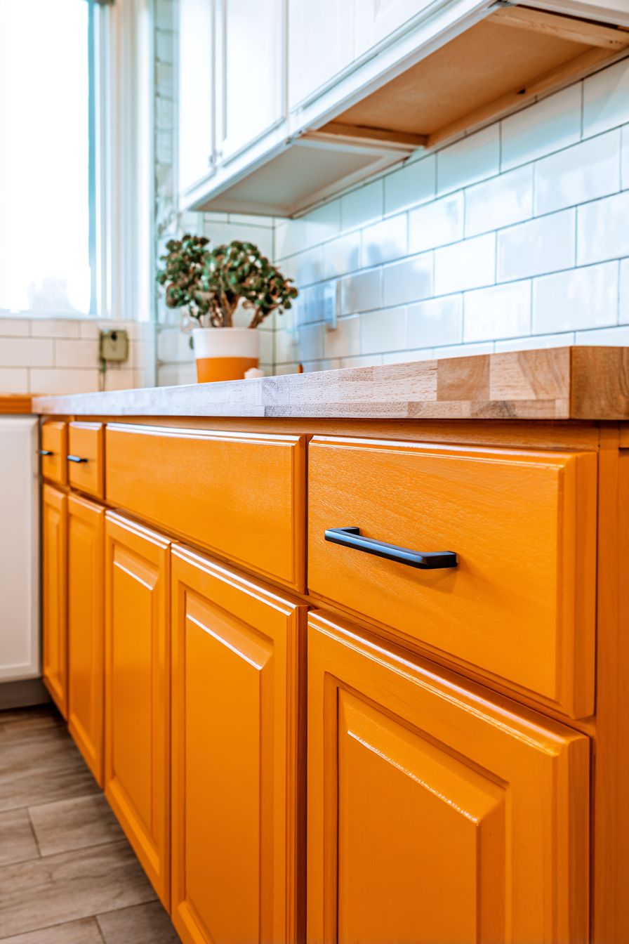
1. Vibrant Custom Cabinetry in Burnt Orange
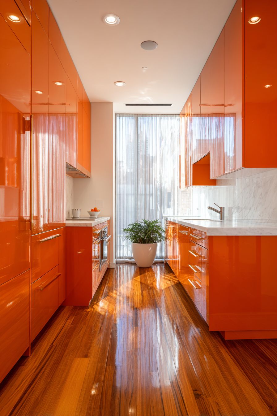
Stepping into a kitchen adorned with custom cabinetry in a warm burnt orange finish creates an immediate sense of enveloping warmth and sophisticated drama. This design approach commits fully to the orange aesthetic, allowing the cabinetry to become the defining feature of the entire space. The burnt orange tone—deeper and more complex than bright tangerine—brings a mature, grounded quality that feels both contemporary and timeless. When paired with sleek brushed gold hardware, the cabinetry elevates from simply colorful to genuinely luxurious, with metallic accents catching light and creating subtle visual interest across cabinet faces.
The genius of this design lies in its thoughtful material contrasts. White quartz countertops provide essential visual relief, creating clean horizontal lines that prevent the orange from becoming overwhelming while offering practical, durable work surfaces. Natural oak flooring introduces another warm element that harmonizes beautifully with the orange cabinetry rather than competing with it, establishing a cohesive warmth throughout the lower visual field. The wood grain in the flooring adds organic texture that softens the clean lines of modern cabinetry, creating a space that feels inviting rather than stark.
Natural light plays a transformative role in this kitchen concept. A large window dressed with sheer curtains allows soft daylight to filter through, enhancing the orange tones throughout the day as the sun’s position changes. Morning light might emphasize peachy undertones, while afternoon sun could deepen the burnt quality of the orange, creating a dynamic space that never looks quite the same twice. This interaction between natural light and bold color choice demonstrates sophisticated design thinking—recognizing that color exists not in isolation but in constant relationship with illumination.
Key Design Tips:
- Select burnt orange rather than bright orange for cabinetry to achieve a more sophisticated, livable result that won’t feel dated quickly
- Invest in quality brushed gold or brass hardware to elevate the overall design and complement warm orange tones
- Balance bold cabinetry with neutral countertops in white or light gray to provide visual rest areas
- Position the kitchen to maximize natural light exposure, as orange tones become richer and more dimensional with abundant daylight
- Consider matte or satin cabinet finishes rather than high gloss to reduce visual intensity and create a more refined appearance
- Incorporate open shelving in select areas to break up solid orange expanses and add functional display space
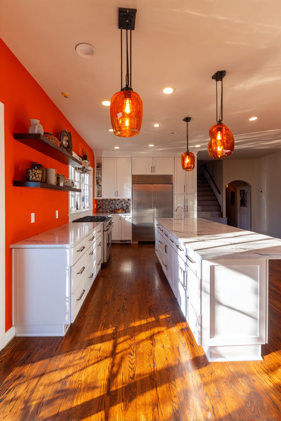
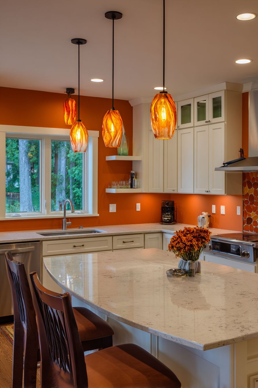
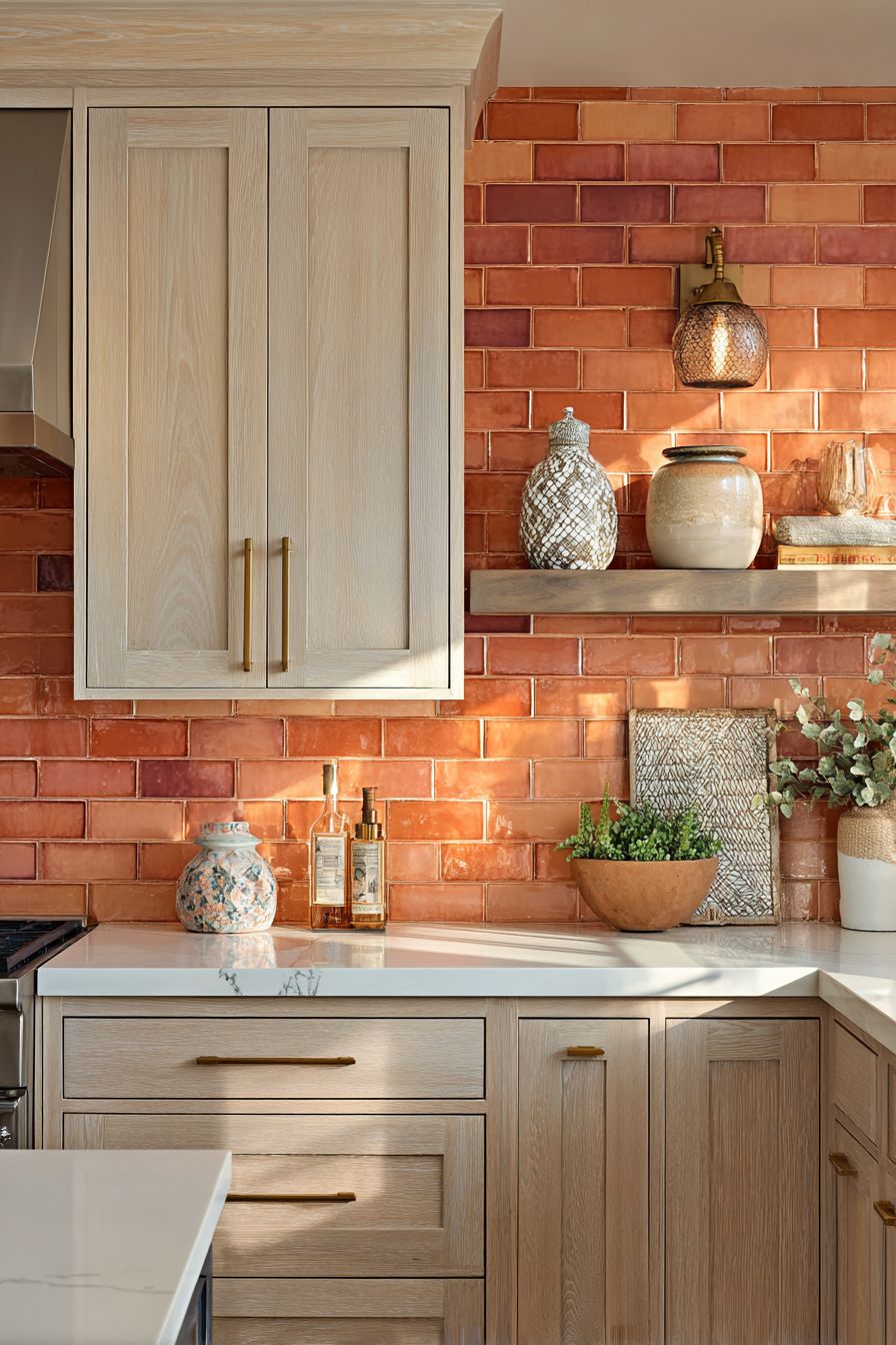
2. Terracotta Accent Wall with Floating Shelves
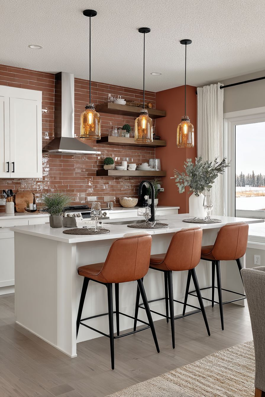
The strategic use of a terracotta orange accent wall demonstrates how color can be introduced powerfully yet proportionally, creating focal interest without demanding total commitment. This approach centers on a single wall, typically behind the range or sink area, painted in a warm terracotta hue that evokes Mediterranean landscapes and artisanal pottery. The earthiness of terracotta brings an organic quality that feels more connected to natural materials than synthetic bright oranges, making it easier to integrate into diverse design schemes and more forgiving over time as trends shift.
Against this vibrant backdrop, open floating shelves create both functional storage and compositional balance. The shelves, typically in natural wood or matte white finishes, break up the solid color field while providing opportunities for styled displays that can incorporate complementary colors, textures, and personal objects. This layering effect adds depth to the wall, transforming it from a flat painted surface into a three-dimensional design feature. The shelving also serves a practical purpose in modern kitchens where display storage has become increasingly popular for frequently used items, cookbooks, and decorative elements that express the homeowner’s personality.
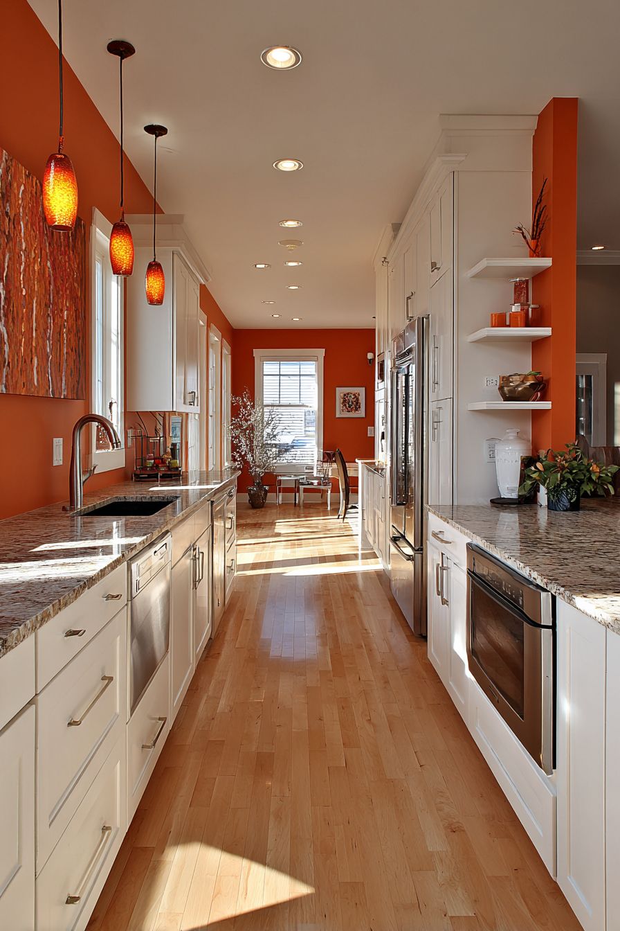
White shaker-style cabinetry surrounding the accent wall provides classic appeal and ensures the orange doesn’t dominate the entire kitchen atmosphere. This neutral framework allows the terracotta wall to shine without competition, creating a clear visual hierarchy where the eye is naturally drawn to the colorful focal point. Stainless steel appliances introduce contemporary functionality and cool metallic tones that provide temperature contrast to the warm orange. Pendant lights with amber glass shades extend the orange color story vertically, creating visual continuity between the wall and ceiling plane while adding warm illumination during evening hours.
Key Design Tips:
- Choose one primary wall for the orange accent rather than painting multiple walls to maintain balance and prevent color saturation
- Install floating shelves at varying heights to create visual rhythm and accommodate items of different sizes
- Style shelves with a mix of functional items and decorative objects in complementary colors like cream, olive green, or warm gray
- Select pendant lights with warm-toned glass or shades to reinforce the orange theme without exact matching
- Use the accent wall to anchor the kitchen’s color scheme, pulling accent colors from it for textiles, artwork, and accessories throughout the space
- Ensure adequate lighting directed at the accent wall to maintain color vibrancy even during evening hours
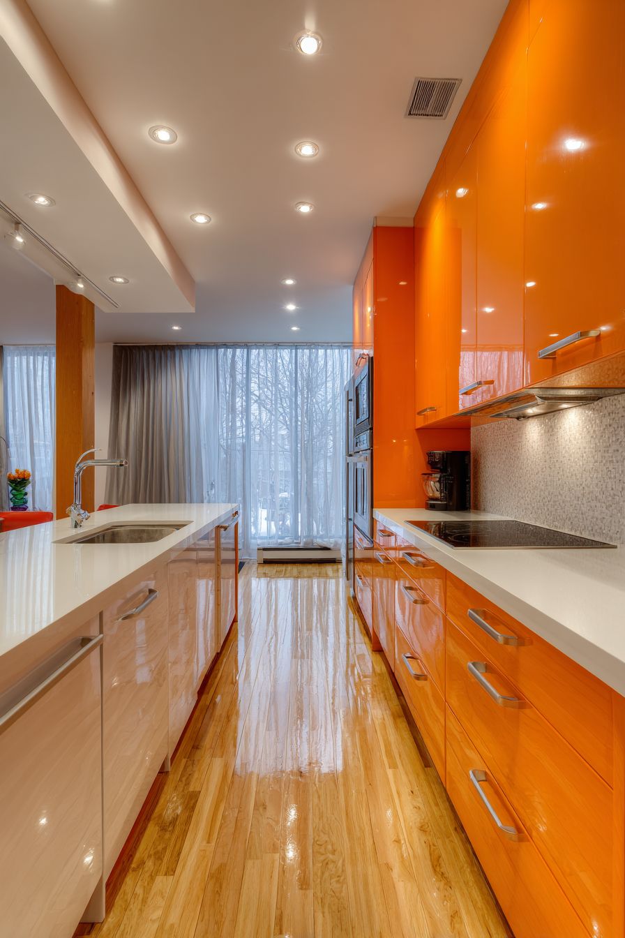
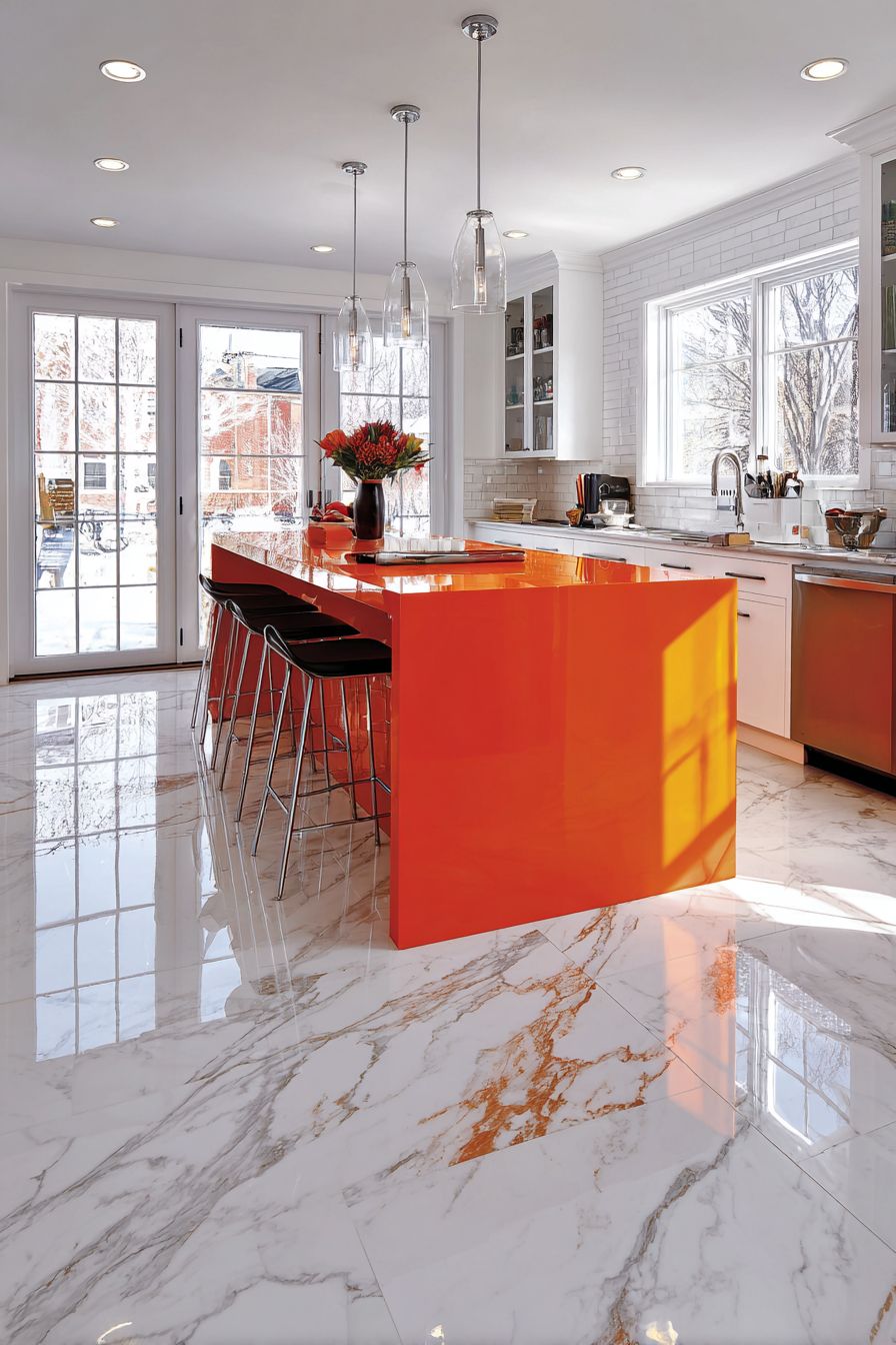
3. Glossy Tangerine Island Centerpiece
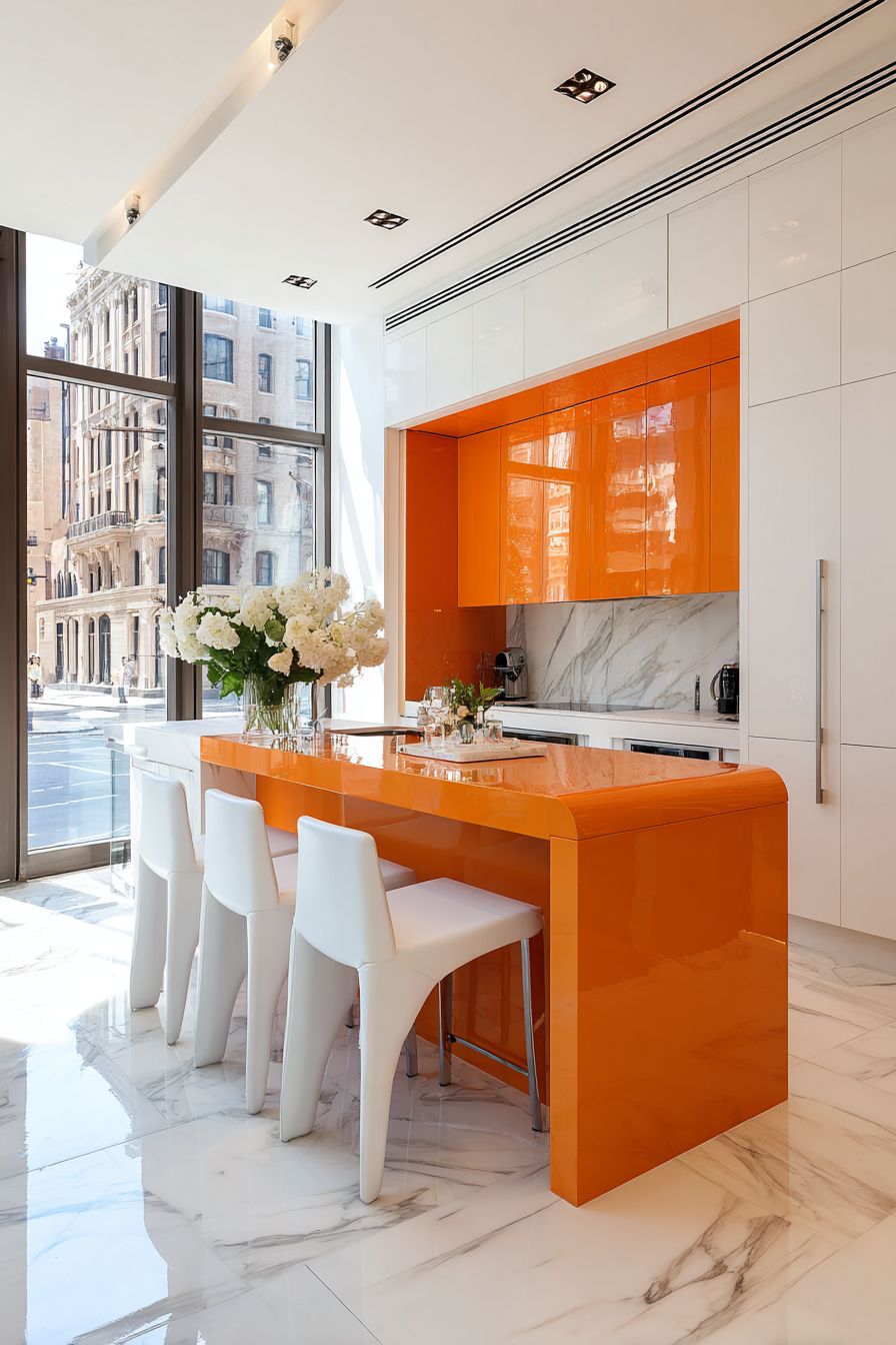
Creating a statement kitchen island in glossy tangerine orange with a waterfall edge design represents the epitome of contemporary kitchen drama. This approach concentrates bold color on the kitchen’s most social and functional element—the island—allowing it to command attention while surrounding cabinetry remains neutral. The glossy lacquer finish reflects light beautifully, creating a jewel-like quality that changes throughout the day as natural and artificial light sources shift. The waterfall edge, where the countertop material continues down the sides to the floor, amplifies the modern aesthetic while showcasing the vibrant orange from multiple angles.
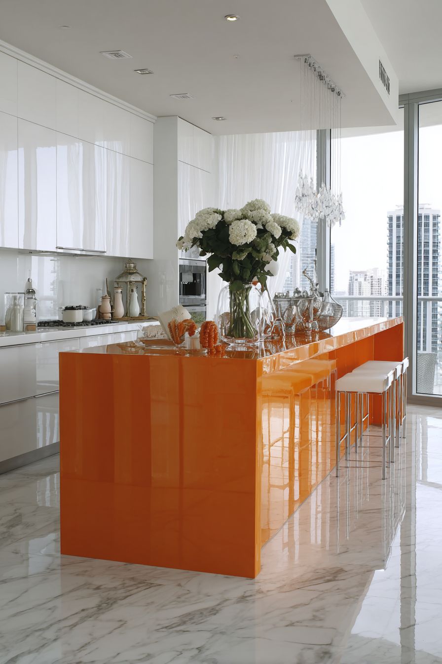
The reflective quality of glossy tangerine lacquer serves multiple design purposes beyond pure aesthetics. In practical terms, the sheen makes the island appear larger and more sculptural, transforming a functional element into genuine art. The reflection of overhead lighting, pendant fixtures, and natural light from windows creates dynamic visual interest that matte finishes cannot achieve. However, this high-impact finish requires commitment to maintenance, as glossy surfaces show fingerprints and require regular cleaning—a consideration balanced against the stunning visual payoff.
Surrounding this bold centerpiece with crisp white cabinetry creates maximum contrast and allows the orange island to truly star. The white cabinetry recedes visually, making the kitchen feel more spacious while providing ample storage that doesn’t compete for attention. Marble-look porcelain flooring introduces pattern and visual texture without adding color competition, while its light tones reflect the abundant natural light mentioned in the design. The island’s built-in storage and seating for three transforms it from mere visual statement to highly functional gathering spot where family and guests naturally congregate.
Key Design Tips:
- Limit glossy, intensely colored finishes to one major element to prevent visual overwhelm and maintain sophistication
- Choose a waterfall edge detail to emphasize the island’s sculptural quality and create a more finished, luxury appearance
- Ensure the island dimensions are substantial enough to carry a bold color—undersized islands in bright hues can appear toylike rather than dramatic
- Install adequate task lighting above the island to highlight the glossy finish and ensure functionality for food preparation
- Select comfortable, stylish seating that complements rather than matches the orange, perhaps in neutral upholstery with wood or metal frames
- Consider the sight lines from adjacent rooms, as a glossy orange island will be visible and impactful from multiple vantage points
- Specify high-quality lacquer finishes that resist yellowing and maintain color integrity over time
4. Gradient Orange Ceramic Tile Backsplash
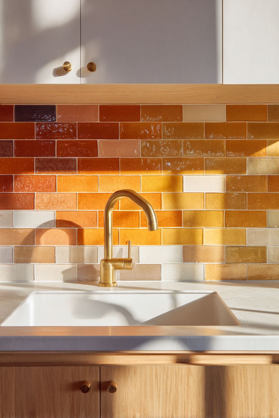
An orange kitchen backsplash featuring handmade ceramic subway tiles in a gradient ranging from soft peach to deep pumpkin represents artisanal craftsmanship merged with thoughtful color theory. This approach celebrates the inherent beauty of handcrafted materials, where slight variations in glaze application create organic color transitions that machine-made tiles cannot replicate. The gradient effect—moving gradually through the orange spectrum—adds visual movement and depth to what might otherwise be a flat vertical surface, creating an ever-changing backdrop as natural light shifts throughout the day.
The decision to frame this colorful backsplash with white countertops and light wood cabinetry demonstrates restraint and design sophistication. By keeping surrounding elements neutral and natural, the backsplash becomes an intentional focal point rather than one component in a chaotic color scheme.
Light wood cabinetry introduces warmth that harmonizes with orange tones while maintaining visual separation through material difference. The wood grain provides organic texture that complements the handmade quality of the ceramic tiles, creating a cohesive artisanal aesthetic throughout the space.
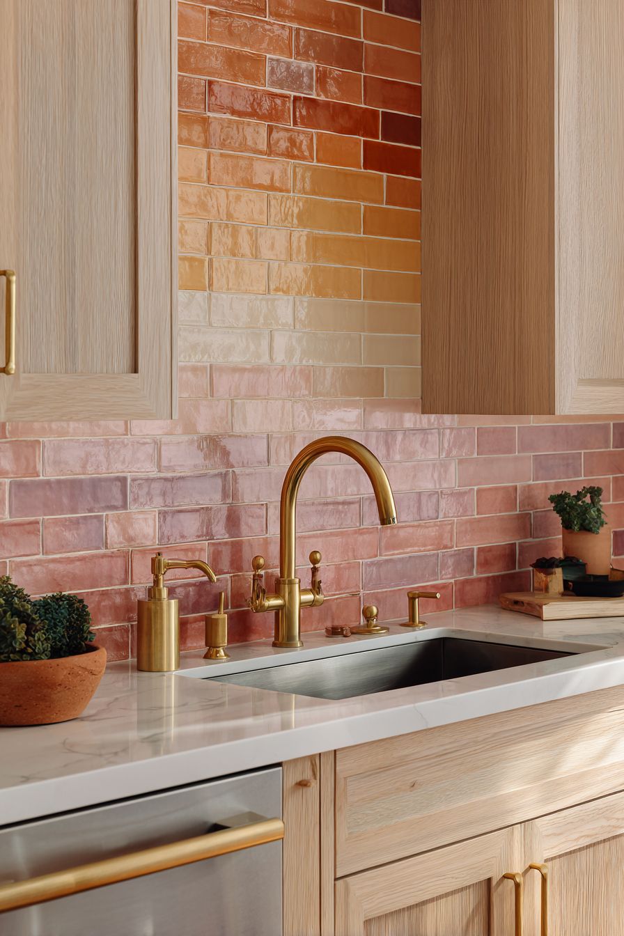
Brass fixtures and hardware extend the warm metallic story, creating a unified design language that feels curated rather than coincidental. Brass has experienced a significant resurgence in kitchen design, valued for its warmth and the living patina it develops over time.
When paired with orange tones, brass creates a complementary relationship where both elements enhance each other—the orange making the brass appear richer and more golden, while the brass lends sophistication to the orange. Capturing this design during golden hour, when natural light takes on warm amber qualities, showcases the backsplash at its most beautiful, with the gradient tiles seeming to glow from within.
Key Design Tips:
- Specify handmade tiles rather than manufactured ones to achieve authentic color variation and artisanal character
- Extend the backsplash from counter to upper cabinets to create sufficient visual impact and showcase the gradient effect fully
- Choose a gradient that transitions vertically (light to dark from top to bottom or vice versa) to complement the natural flow of the eye
- Install brass or warm gold fixtures and hardware throughout the kitchen to create material harmony with the orange tiles
- Seal handmade ceramic tiles properly to prevent staining and ensure longevity in the high-moisture backsplash environment
- Consider continuing the backsplash across the entire wall rather than just behind the range to create a more significant design statement
- Style open shelving or countertops with objects that pull colors from various points in the gradient to create visual continuity
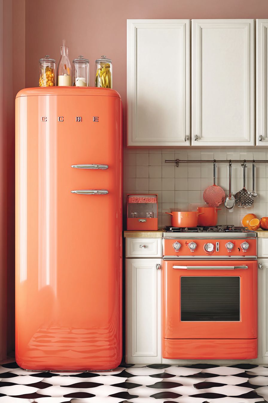
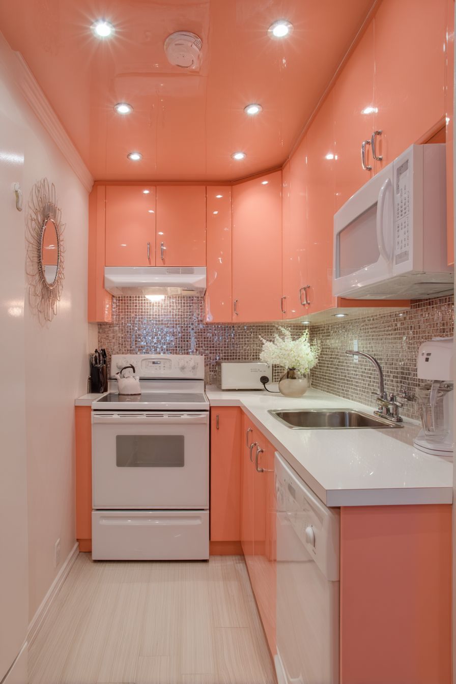
5. Retro Coral Orange Vintage Appliances

Embracing mid-century nostalgia through vintage-style appliances in cheerful coral orange creates a kitchen that celebrates a specific design era with authenticity and playfulness. This approach centers on statement appliances—particularly a vintage-style refrigerator and range in coral orange finishes—that immediately transport the space to the optimistic aesthetic of the 1950s and 60s. These reproduction appliances combine period-accurate styling with modern functionality, offering the visual appeal of true vintage pieces without sacrificing contemporary conveniences like energy efficiency, precise temperature control, and modern cooking technology.
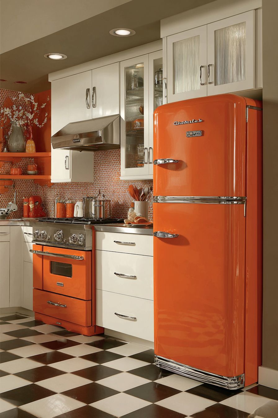
The checkerboard flooring in black and white adds essential period authenticity while providing bold graphic contrast to the coral appliances. This classic flooring pattern creates visual energy and movement, preventing the kitchen from feeling too sweet or one-dimensional. The high contrast of black and white grounds the coral orange, making it appear more intentional and less potentially overwhelming. White upper cabinets maintain the bright, optimistic feeling characteristic of mid-century kitchens while ensuring the space doesn’t become too dark or heavy despite the checkerboard floor.
Chrome fixtures and hardware complete the retro aesthetic with metallic brightness that reflects the era’s enthusiasm for modern materials and streamlined forms. Chrome’s cool, mirror-like finish provides temperature contrast to the warm coral orange, creating visual balance and preventing the space from becoming too monotonously warm in tone. The reflective quality of chrome also helps bounce light around the space, maintaining the bright, cheerful atmosphere that defines successful retro kitchen design. Soft, diffused lighting emphasizes the playful color scheme while avoiding harsh shadows that would disrupt the nostalgic, welcoming ambiance.

Key Design Tips:
- Invest in quality reproduction appliances from reputable manufacturers that offer genuine vintage styling with modern internals
- Balance the playful coral color with classic black and white elements to prevent the space from appearing costume-like
- Incorporate authentic mid-century design elements like chrome bar stools, pendant lights with atomic-age designs, or period-appropriate cabinet hardware
- Choose matte or satin finish coral rather than high gloss to achieve a more authentic vintage appearance
- Add period-appropriate textiles like gingham curtains or vintage-inspired tea towels to reinforce the retro theme
- Consider incorporating a vintage-style diner booth or banquette seating if space allows for additional period authenticity
- Source genuine vintage accessories like enamelware, Pyrex, or period signage to complete the aesthetic on open shelving or display areas
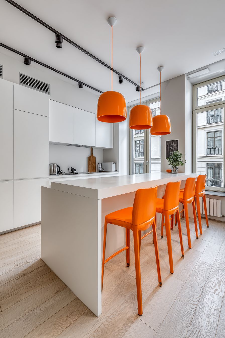
6. Scandinavian Minimalism with Orange Accents
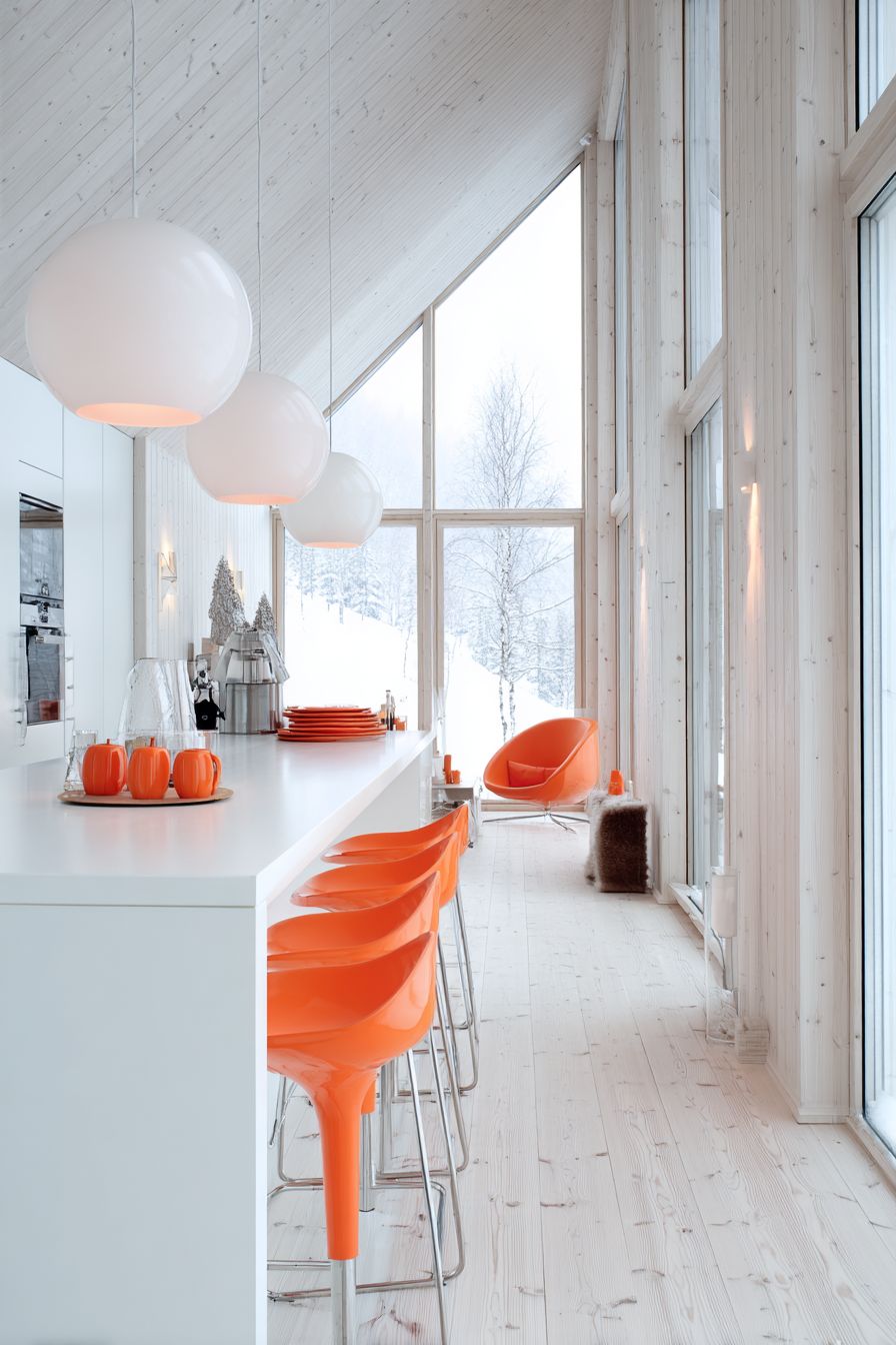
The Scandinavian approach to incorporating orange demonstrates how bold color can exist within minimalist frameworks when applied with restraint and intention. This design philosophy centers on minimalist white cabinetry that provides a clean, serene backdrop while orange appears in carefully selected accent elements—bar stools, pendant lights, and curated decorative accessories. This distribution strategy allows orange to energize the space without dominating it, creating pops of warmth that draw the eye and add personality while maintaining the uncluttered aesthetic central to Nordic design.
Light birch wood flooring and countertops introduce the natural warmth characteristic of Scandinavian interiors, creating a foundation of organic materiality that prevents the white-dominated space from feeling cold or clinical. Birch’s pale golden tones harmonize beautifully with orange accents, establishing a cohesive, warm palette that feels sunny and inviting despite the predominance of white surfaces. The wood grain adds subtle texture and visual interest that aligns with Scandinavian values of craftsmanship and connection to nature.

Large windows are essential to this design concept, flooding the space with abundant natural light that is fundamental to Nordic design philosophy. In northern climates with limited daylight during winter months, maximizing natural light becomes crucial for both practical and psychological well-being. The natural light interacts beautifully with the orange accents, making them appear to glow and creating shadows that add dimension throughout the day. The airy, light-filled atmosphere achieved through this combination of white surfaces, natural materials, and generous glazing creates an inviting environment that feels both energizing and calming—a balance central to successful Scandinavian design.

Key Design Tips:
- Limit orange accents to three to five key elements to maintain minimalist principles while achieving impact
- Choose orange accent pieces in similar tones to create cohesion rather than mixing multiple orange hues that can appear chaotic
- Select simple, clean-lined designs for orange accent pieces that align with Scandinavian aesthetic principles
- Incorporate plenty of natural light through large, unadorned windows with minimal or no window treatments
- Add natural textures through linen textiles, wool rugs, or ceramic objects to prevent the space from feeling too stark
- Keep countertops largely clear, displaying only essential items or a few carefully chosen objects
- Consider incorporating plants with green foliage to complement the orange accents and add life to the neutral palette
- Choose warm white paint rather than cool white to create a softer, more inviting backdrop for the orange accents
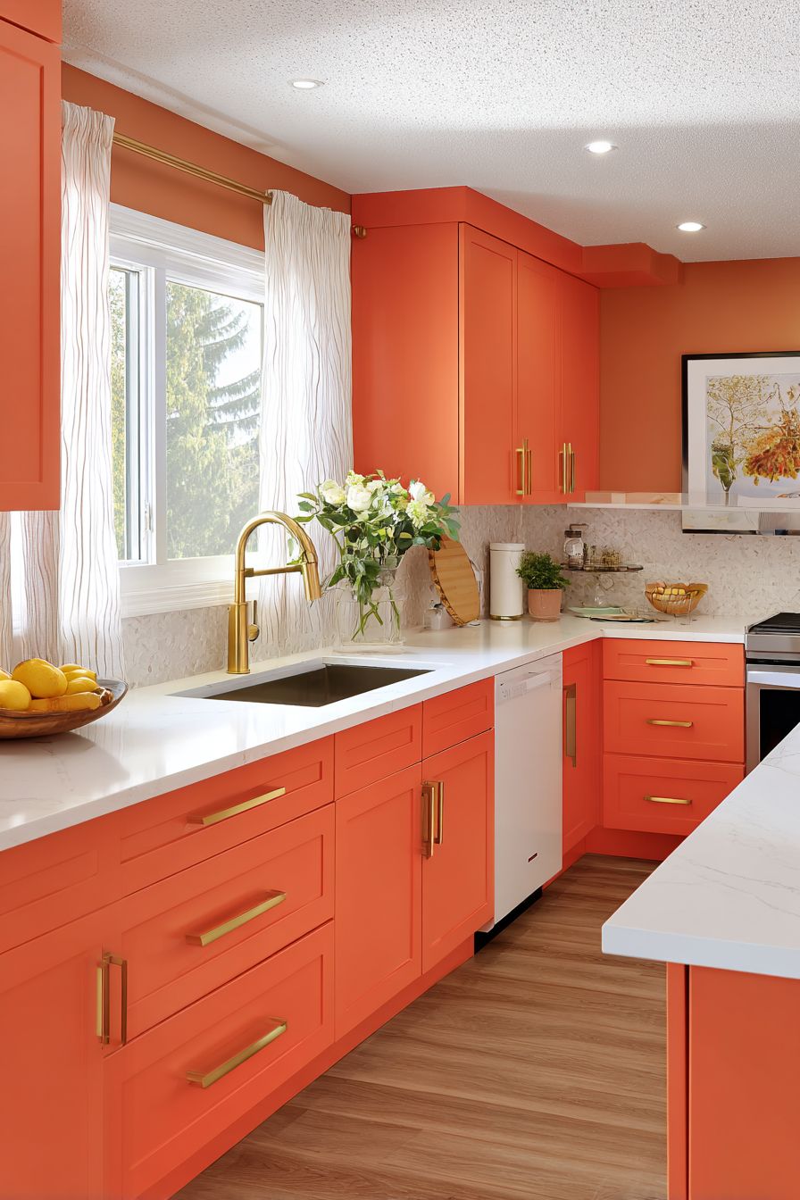
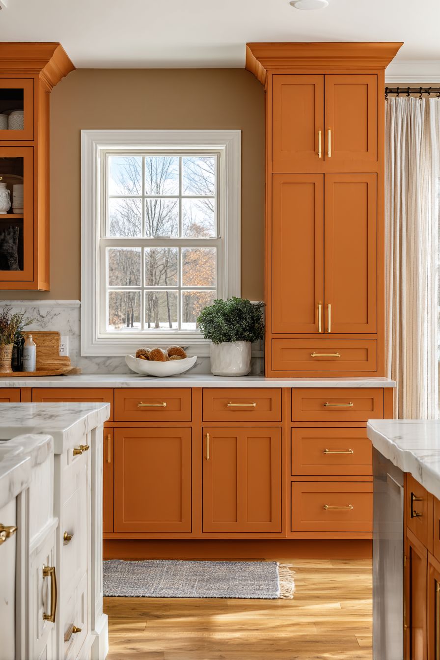
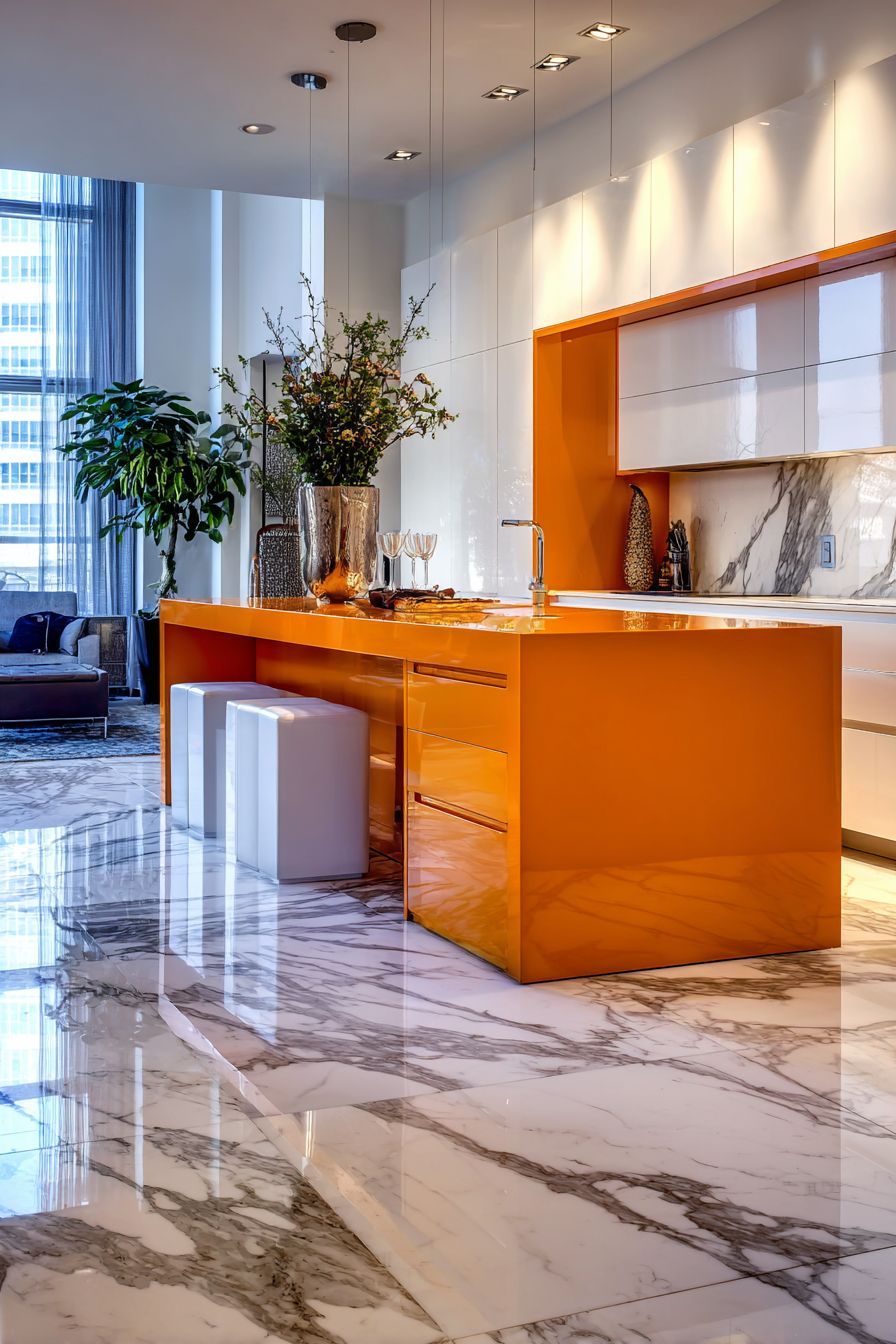
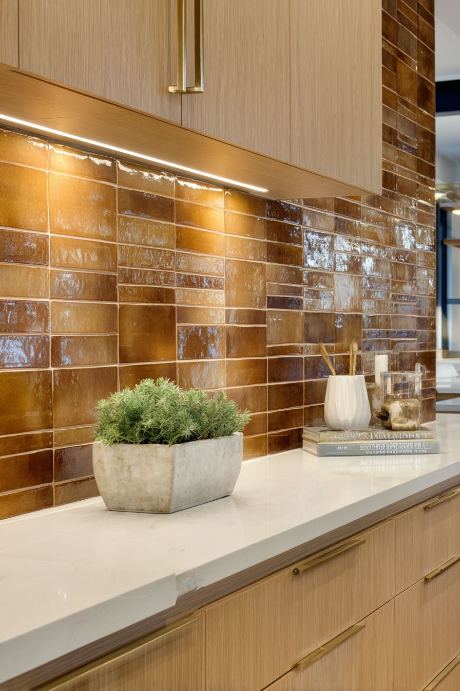
7. Two-Tone Cabinetry in Burnt Orange and White
The two-tone cabinetry approach featuring deep burnt orange lower cabinets and white upper cabinets represents a sophisticated strategy for incorporating bold color while maintaining visual balance and practical functionality. This vertical division creates clear zones within the kitchen—the warm, grounded feeling of orange at the base level where we interact most directly with the space, and the light, airy quality of white above that draws the eye upward and prevents the kitchen from feeling heavy or enclosed. This distribution respects human visual perception, with darker colors below feeling naturally stable and lighter colors above creating openness.
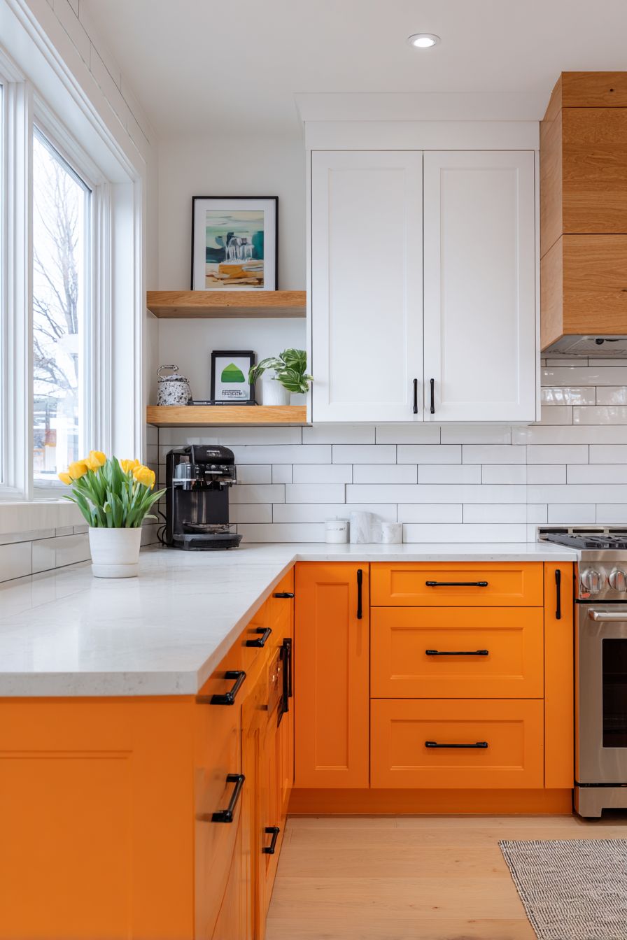
Butcher block countertops introduce natural warmth and organic texture that bridges the orange and white zones, creating material harmony that softens the color transition. The honey tones and visible grain of butcher block complement the orange cabinetry while adding practical benefits—a forgiving, repairable surface that develops character over time. A white subway tile backsplash provides clean contrast and extends the white upper cabinet color between the levels, maintaining visual continuity while offering a classic backdrop that won’t compete with the colorful cabinetry.
Matte black hardware and fixtures create modern sophistication and provide strong visual punctuation throughout the space. Black’s neutrality allows it to work with both the orange and white elements while adding contemporary edge that prevents the design from feeling too traditional or predictable.

The matte finish on hardware and fixtures aligns with current design trends while avoiding the fingerprint issues of polished finishes. Natural window light highlights the practical layout while emphasizing the rich orange cabinet finish, with visible wood grain texture adding depth and interest that flat painted finishes cannot achieve.
Key Design Tips:
- Choose deeper, more sophisticated orange tones for lower cabinets to create grounding rather than bright, potentially jarring hues
- Consider the 60-30-10 color rule: approximately 60% white, 30% orange, 10% black accents for balanced distribution
- Specify wood grain texture in orange cabinet finish rather than solid paint to add dimension and visual interest
- Install butcher block countertops with proper sealing and maintenance instructions to ensure longevity
- Use consistent hardware throughout both cabinet colors to create unity despite the color difference
- Ensure lower cabinet interiors are well-lit, as dark exteriors can make interiors seem dim during use
- Consider open shelving or glass-front cabinet doors in a few upper cabinet sections to break up solid white expanses
- Select appliances in stainless steel or black to complement the modern aesthetic and coordinate with black hardware
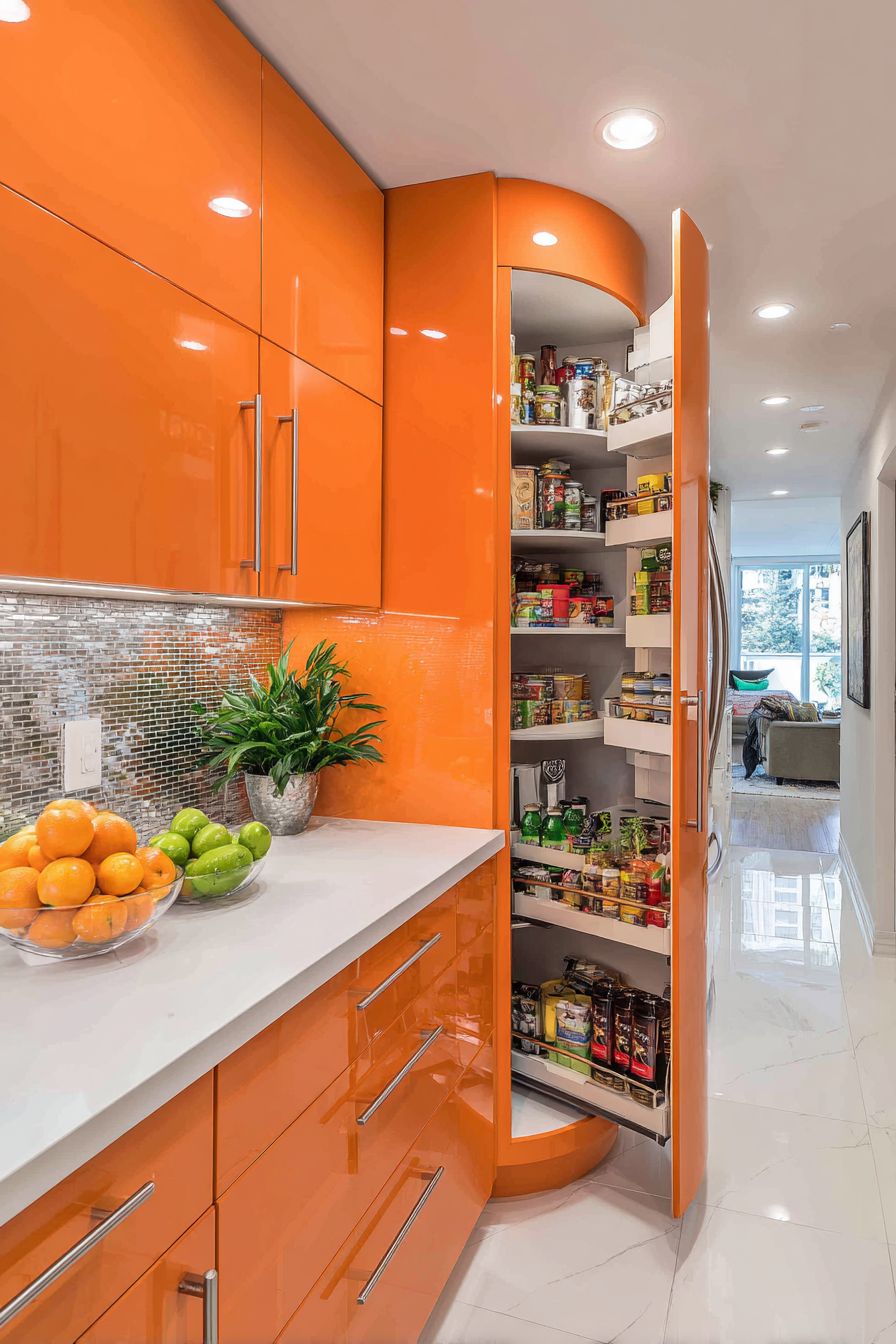
8. Space-Maximizing Apricot Orange Small Kitchen

Designing a small kitchen in soft apricot orange demonstrates how thoughtful color choices and clever spatial planning can transform limited square footage into an efficient, personality-filled space. The decision to use floor-to-ceiling cabinets in apricot orange maximizes every vertical inch while the softer, more delicate orange tone prevents the space from feeling overwhelming despite the color’s full-height presence. Apricot orange offers the warmth and character of deeper oranges while maintaining a lighter quality that helps small spaces feel more open and less confined.
Smart storage solutions integrated throughout the design include pull-out pantry organizers that make deep cabinets accessible, corner carousel units that capture typically wasted corner space, and vertical dividers that keep baking sheets and cutting boards organized. These organizational elements transform the kitchen from merely pretty to genuinely functional, proving that small kitchens can operate efficiently when every cubic inch is thoughtfully planned. The apricot orange cabinetry becomes the personality layer applied over fundamentally sound spatial planning.
White countertops and a mirrored backsplash employ classic small-space design strategies to brighten and visually expand the compact footprint. The mirrored backsplash reflects light throughout the space while creating the illusion of additional depth, making the kitchen feel larger than its actual dimensions. Recessed lighting creates even, shadow-free illumination that prevents dark corners and maintains brightness essential in windowless or light-challenged small kitchens. The combination of reflective surfaces, consistent lighting, and the warm apricot cabinetry creates a small kitchen that feels cozy rather than cramped, characterful rather than generic.
Key Design Tips:
- Choose lighter orange tones like apricot or peach for small spaces to maintain airiness while adding personality
- Maximize vertical storage with floor-to-ceiling cabinetry to capture every possible cubic inch
- Incorporate reflective surfaces like mirrored backsplashes or glossy tile to bounce light and create visual expansion
- Install multiple layers of lighting including recessed ceiling lights, under-cabinet lighting, and task lighting over work areas
- Specify custom storage solutions tailored to your specific needs rather than standard cabinet interiors
- Keep countertops as clear as possible to maximize visual and functional space
- Consider pocket doors or sliding doors if the kitchen opens to adjacent spaces to save swing clearance
- Use consistent flooring between kitchen and adjacent spaces to create visual flow that makes the kitchen feel less isolated
- Limit additional color accents to maintain simplicity and prevent visual clutter in the limited space
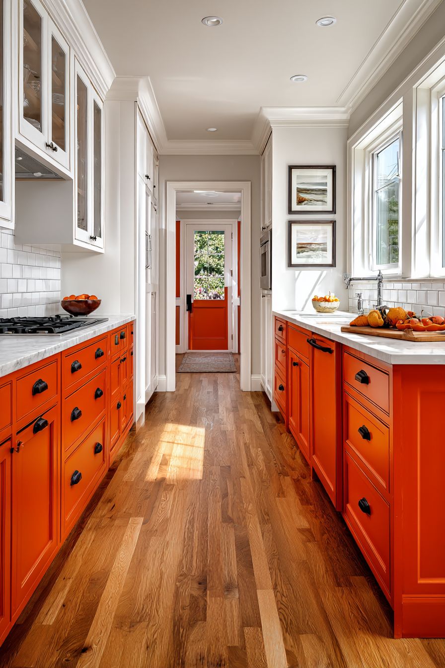
9. Industrial Style with Terracotta Brick and Metal
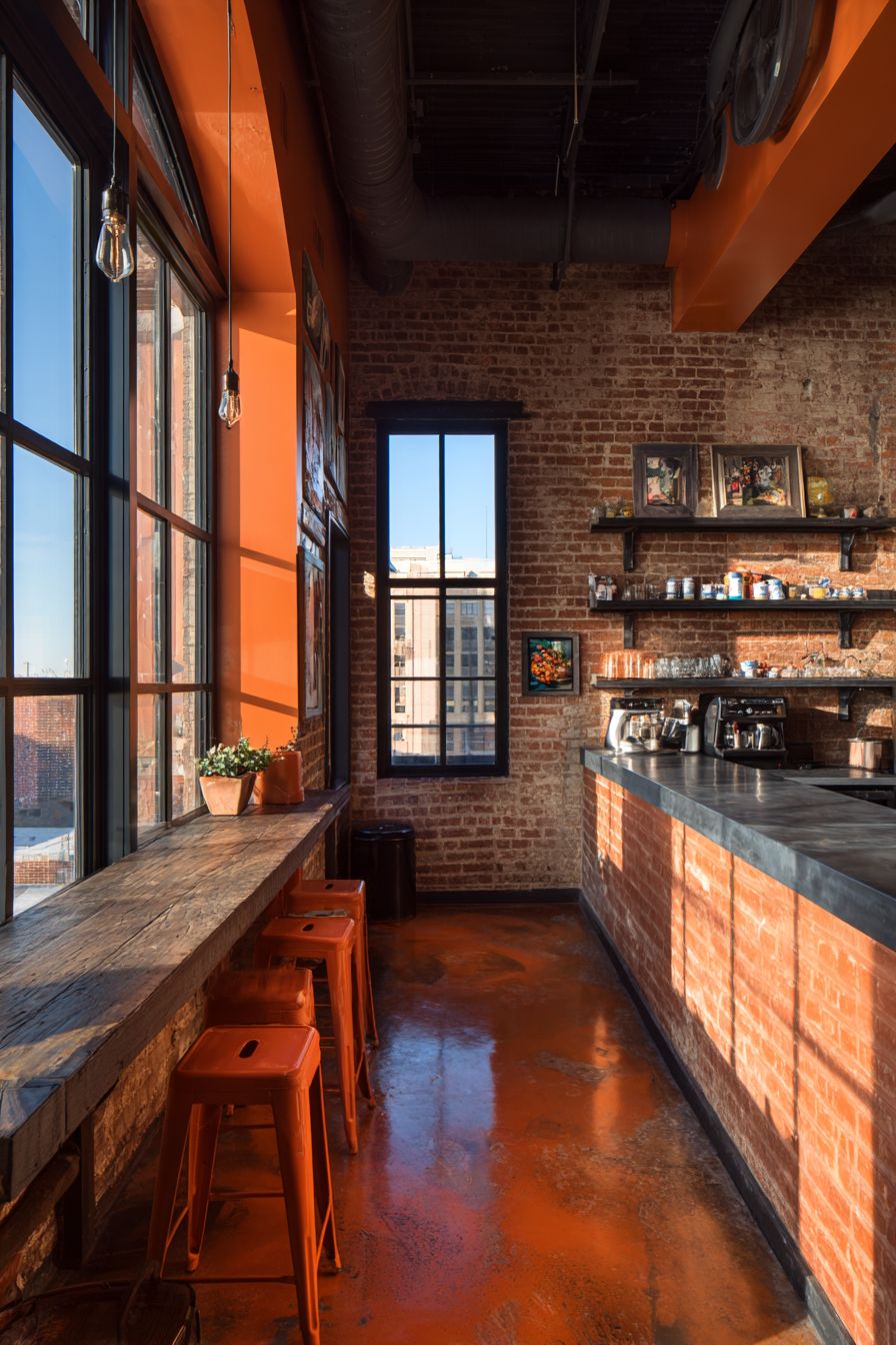
The industrial-style orange kitchen achieves its distinctive character through the integration of exposed brick walls in terracotta orange tones that provide both color and authentic material texture. These brick walls—whether original to an older building or added for aesthetic effect—introduce raw architectural character that immediately establishes the industrial aesthetic while providing the desired orange color through natural material rather than applied paint or cabinetry. The irregular surface of brick, with its mortar lines and slight color variations, adds depth and visual interest impossible to achieve with smooth painted surfaces.
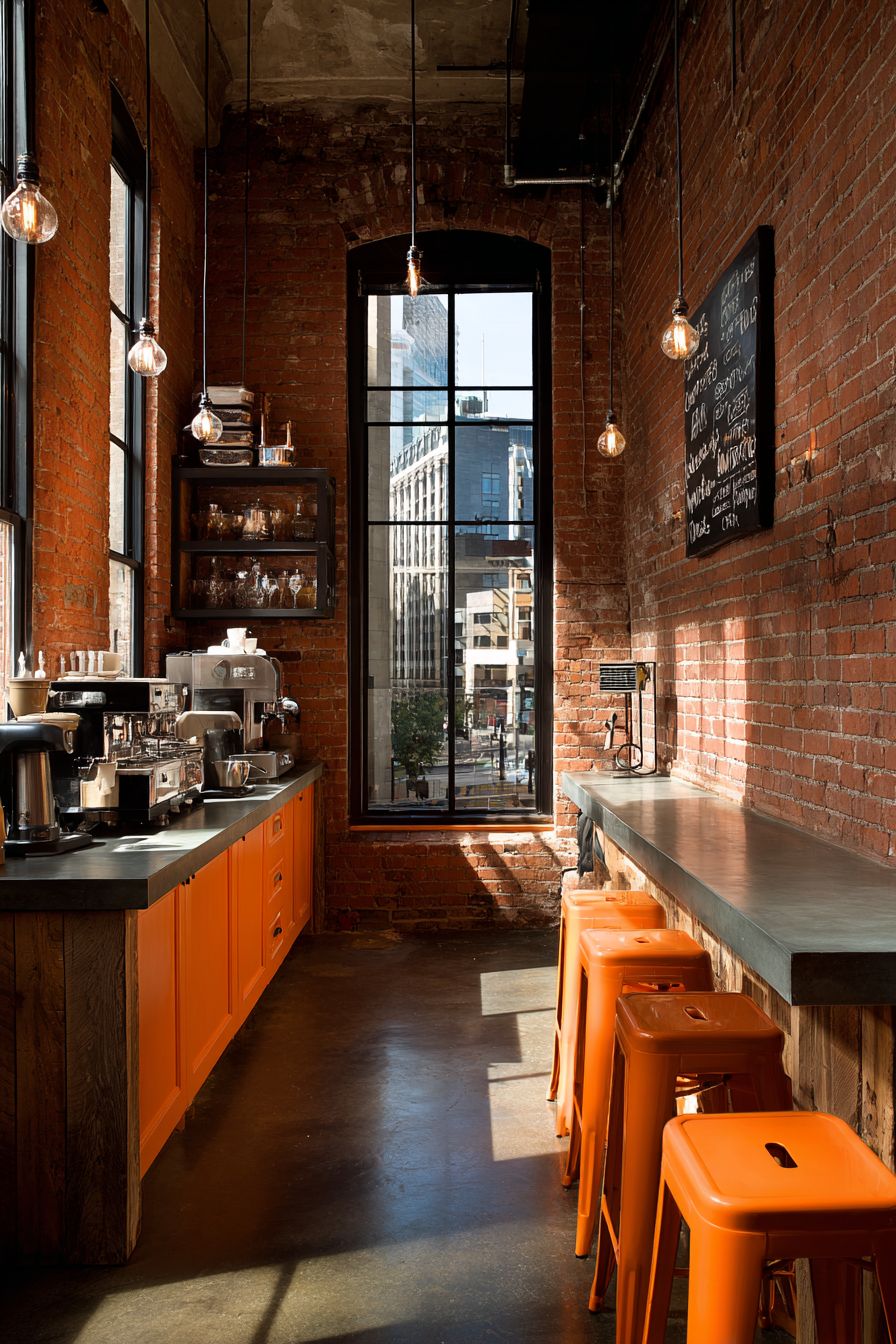
Black metal open shelving and pendant lights with Edison bulbs extend the industrial theme through honest materials and exposed functionality. The open shelving reveals stored items and the wall behind, creating visual transparency that makes the space feel less enclosed while offering practical storage for frequently used items and decorative objects. Edison bulbs in industrial pendant fixtures provide warm, amber-toned illumination that complements the terracotta brick while their visible filaments celebrate the beauty of exposed utility—a core principle of industrial design.
Concrete countertops provide raw texture and cool gray tones that balance the warmth of the terracotta brick, creating temperature contrast essential to preventing the space from becoming monotonously warm. Vintage orange bar stools at a reclaimed wood breakfast bar add intentional orange color elements that echo the brick while introducing additional salvaged materials that reinforce the industrial aesthetic’s appreciation for repurposed objects. Large factory-style windows illuminate the space with abundant natural light while their industrial frames and divided lights reinforce the warehouse-inspired design language throughout.

Key Design Tips:
- If adding faux brick, invest in quality materials that convincingly mimic real brick texture and color variation
- Seal exposed brick properly to prevent dust and facilitate cleaning in the kitchen environment
- Choose open shelving made from genuine industrial materials like iron pipe or steel brackets for authenticity
- Install dimmer switches on Edison bulb fixtures to control ambiance and prevent excessive brightness from multiple exposed bulbs
- Select concrete countertops sealed properly to resist staining from kitchen use
- Source genuinely vintage or reclaimed elements rather than new items made to look old for authentic industrial character
- Maintain some softer elements through textiles or plants to prevent the space from feeling too hard or cold
- Consider exposing ductwork, pipes, or structural beams if possible to enhance the industrial aesthetic’s celebration of building systems
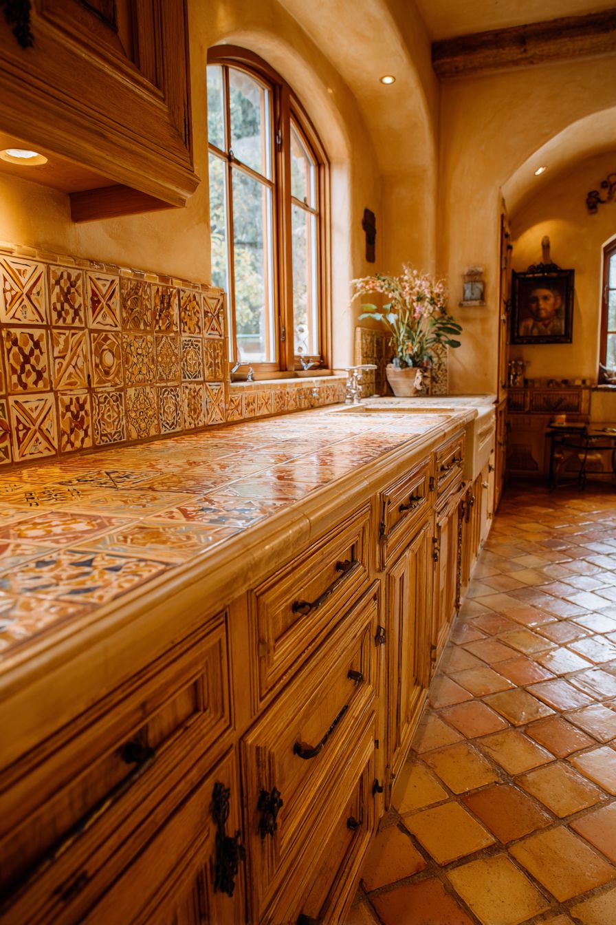
10. Mediterranean Hand-Painted Tile Artistry
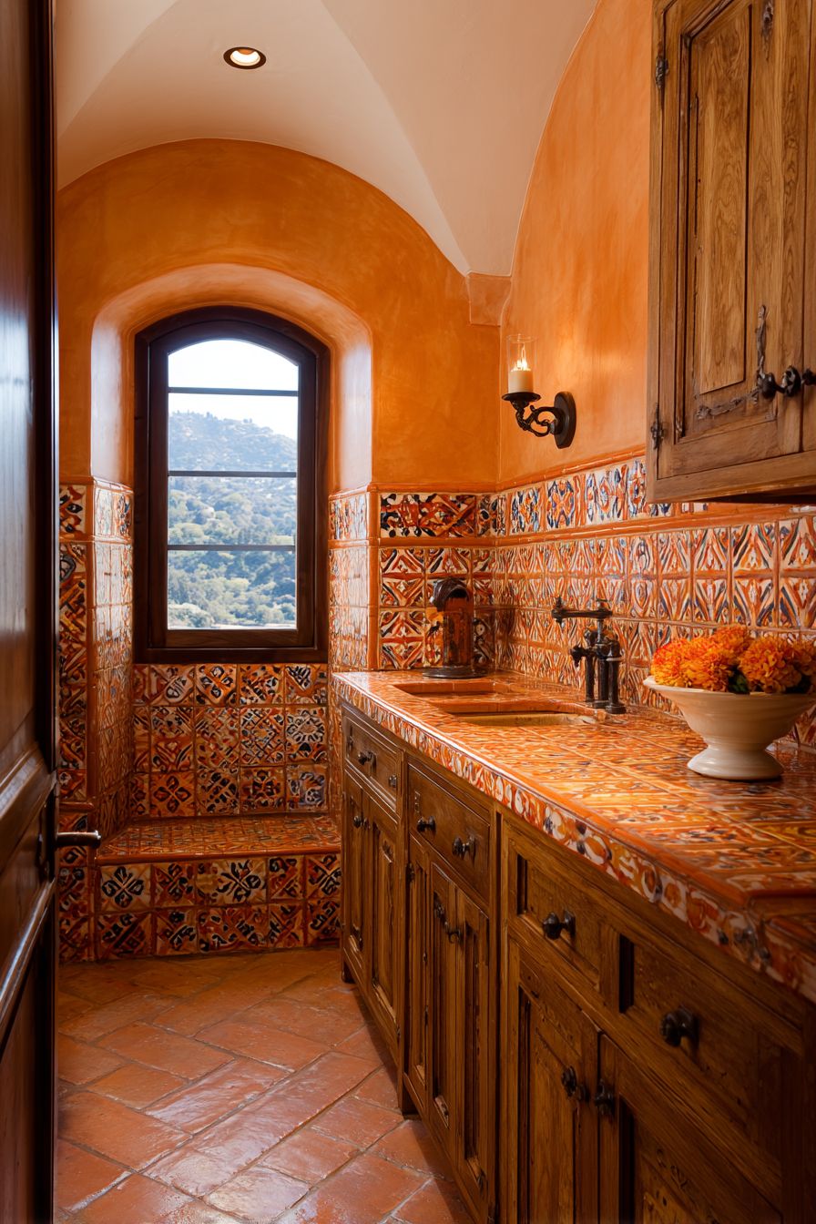
A Mediterranean-inspired orange kitchen celebrates centuries-old tile-making traditions through hand-painted orange tile work featuring intricate geometric patterns in shades of orange, terracotta, and cream. This approach transforms the backsplash into genuine artwork where each tile represents skilled craftsmanship and where slight irregularities in pattern and glaze application prove authenticity. The geometric patterns—possibly inspired by Moorish designs, Spanish azulejos, or Italian majolica traditions—add visual complexity and cultural depth that mass-produced tiles cannot achieve, creating a kitchen that feels connected to European design heritage.

Warm honey-toned wood cabinetry and wrought iron hardware enhance the European aesthetic through material choices that reference traditional Mediterranean architecture and furnishings. The honey-toned wood—whether oak, pine, or chestnut—brings natural warmth and visible grain that harmonizes with the orange tile work while maintaining distinction through material difference. Wrought iron hardware, with its hand-forged appearance and matte black finish, introduces artisanal metalwork that complements the handmade quality of the tiles, creating material consistency in the celebration of traditional craftsmanship.
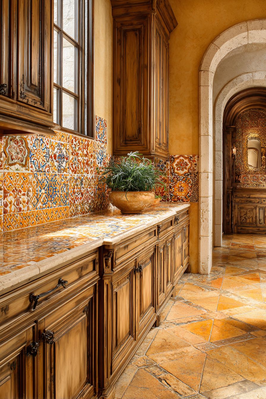
Terra cotta floor tiles add authentic character while extending the orange color story to the ground plane. Traditional terra cotta floor tiles—unglazed, porous, and varying slightly in tone—require sealing but offer unmatched warmth and authenticity in Mediterranean-inspired spaces. An arched window allows soft natural light to highlight the artisanal orange tilework while the arch itself references traditional Mediterranean architectural forms. The interplay between natural light and handcrafted surfaces creates an ever-changing environment where the tiles reveal new details and the space takes on different moods as sunlight moves throughout the day, achieving the timeless quality central to enduring Mediterranean design.
Key Design Tips:
- Source hand-painted tiles from artisan makers or import them from Mediterranean countries for authentic character
- Plan the tile layout carefully to showcase the patterns effectively and determine if professional installation is needed for complex designs
- Seal terra cotta floor tiles appropriately for kitchen use to prevent staining while maintaining their natural appearance
- Choose simple, traditional cabinet door styles that don’t compete with elaborate tile patterns
- Incorporate other handcrafted elements like pottery, woven baskets, or copper cookware to reinforce the artisanal theme
- Consider extending decorative tile work beyond the backsplash to a range hood surround or accent areas
- Install warm-toned task lighting that enhances rather than washes out the rich colors in the hand-painted tiles
- Add Mediterranean plants like herbs in terra cotta pots on windowsills or countertops to complete the aesthetic
Why These Orange Kitchen Designs Are the Best
The ten orange kitchen designs presented in this comprehensive guide represent the pinnacle of contemporary kitchen design thinking, each demonstrating a unique approach to incorporating this bold, warm color into functional culinary spaces. These designs succeed because they understand orange not merely as a color choice but as a design tool that can dramatically influence the mood, perceived temperature, and personality of a kitchen. From the full commitment of burnt orange custom cabinetry to the strategic restraint of Scandinavian orange accents, each approach offers a roadmap for homeowners seeking to move beyond safe neutrals toward more expressive, personality-driven spaces.
The vibrant custom cabinetry design exemplifies how bold color can be sophisticated when executed with quality materials and thoughtful pairings. This approach works beautifully for homeowners who want their kitchen to make an immediate, dramatic statement while maintaining luxury through details like brushed gold hardware and quartz countertops. The burnt orange tone chosen represents optimal color selection within the orange spectrum—deep enough to feel rich and mature, warm enough to create enveloping coziness, yet vibrant enough to energize the space. This design proves that committing fully to orange cabinetry need not result in overwhelming intensity when balanced with strategic neutrals and abundant natural light.
The terracotta accent wall design succeeds by demonstrating proportional color use, perfect for those who love orange but fear committing to it throughout the entire kitchen. This measured approach allows homeowners to test bold color in a significant but changeable way—a painted accent wall can be repainted far more easily than replaced cabinetry. The terracotta shade chosen connects to natural earth tones and architectural materials, making it feel organic rather than arbitrary. Combined with white shaker cabinetry and stainless appliances, this design achieves perfect balance between contemporary functionality and warm personality, suitable for traditional and modern homes alike.
The glossy tangerine island represents the cutting edge of contemporary kitchen design where a single bold element becomes sculptural focal point. This approach is ideal for open-concept homes where the kitchen island serves as transition between cooking and living spaces, visible from multiple angles and thus deserving of dramatic treatment. The waterfall edge detail elevates the island from furniture to architecture, while the glossy finish creates a jewel-like quality that changes throughout the day as light conditions shift. This design philosophy—concentrating color and drama on one key element while keeping surroundings neutral—allows maximum impact with controlled risk, perfect for design-forward homeowners who want their kitchen to feel gallery-worthy.
The gradient orange backsplash design celebrates artisanal craftsmanship in an era of mass production, appealing to homeowners who value uniqueness and the human touch in their interiors. Hand-painted ceramic tiles with natural color variation create visual depth impossible to achieve with machine-made materials, while the gradient from peach to pumpkin demonstrates sophisticated color theory application. This design works exceptionally well because it confines the color to a contained, changeable area—backsplashes can be replaced more readily than cabinetry—while creating sufficient visual impact to define the entire kitchen aesthetic. The combination with brass fixtures shows how metallic choices can dramatically influence how orange reads, with warm metals amplifying orange’s inherent warmth.
The retro-inspired design with vintage coral appliances offers pure joy and nostalgia, perfect for homeowners who appreciate mid-century design’s optimistic aesthetic and playful approach to color. This design succeeds because it commits fully to a specific design era, with checkerboard flooring, chrome fixtures, and vintage-style appliances creating cohesive period authenticity rather than superficial retro touches. The coral orange chosen—softer and more pink-leaned than pure orange—captures the exact hue popular in 1950s and 60s kitchens, demonstrating how period-specific color research elevates theme execution. This approach proves that kitchens can be fun, whimsical, and colorful while remaining functional and genuinely well-designed.
The Scandinavian approach demonstrates how orange can exist within minimalist frameworks through restraint and strategic placement. This design philosophy is ideal for those who crave simplicity and uncluttered spaces but want to avoid the coldness that can afflict all-white minimalist kitchens. By introducing orange through accent pieces—bar stools, pendant lights, small accessories—the design adds warmth and personality without compromising the serene, orderly aesthetic central to Nordic design. The combination of white cabinetry, light birch wood, and abundant natural light creates the luminous quality essential to Scandinavian interiors, while orange accents provide energizing pops of color that prevent monotony.
The two-tone cabinetry design in burnt orange and white represents sophisticated color blocking that satisfies both practical and aesthetic considerations. Placing darker orange on lower cabinets creates visual grounding while the lighter white uppers prevent the ceiling from feeling lowered—crucial in standard-height kitchens. This approach works brilliantly because it acknowledges human visual perception and spatial psychology, using color placement to enhance rather than fight against how we naturally experience space. The addition of butcher block countertops and matte black hardware creates a material palette that feels current yet timeless, capable of aging gracefully as trends shift.
The space-maximizing small kitchen in apricot orange proves that limited square footage need not mean limited personality. This design succeeds through the careful selection of a lighter orange tone that adds character without visual weight, essential in small spaces where dark colors can feel oppressive. The floor-to-ceiling cabinetry maximizes storage capacity while the consistent apricot finish creates visual unity that makes the space feel larger than fragmented color treatments would allow. Combined with reflective surfaces and layered lighting, this design demonstrates how thoughtful color selection supports rather than undermines small-space design strategies, creating a kitchen that feels cozy and intimate rather than cramped.
The industrial-style kitchen with exposed brick and metal elements shows how orange can be introduced through architectural materials rather than applied finishes. The terracotta brick provides texture, color, and authenticity simultaneously, creating a foundation that requires minimal additional orange elements to achieve desired color impact. This design works because it embraces honest materials and celebrates the beauty of raw, unfinished surfaces—core principles of industrial design. The combination of warm brick, cool concrete, and black metal creates temperature and textural contrast that prevents visual monotony while maintaining the edgy, urban aesthetic that defines successful industrial interiors.
The Mediterranean-inspired kitchen with hand-painted tile work represents the apex of artisanal craftsmanship and cultural design heritage. This approach succeeds by celebrating tile as genuine art rather than merely functional surface covering, with intricate geometric patterns and hand-applied glazes creating a backsplash worthy of museum consideration. The design philosophy here connects contemporary kitchen design to centuries of Mediterranean tile-making tradition, creating spaces that feel rooted in history and cultural authenticity rather than driven by fleeting trends. Combined with warm wood cabinetry, wrought iron details, and terra cotta flooring, this kitchen achieves the timeless quality that characterizes enduring Mediterranean design.
Conclusion
The journey through these ten distinctive orange kitchen designs reveals the remarkable versatility of this bold color and the numerous pathways available for incorporating it into contemporary kitchens. Whether your aesthetic preferences lean toward retro nostalgia, industrial edge, Scandinavian minimalism, or Mediterranean warmth, orange offers possibilities for creating kitchens that transcend the ordinary while remaining highly functional and livable. The key to success lies not merely in choosing orange but in understanding how to balance its inherent warmth and energy with complementary materials, strategic neutral zones, and thoughtful design details that create cohesion rather than chaos.
These designs demonstrate that incorporating orange into kitchen design requires courage but rewards it with spaces that genuinely reflect personality and create memorable experiences. From the soft whisper of apricot accents in Scandinavian-inspired spaces to the bold declaration of glossy tangerine islands and burnt orange cabinetry, each approach offers a template that can be adapted to individual preferences, existing architectural contexts, and practical needs. The success stories shared here prove that orange kitchens need not be trendy or fleeting—when executed with quality materials, sophisticated color pairings, and attention to balance, they create enduring spaces that continue to delight years after installation.
As you consider bringing orange into your own kitchen, remember that successful design begins with honest assessment of your personal style, lifestyle needs, and long-term comfort with bold color. Start by identifying which of these ten approaches resonates most strongly with your aesthetic sensibilities, then adapt the principles demonstrated here to your specific space and circumstances. Whether you commit fully to orange cabinetry or introduce it more cautiously through accent elements, the warmth, energy, and personality this remarkable color brings will transform your kitchen from simply functional to genuinely inspiring—a space where cooking becomes more joyful, gatherings more memorable, and every day begins with the energizing warmth that only orange can provide.