Your living room serves as the heart of your home, where families gather and memories are made. Yet many homeowners unknowingly commit layout errors that compromise both functionality and aesthetics. These mistakes can make even the most beautifully decorated spaces feel awkward and uninviting.
Understanding proper spatial planning is essential for creating a living room that truly works for your lifestyle. Whether you’re arranging furniture in a compact apartment or a spacious family room, avoiding common pitfalls will transform your space dramatically. The principles we’ll explore apply to various design styles, from modern minimalism to traditional elegance.
This guide reveals eight critical layout mistakes that even experienced decorators sometimes overlook. By addressing these issues, you’ll create a harmonious and functional living environment that enhances your daily life. Let’s explore how to maximize your space while maintaining beauty and comfort.
1. Pushing All Furniture Against the Walls
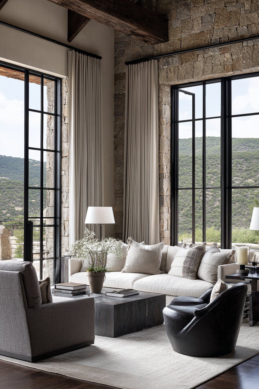
Many people believe that lining furniture along walls creates more space, but this approach often produces the opposite effect. Wall-hugging arrangements actually make rooms feel disconnected and awkward, preventing natural conversation flow. This mistake is particularly common in larger living rooms where people fear empty space.
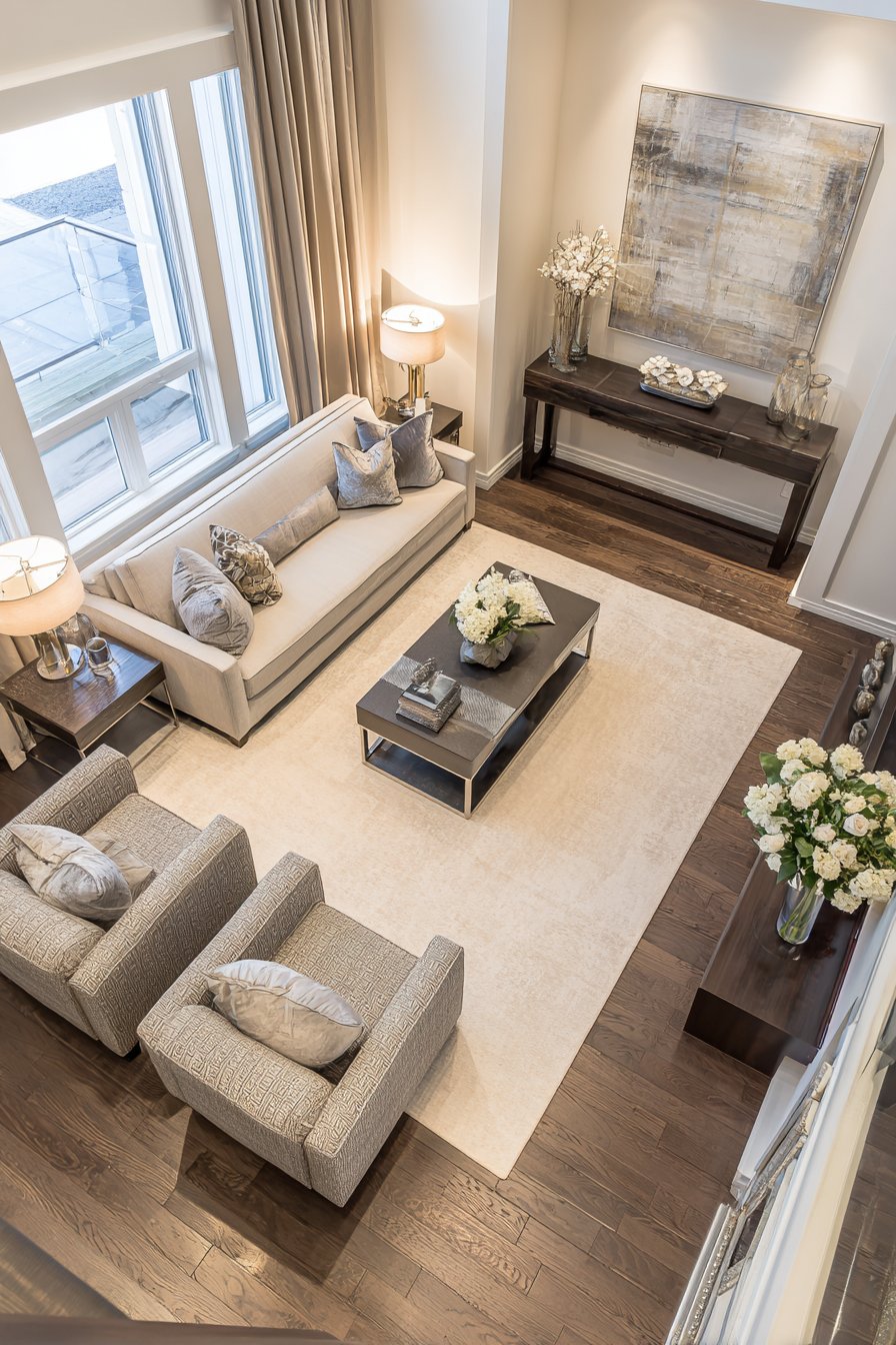
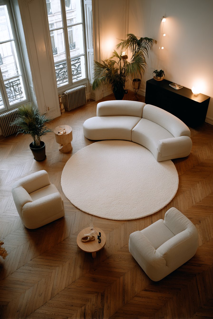
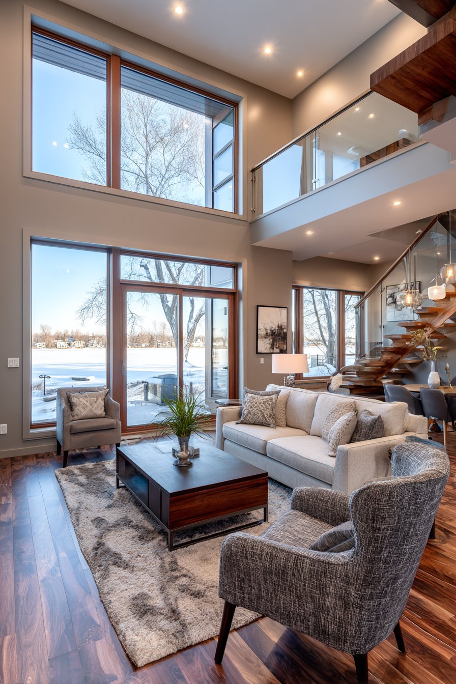
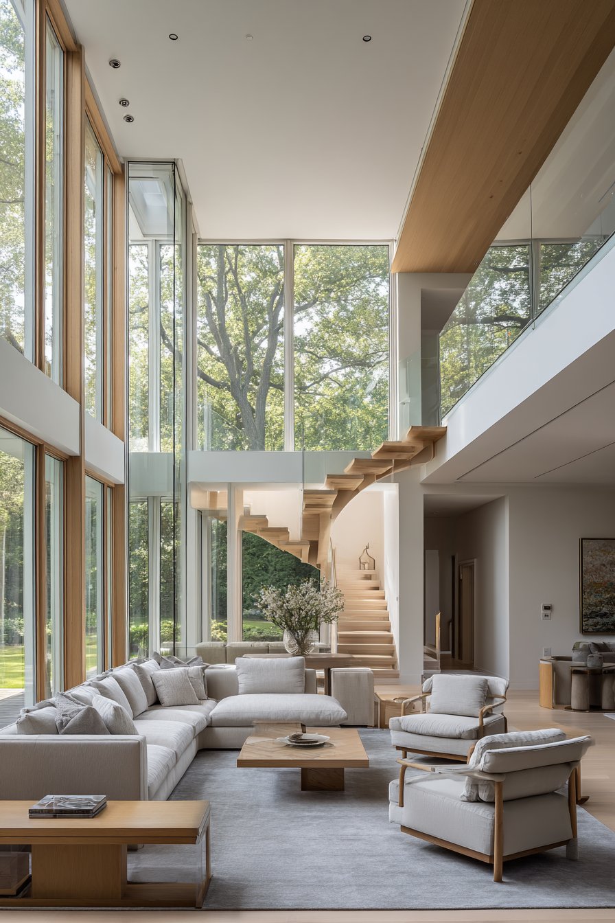
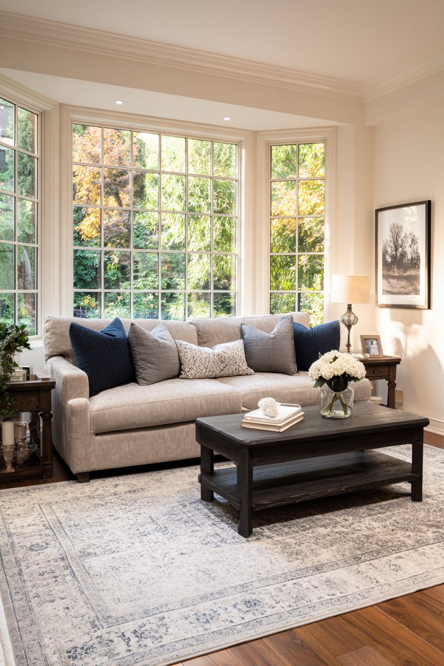
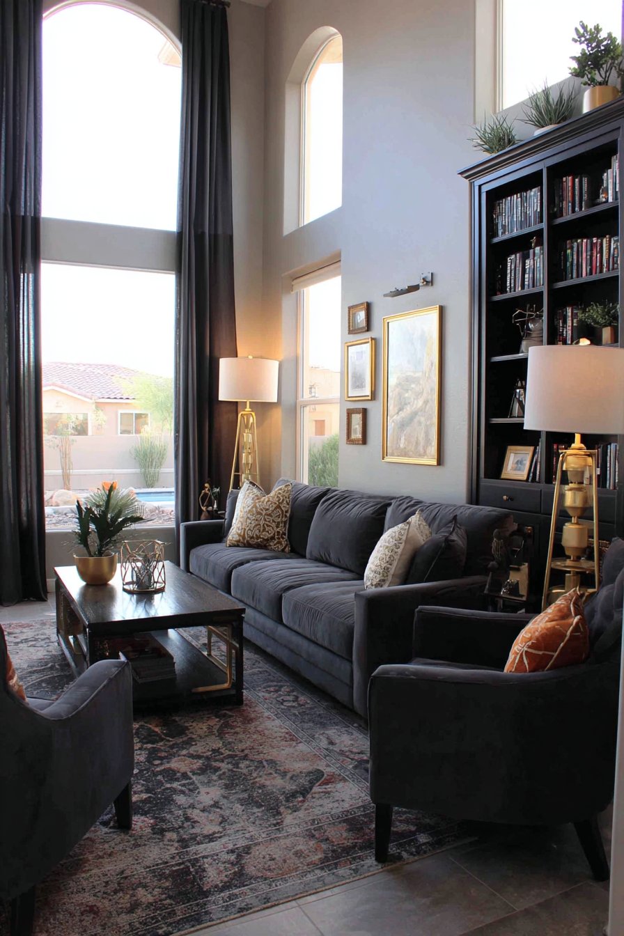
Pulling furniture away from walls creates intimate conversation zones that feel welcoming and purposeful. Even moving pieces just 12 to 18 inches inward can dramatically improve the room’s functionality. This technique works especially well when you anchor the seating area with an area rug that defines the space boundaries.
Strategic furniture placement encourages better traffic flow and makes your living room feel more intentional. Consider creating multiple activity zones within one room for reading, watching television, and socializing. This layered approach adds sophistication while maximizing your space’s potential.
- Position sofas and chairs to face each other, creating natural conversation circles
- Use area rugs to define and anchor furniture groupings away from walls
- Leave 24 to 36 inches of walking space between furniture pieces
- Create floating furniture arrangements in larger rooms for better proportion
- Angle chairs slightly inward to promote engagement and visual interest
- Use console tables behind sofas to add functionality and define zones
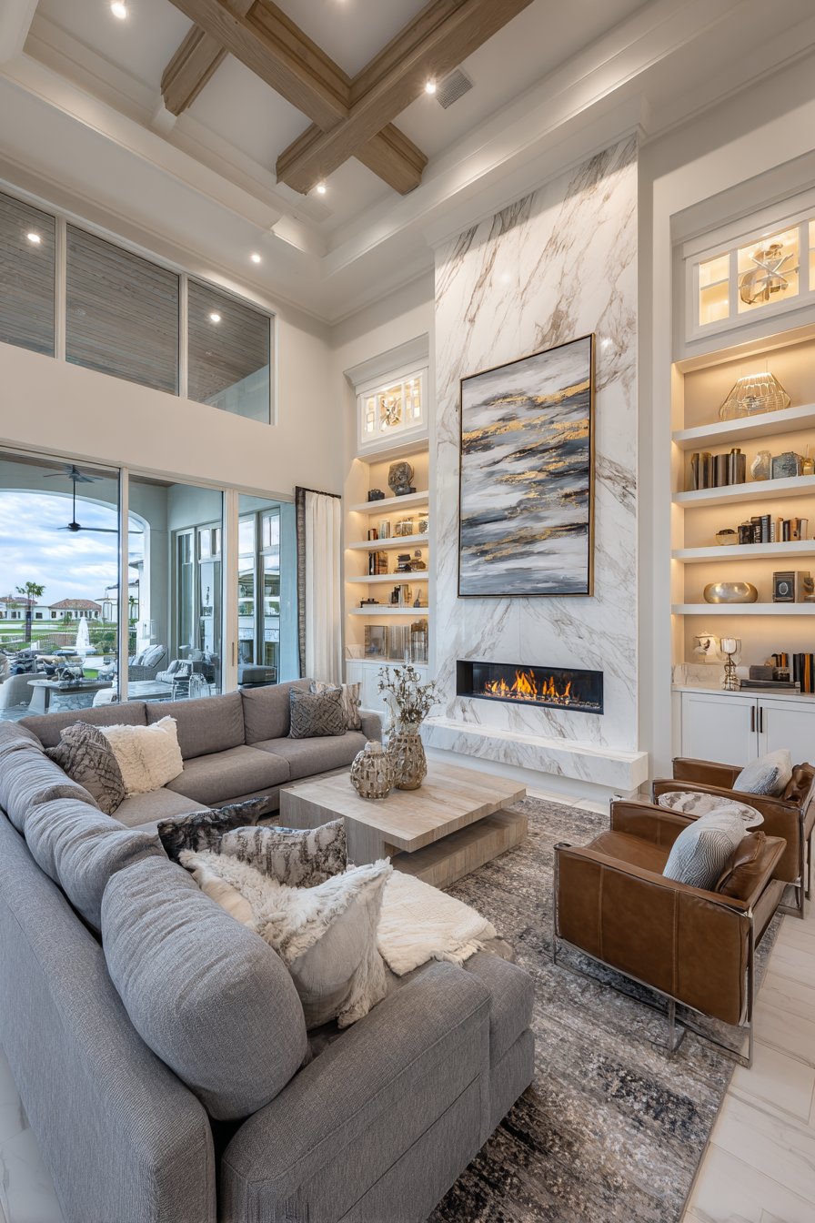
2. Ignoring the Room’s Focal Point
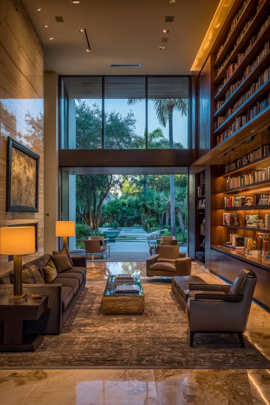
Every successful living room design needs a clear focal point that draws the eye and anchors the arrangement. Without this visual anchor, spaces feel chaotic and directionless, leaving guests uncertain where to focus their attention. Common focal points include fireplaces, large windows, entertainment centers, or striking architectural features.
The mistake occurs when furniture placement competes with rather than complements the focal point. For example, positioning your sofa perpendicular to a beautiful fireplace wastes the room’s natural advantage. Similarly, blocking a stunning window view with tall furniture diminishes the space’s inherent beauty and natural light.
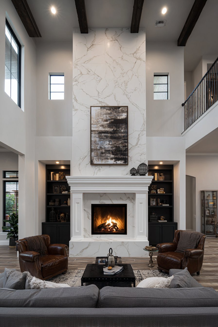
Arrange your primary seating to face or embrace the focal point naturally. If your room lacks an obvious focal point, create one using artwork, a media console, or an accent wall. This intentional approach gives your layout purpose and helps guide all other design decisions effectively.
- Identify your room’s strongest architectural feature before arranging furniture
- Orient the main sofa to directly face or complement the focal point
- Avoid placing television screens opposite large windows to prevent glare
- Use lighting to emphasize and enhance your chosen focal point
- Keep pathways clear so the focal point remains visible from entry points
- Balance secondary elements without creating competing focal points
3. Selecting Incorrectly Sized Furniture
Furniture proportions make or break a living room’s aesthetic and functionality. Oversized pieces overwhelm small spaces, while undersized furniture gets lost in expansive rooms, creating an unbalanced appearance. This mistake often happens when people buy furniture without measuring their space first or considering scale relationships.
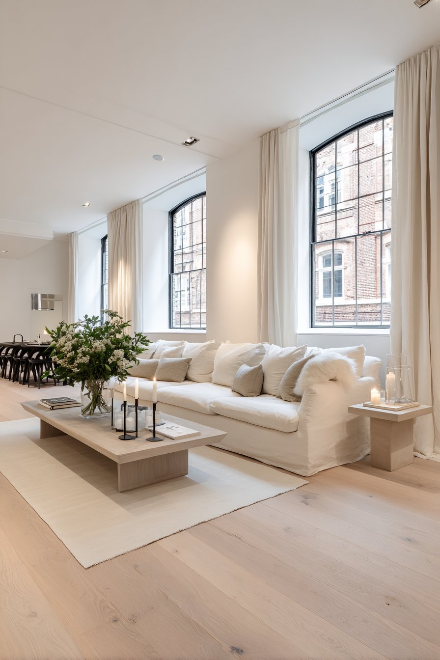
A common error involves choosing a sofa that’s too large for the room, leaving insufficient space for traffic flow or additional seating. Conversely, tiny furniture in a large room creates a sparse, uninviting atmosphere that lacks visual weight. The key is understanding how furniture dimensions relate to your room’s square footage and ceiling height.
Before purchasing, always measure your space carefully and create a floor plan with proper dimensions. Consider the visual weight of pieces, not just their physical size. Dark, bulky furniture appears larger than lighter, streamlined options with similar dimensions.
- Measure doorways, hallways, and room dimensions before buying furniture
- Maintain at least 30 to 36 inches of clearance for main walkways
- Choose sofas that are roughly two-thirds the length of your wall
- Use painter’s tape on floors to visualize furniture footprints before purchasing
- Consider furniture height in relation to ceiling height for proper scale
- Mix furniture sizes within a room to create visual interest and balance
4. Neglecting Traffic Flow Patterns
Traffic flow determines how easily people move through your living room to reach other areas. Poor circulation patterns force guests to navigate awkwardly around furniture or interrupt conversations to pass through. This mistake creates frustration and makes even beautiful rooms feel dysfunctional in daily use.
The ideal layout includes clear pathways of at least 30 inches wide connecting all entry and exit points. Major traffic routes should never cut directly through conversation areas or force people to walk between someone and the television. Think of traffic flow like rivers that naturally flow around furniture islands.
Test your layout by walking through the space multiple times from different entry points. If you find yourself bumping into furniture or taking circuitous routes, rearrangement is necessary. Good traffic flow should feel intuitive and effortless, almost invisible to occupants and visitors.
- Create main pathways that are 36 inches wide for comfortable passage
- Position furniture perpendicular to traffic flow rather than blocking it
- Avoid placing furniture in front of doorways or natural walkways
- Ensure paths to stairs, hallways, and other rooms remain unobstructed
- Test traffic patterns by walking through the space before finalizing layout
- Consider how people will move when carrying items or walking in groups
5. Overlooking Proper Lighting Layers
Inadequate lighting ranks among the most detrimental layout mistakes, yet it’s frequently addressed as an afterthought. Relying solely on overhead fixtures creates harsh shadows and fails to accommodate different activities and moods. A well-designed living room requires three lighting layers: ambient, task, and accent lighting working together harmoniously.
Many homeowners position furniture without considering access to electrical outlets or natural light sources. This oversight results in dark corners and insufficient reading light, limiting the room’s functionality during evening hours. Floor lamps placed behind sofas or table lamps on side tables should be incorporated into your initial layout planning.
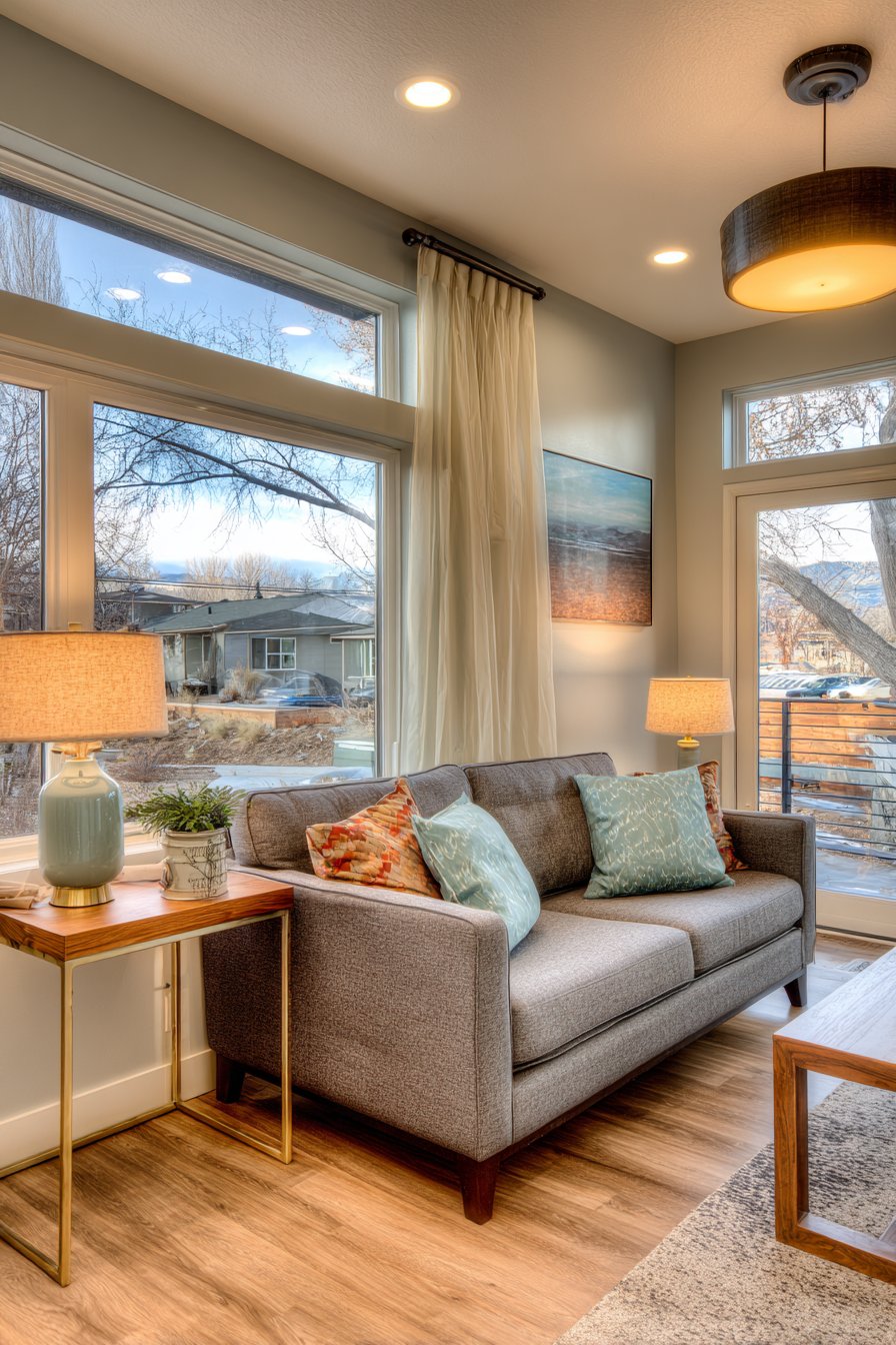
Plan your lighting strategy simultaneously with furniture arrangement, not afterward. Consider where you’ll need task lighting for reading or hobbies and how accent lighting can highlight architectural features. Window treatments should also be selected based on your furniture layout to control natural light effectively.
- Include at least three light sources in every living room for proper layering
- Position floor and table lamps within reach of electrical outlets before placing furniture
- Add dimmer switches to create flexible ambiance for different occasions
- Use a combination of overhead, task, and accent lighting throughout
- Place reading lamps 15 inches above shoulder height when seated
- Consider battery-operated or rechargeable lamps for areas without convenient outlets
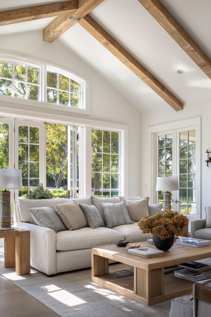
6. Forgetting About Scale and Proportion
Visual balance through proper scale and proportion creates harmony that makes rooms feel complete and comfortable. This involves more than just furniture size—it encompasses the relationship between all elements in your space. Mistakes occur when designers focus on individual pieces without considering how they interact visually with surroundings.
Common proportion errors include hanging artwork too high, using tiny rugs under large furniture groupings, or pairing delicate side tables with massive sofas. These mismatched elements create visual discord that subtly undermines even well-intentioned designs. The result feels slightly “off” even when people can’t articulate exactly what’s wrong.
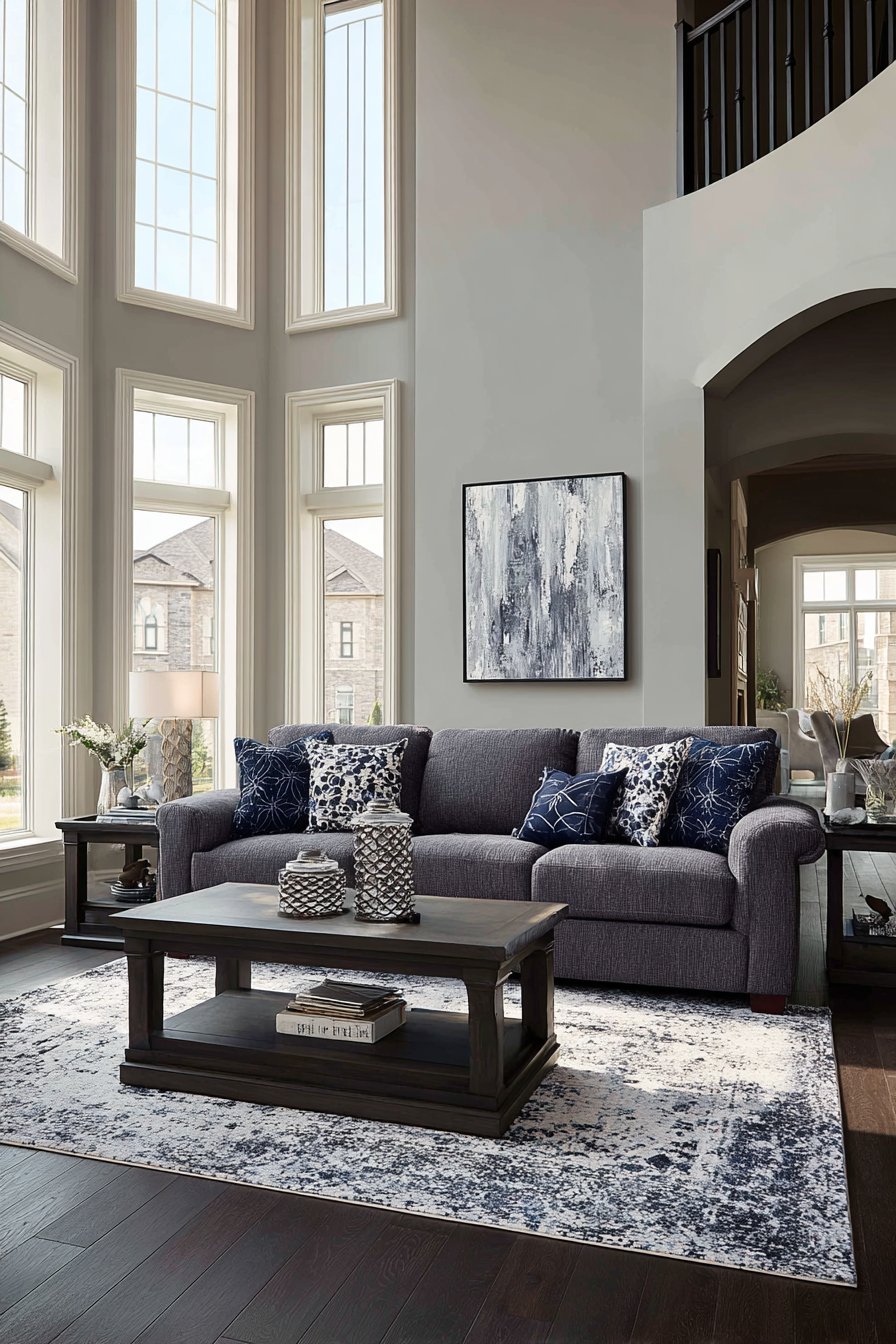
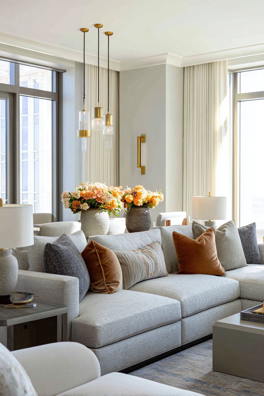
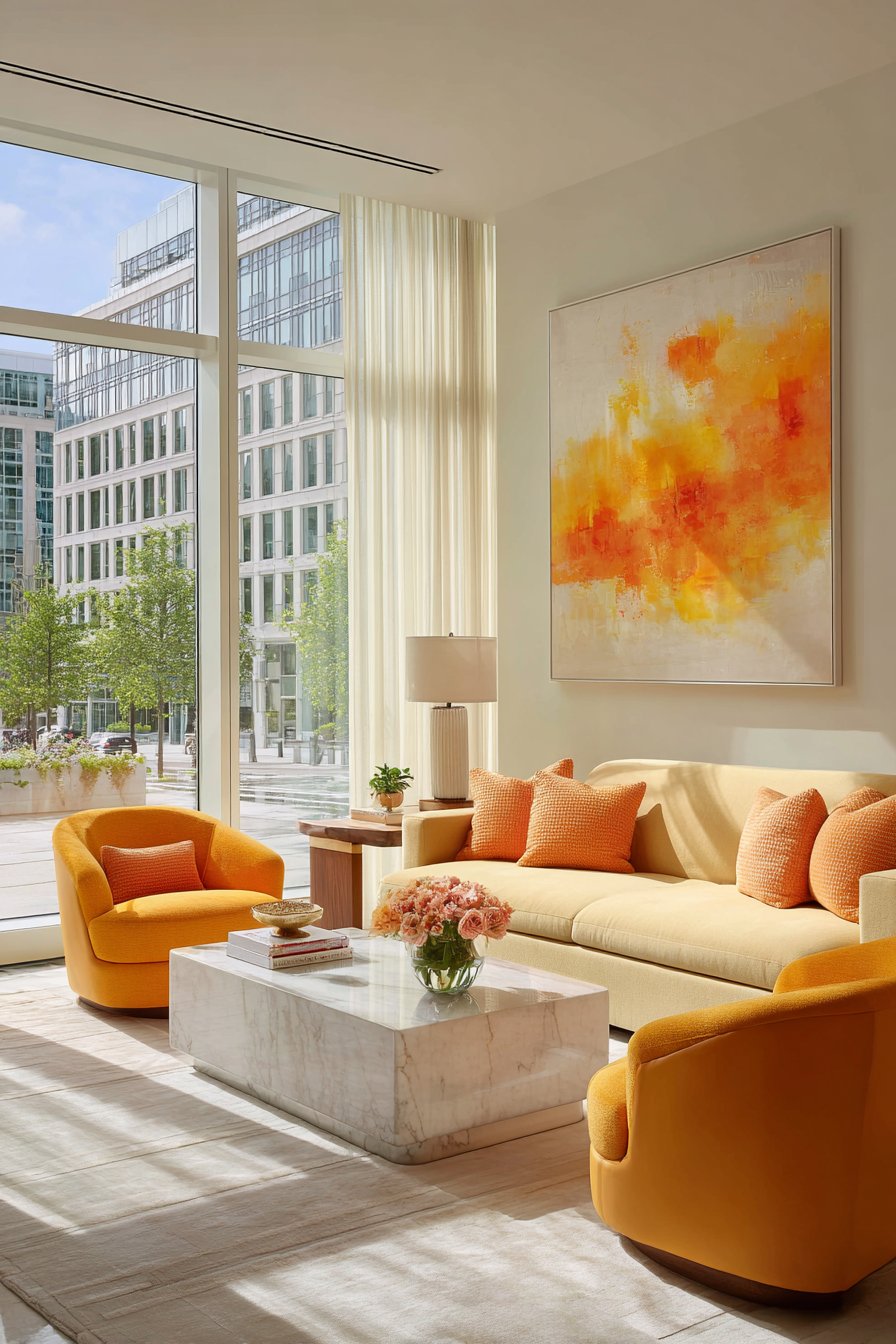
Apply the two-thirds rule as a general guideline for proportional relationships. Coffee tables should be about two-thirds the sofa’s length, and artwork should cover roughly two-thirds of the wall space above furniture. These ratios create naturally pleasing visual relationships that feel intentional and professional.
- Hang artwork so the center sits at eye level, approximately 57 to 60 inches from the floor
- Choose area rugs large enough that all furniture legs rest on the rug
- Select coffee tables that are two-thirds the length of your sofa
- Match side table heights to sofa arm height for proper proportion
- Use appropriately sized accessories and decor for your furniture scale
- Maintain consistent visual weight distribution throughout the room to avoid lopsided arrangements
7. Creating Dead Zones and Unused Corners
Awkward empty spaces in corners or along walls represent missed opportunities that diminish your living room’s potential. These dead zones make rooms feel incomplete while wasting valuable square footage. The mistake stems from focusing only on central areas and neglecting peripheral spaces that could enhance functionality and aesthetics.
Many layouts leave corners completely bare when these areas could accommodate reading nooks, plants, floor lamps, or decorative storage solutions. Similarly, the space behind sofas often remains unutilized when a console table could add both function and visual interest. These forgotten areas represent untapped potential in your design.
Transform dead zones into purposeful spaces that contribute to your room’s overall functionality. Even small additions like a corner chair with a floor lamp create cozy reading spots. Behind-sofa tables provide display space and help define the seating area without requiring additional floor space.
- Add corner shelving units to display books, plants, or decorative objects
- Position floor lamps in dark corners to brighten and activate the space
- Use console tables behind sofas for additional surface area and visual definition
- Create cozy reading nooks in corners with a comfortable chair and lighting
- Install floating shelves to utilize vertical wall space without consuming floor area
- Consider tall plants or decorative screens to fill empty corners beautifully
8. Ignoring Balance and Symmetry Principles
Visual equilibrium through balanced furniture arrangement creates rooms that feel stable and harmonious. This doesn’t mean everything must be perfectly symmetrical, but weight distribution should feel intentional and grounded. The mistake happens when all heavy furniture clusters on one side, creating an unbalanced composition that makes spaces feel tilted or uncomfortable.
Asymmetrical balance can be just as effective as symmetry when executed properly. A large sofa on one side can be balanced by two chairs and a side table on the opposite side. The key is ensuring that visual weight distributes evenly across the room rather than clustering heavily in one area.
Consider both physical mass and visual weight when arranging furniture. Dark colors, large patterns, and heavy materials carry more visual weight than light colors and delicate pieces. Step back regularly to assess whether your arrangement feels balanced from multiple viewing angles throughout the room.
- Distribute large furniture pieces evenly across the room rather than clustering
- Balance a heavy sofa on one side with multiple lighter pieces opposite
- Consider visual weight, not just physical size, when creating balance
- Use pairs of items like lamps or chairs to create symmetrical moments
- Ensure artwork and accessories balance with furniture below them
- View your arrangement from the main entrance to assess overall visual equilibrium
Conclusion
Creating a successful living room layout requires attention to these fundamental principles that professional designers employ consistently. By avoiding these eight common mistakes, you’ll develop a functional and beautiful space that serves your lifestyle while making a strong aesthetic statement. Remember that good design balances form and function seamlessly.
Take time to plan your layout thoughtfully before moving heavy furniture or making major purchases. Measure carefully, consider traffic patterns, and think about how you actually use your space daily. Small adjustments often yield dramatic improvements in both appearance and functionality. Your living room should enhance your life, not complicate it—so invest the time to get the layout right from the start.