The living room remains the heart of every home, where families gather, guests are entertained, and memories are created. As we move through 2026, color trends are shifting toward more intentional and thoughtful palettes that reflect our evolving lifestyles and values. Whether you’re planning a complete renovation or simply looking to refresh your space with new paint, understanding these emerging trends can help you create a living room that feels both current and timeless.
Color has the remarkable ability to transform mood and perception within any space. The right palette can make a small room feel expansive, a cold space feel warm, or a chaotic environment feel serene. This year’s trends embrace a beautiful balance between bold statements and subtle sophistication, offering something for every design preference. From earthy naturals to unexpected jewel tones, these eight color trends are redefining living room aesthetics across the globe.
Each trend we’ll explore represents more than just a fleeting fashion moment. These colors have emerged from our collective desire for comfort, connection, and authenticity in our homes. They reflect broader cultural shifts toward sustainability, wellness, and personal expression. Let’s dive into the palettes that are making the biggest impact this year.
1. Warm Terracotta and Clay Tones
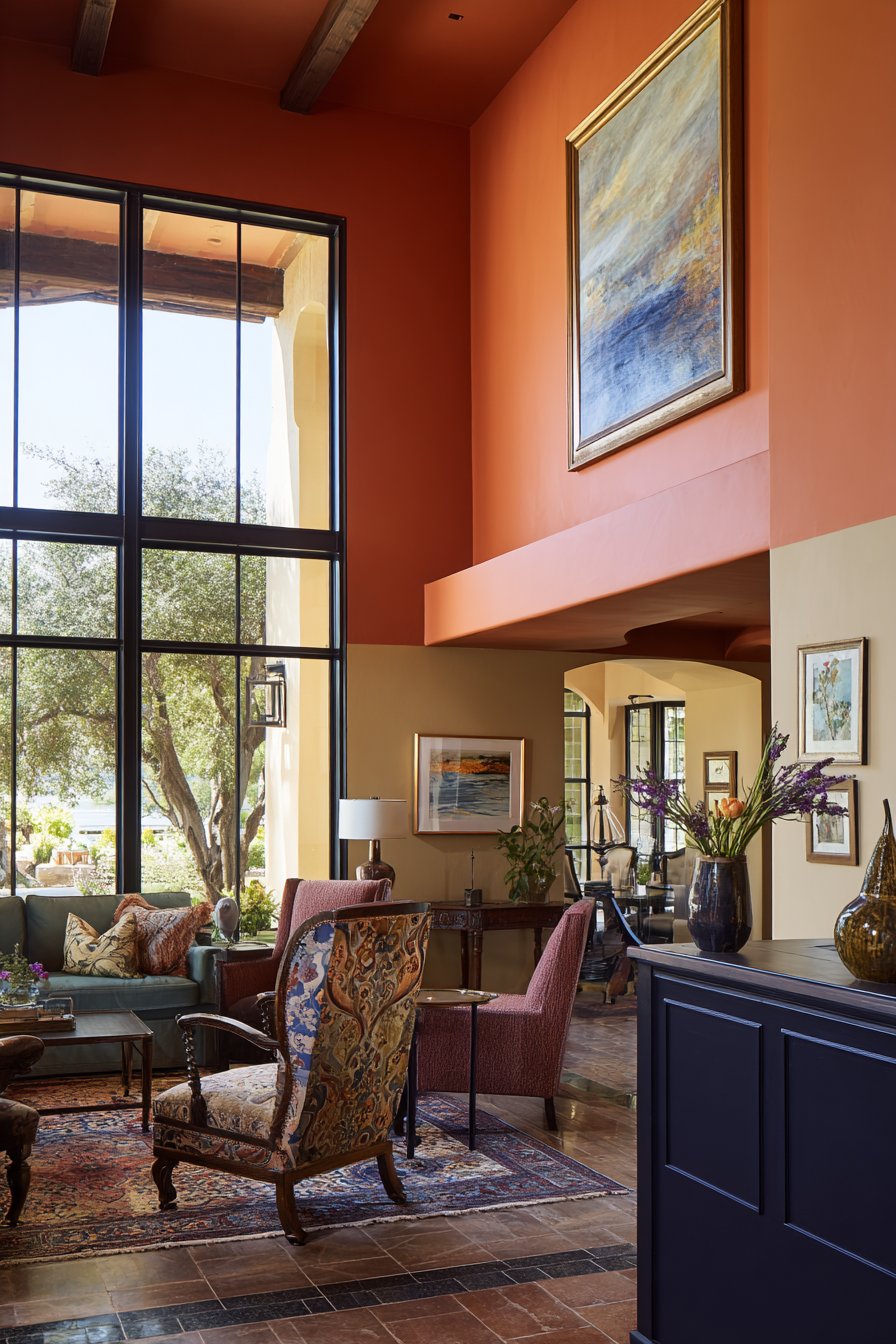
Terracotta and clay-inspired hues are dominating living rooms in 2026, bringing earthy warmth and grounding energy to modern spaces. These rich, sun-baked tones range from soft peachy terracottas to deeper burnt siennas, creating environments that feel both sophisticated and welcoming. The beauty of these colors lies in their versatility—they work equally well as accent walls or throughout an entire room.
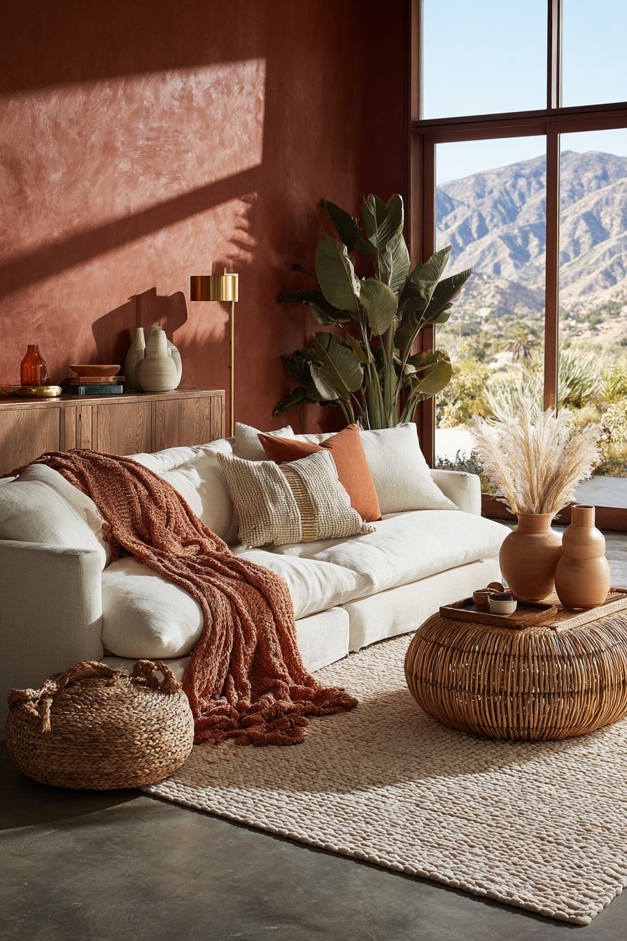
These warm earth tones pair beautifully with natural materials and textures, making them perfect for creating cohesive, organic-feeling spaces. Consider combining terracotta walls with linen upholstery, rattan furniture, and ceramic accessories for a harmonious look. The color also flatters various skin tones in photography, making your living room ideal for gathering and capturing memories.
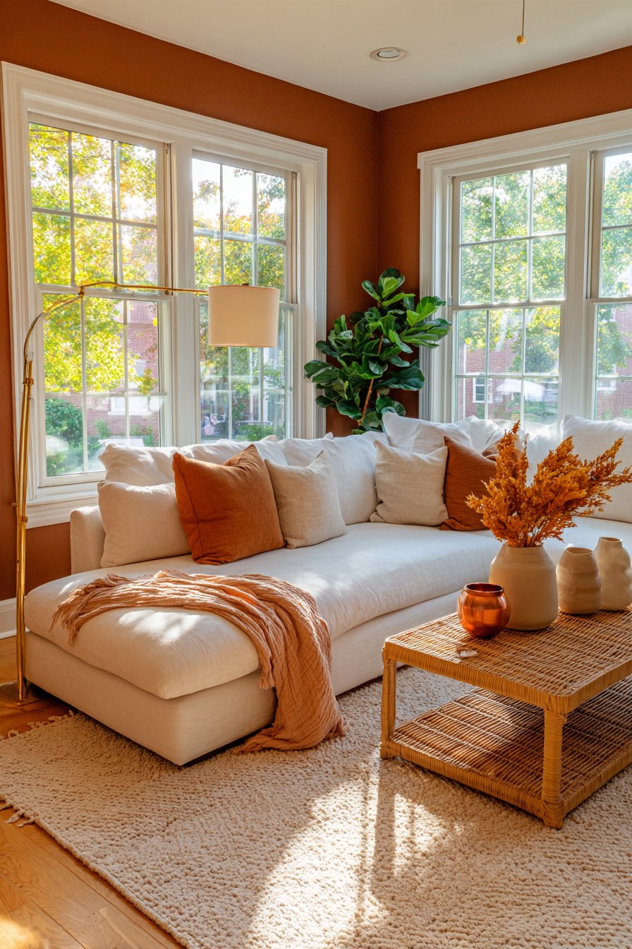
The psychological benefits of terracotta are significant. This color promotes feelings of security and comfort while maintaining an energizing quality that prevents spaces from feeling too sedated. It works particularly well in rooms with abundant natural light, where the color can shift beautifully throughout the day.
- Layer different shades of terracotta through textiles like throw pillows and blankets
- Pair with creamy whites and soft beiges for a balanced palette
- Incorporate terracotta through pottery, vases, and decorative objects
- Use as an accent wall behind a sofa or fireplace for maximum impact
- Combine with sage green or dusty blue for sophisticated contrast
- Add brass or copper metallic accents to enhance the warm undertones
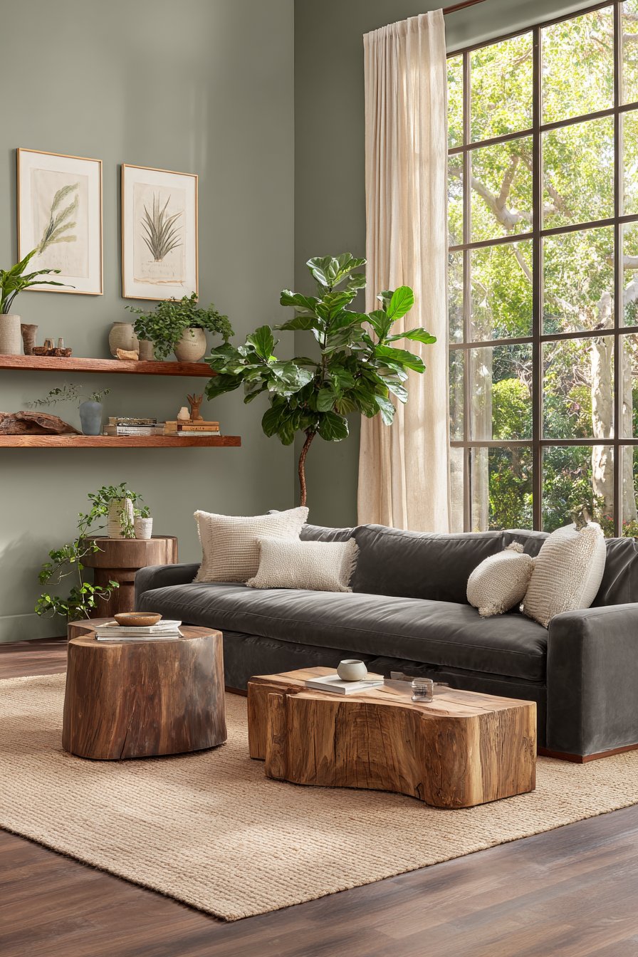
2. Sage Green and Botanical Hues
The continuation of biophilic design principles has made sage green one of 2026’s most sought-after living room colors. This muted, sophisticated green brings the calming essence of nature indoors without overwhelming a space. Unlike brighter greens, sage offers a timeless quality that won’t feel dated in a few years, making it an excellent investment for your home.
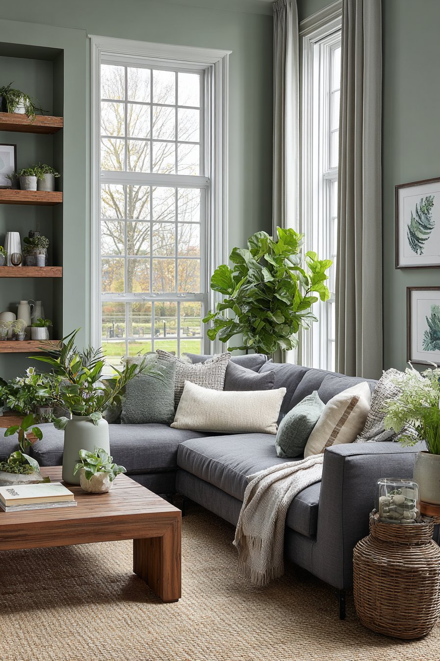
Sage green has proven particularly effective in reducing stress and promoting relaxation, which aligns perfectly with the living room’s purpose as a restorative space. This color works beautifully in both traditional and contemporary settings, serving as a neutral backdrop that allows other design elements to shine. It pairs exceptionally well with natural wood tones, creating organic and cohesive interiors.
The versatility of sage extends to its ability to adapt to different lighting conditions. In north-facing rooms, it can appear cooler and more gray-toned, while southern exposure brings out its warmer, yellower undertones. This adaptability makes it suitable for virtually any living room configuration.
- Use sage on all four walls for an enveloping, cocoon-like atmosphere
- Combine with charcoal gray and cream for a sophisticated neutral scheme
- Integrate live plants to enhance the botanical connection
- Layer various green tones from olive to mint for depth
- Pair with natural fiber rugs and linen curtains for textural interest
- Add wooden furniture in warm or medium tones for balance
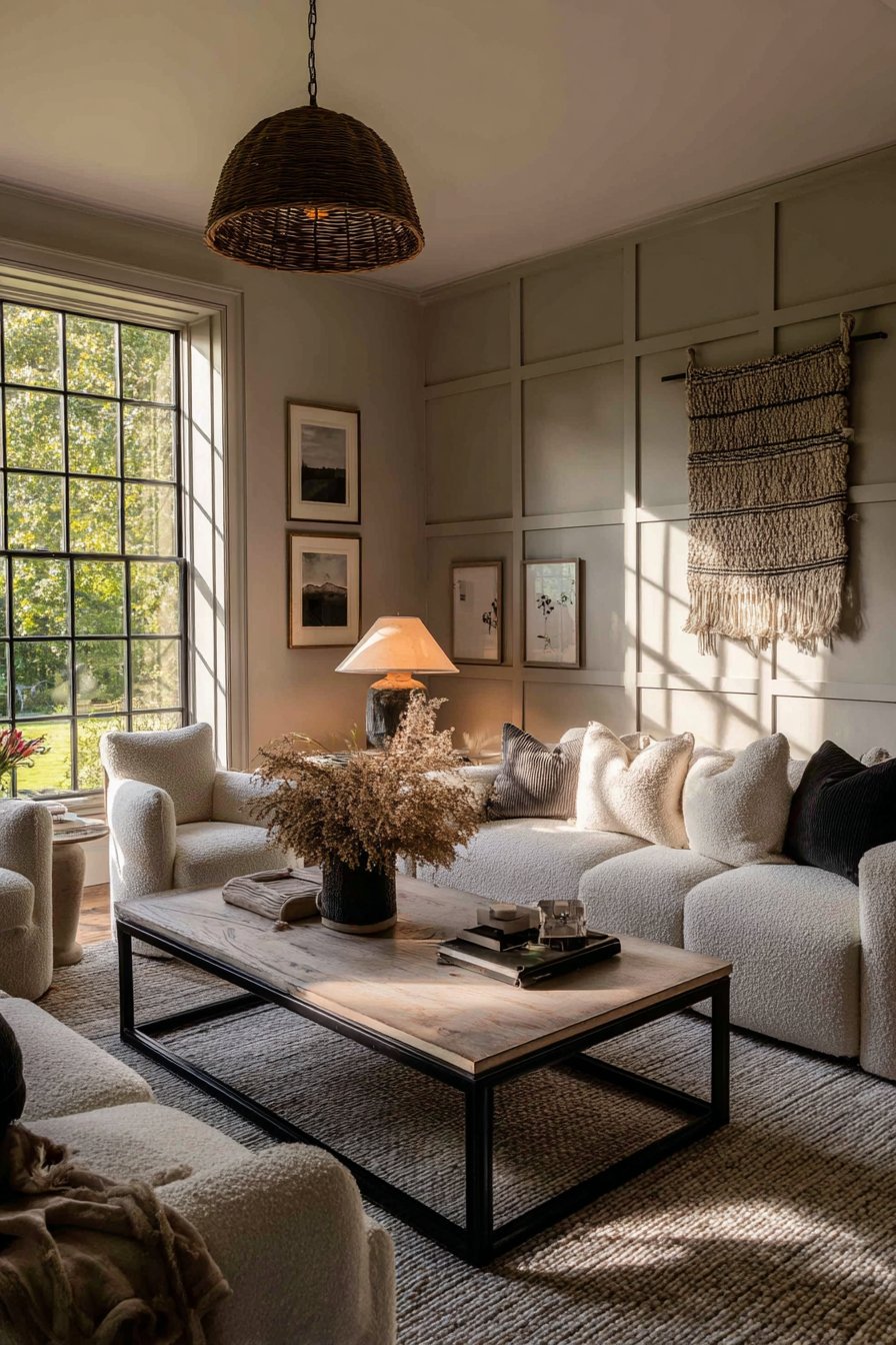
3. Deep Moody Blues and Navy
Rich, saturated blues are making a powerful statement in 2026 living rooms, offering depth and drama without the harshness of black. These deep navy and midnight blue shades create intimate, jewel-box atmospheres that feel luxurious and enveloping. They work particularly well in rooms used primarily during evening hours, where artificial lighting can create beautiful ambiance.
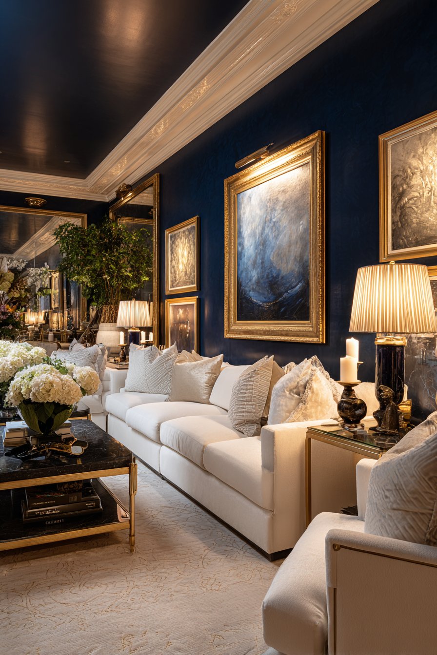
The key to successfully implementing deep blues lies in balancing them with lighter elements. Without adequate contrast, these dark colors can make spaces feel smaller or cave-like. Strategic placement of white trim, light-colored furniture, and metallic accents creates visual breathing room while maintaining the color’s impact.
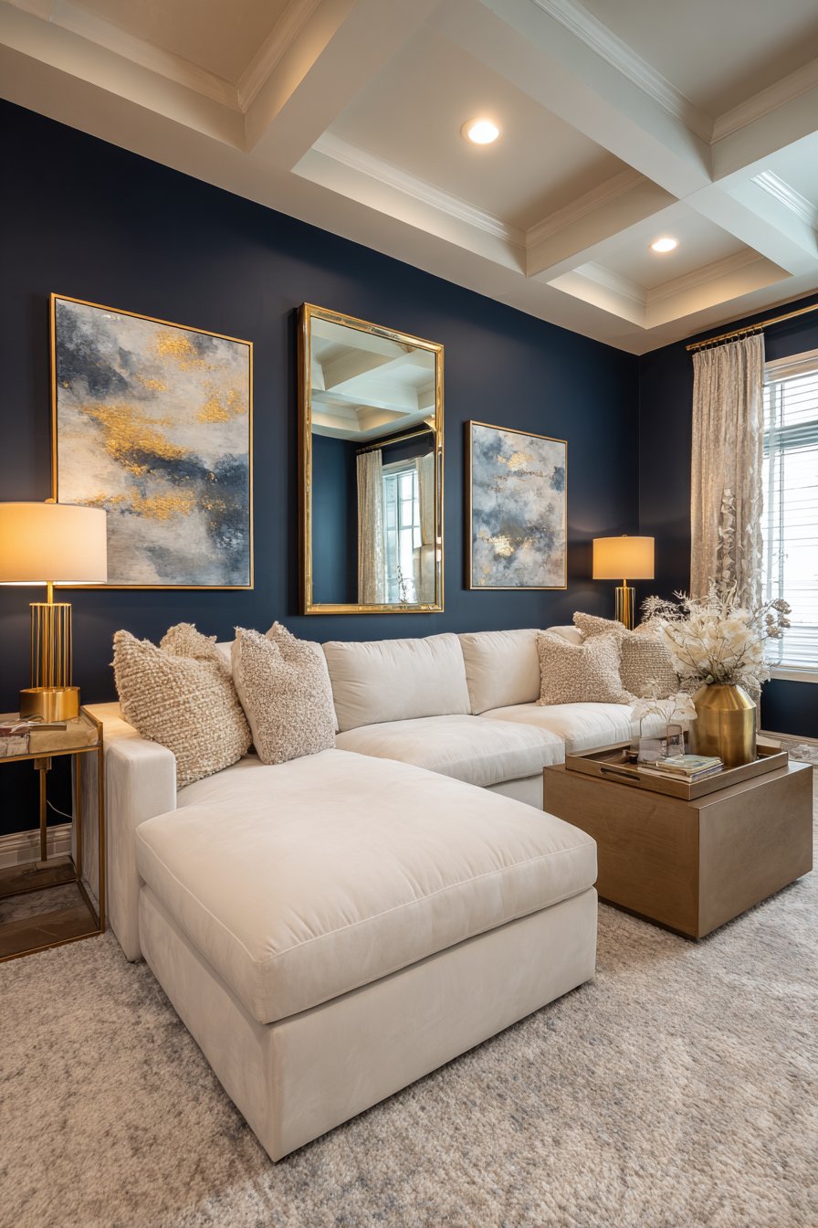
Deep blue has long been associated with stability, trust, and calm, making it psychologically beneficial for living spaces. Modern formulations of these paints include subtle undertones—some lean purple, others green—allowing you to customize the mood. The color also serves as an excellent backdrop for displaying art and decorative objects.
- Install adequate lighting including table lamps and floor lamps throughout the space
- Use high-gloss or satin finishes to reflect light and prevent flatness
- Incorporate mirrors strategically to bounce light and create depth
- Pair with brass, gold, or copper fixtures for warmth
- Add textured fabrics in lighter tones for contrast and comfort
- Consider painting the ceiling a lighter shade to maintain height perception
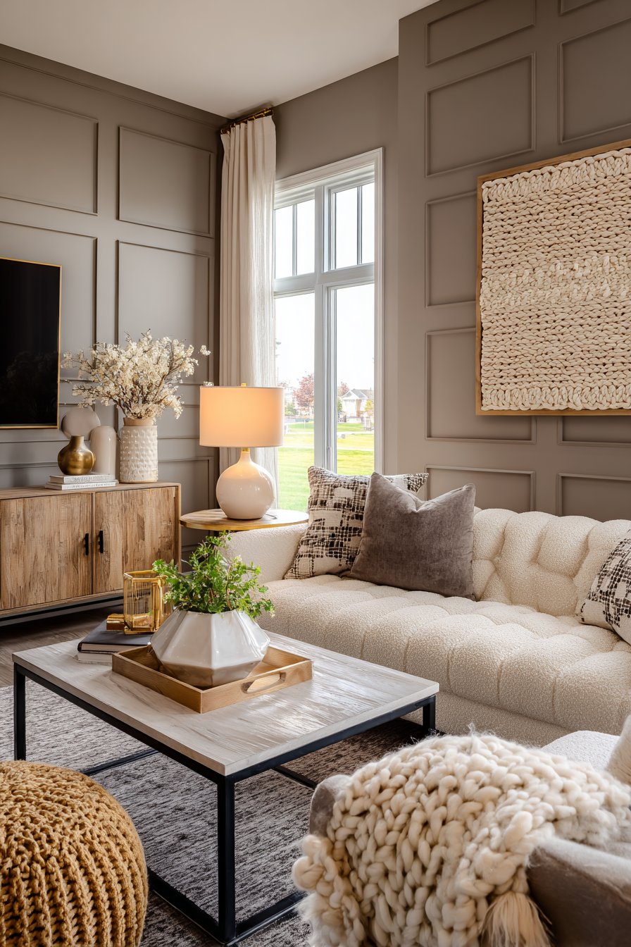
4. Soft Mushroom and Greige Tones
The evolution of gray continues with mushroom and greige tones that offer more warmth than traditional cool grays. These sophisticated neutrals contain subtle brown or taupe undertones, creating cozy yet refined atmospheres that feel current and timeless. They serve as perfect canvases for layering textures and introducing accent colors.
What makes these tones particularly appealing is their chameleon-like quality—they shift appearance based on surrounding colors and lighting conditions. In morning light, they may appear more beige, while evening light brings out their grayer qualities. This dynamic nature keeps rooms visually interesting throughout the day.
Mushroom tones work exceptionally well in open-concept layouts, providing continuity between living spaces while allowing each area to maintain its distinct character through furniture and accessories. These colors also photograph beautifully, making them ideal for those who share their spaces on social media.
- Sample paint colors at different times of day before committing
- Layer multiple shades of greige for sophisticated monochromatic schemes
- Incorporate both warm and cool-toned accessories for balance
- Use texture extensively through bouclé, velvet, and woven materials
- Pair with black accents for modern contrast and definition
- Add warmth through wooden elements and warm metallics like brass
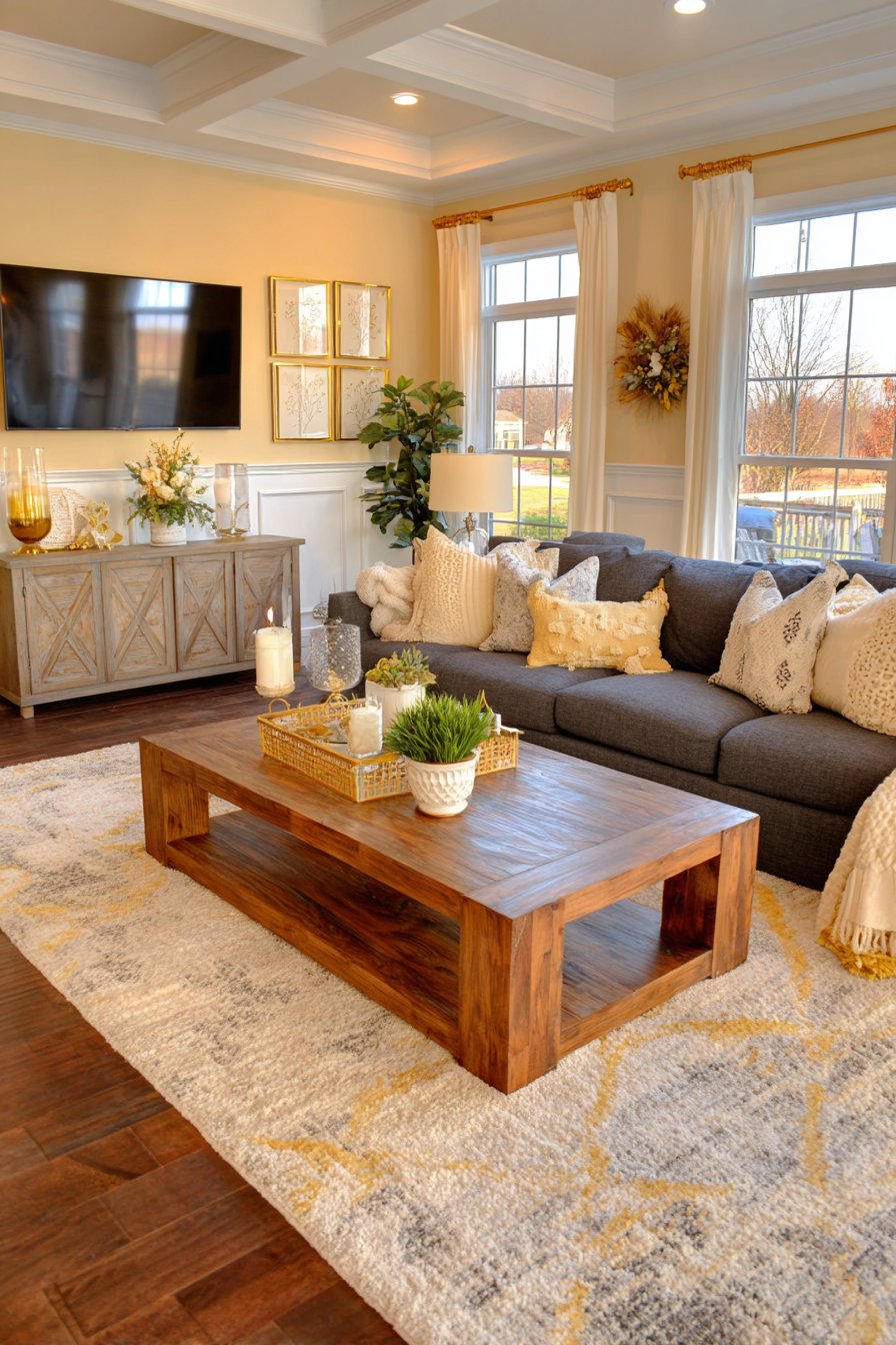
5. Warm Butter Yellow and Honey Tones
Cheerful yellows are experiencing a sophisticated revival, with soft butter and honey shades replacing the bright, acidic yellows of previous decades. These warm, muted tones bring optimism and energy to living rooms while maintaining an elegant, grown-up sensibility. They create naturally bright spaces that feel sunny even on overcast days.
The psychology behind yellow is well-documented—it stimulates mental activity and creativity while promoting feelings of happiness and optimism. However, the key to success with yellow lies in choosing the right shade. Overly bright or cool yellows can feel jarring, while these warm, creamy versions feel inviting and comfortable.
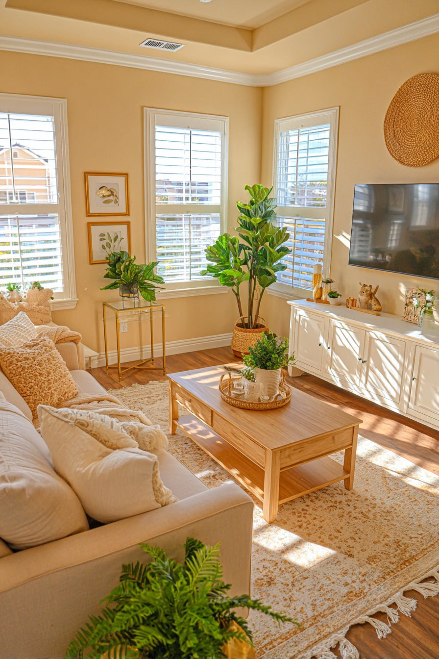
These honey tones work beautifully in traditional and contemporary settings, proving their versatility across design styles. They pair exceptionally well with white trim, natural wood furniture, and both warm and cool accent colors. The color also has the practical benefit of making spaces appear larger and more open.
- Test colors carefully as yellow can vary dramatically between paint chips and walls
- Pair with crisp white trim for clean, fresh contrast
- Incorporate gray or charcoal accents to ground the warmth
- Use in rooms with less natural light to create artificial brightness
- Combine with botanical greens for a cheerful, nature-inspired palette
- Add depth through layered textiles in cream, tan, and gold tones
6. Dusty Rose and Mauve Accents
The maturation of millennial pink has evolved into sophisticated dusty rose and mauve tones that bring warmth without sweetness to living rooms. These muted pinks contain gray undertones that make them unexpectedly versatile and gender-neutral. They create welcoming, soft environments that feel both modern and romantic.
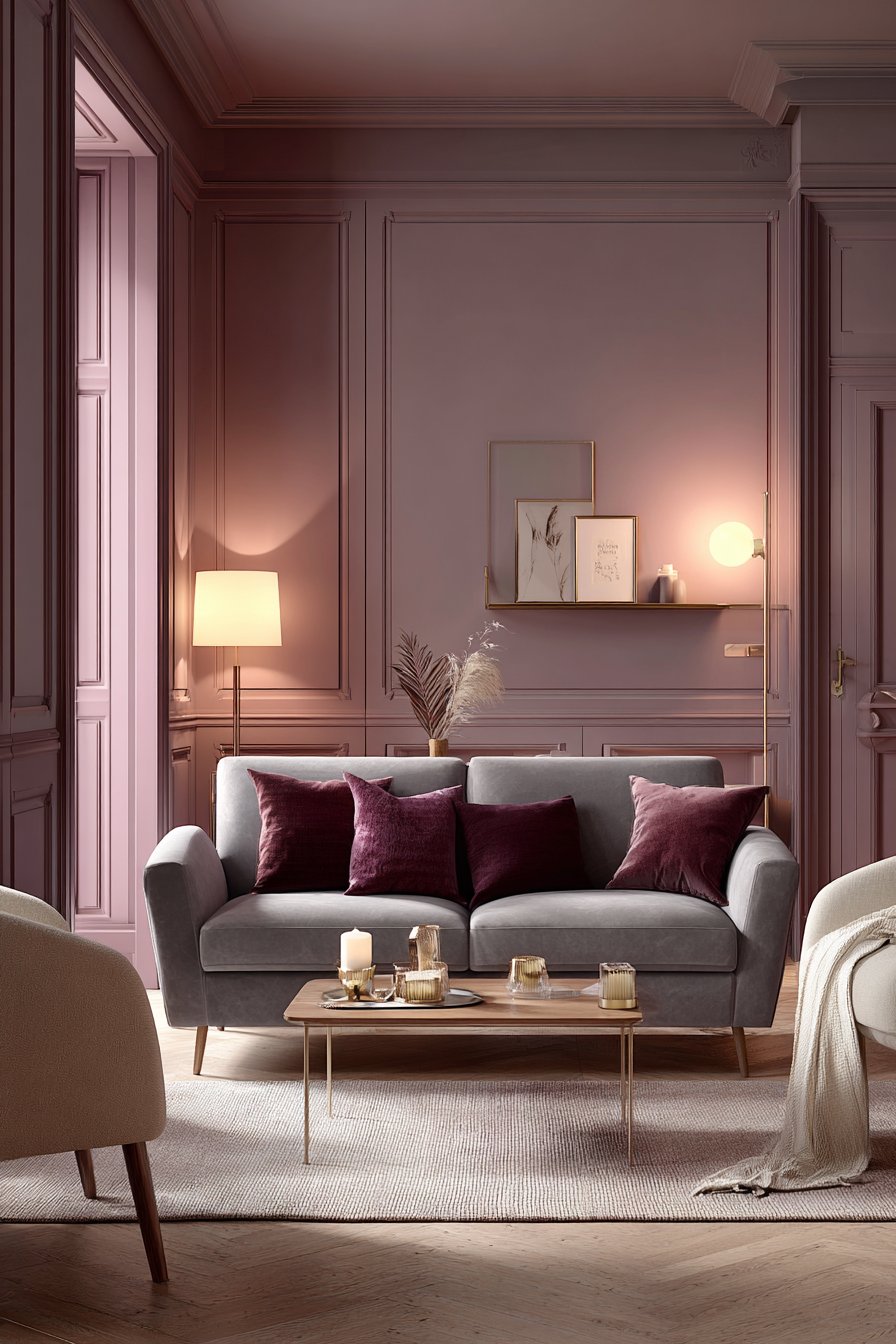
These rose tones offer a refreshing alternative to beige while maintaining similar versatility and neutrality. They work beautifully with both gold and silver metallics, allowing flexibility in hardware and accessories. The color also complements a wide range of skin tones, making it flattering for spaces where people gather.
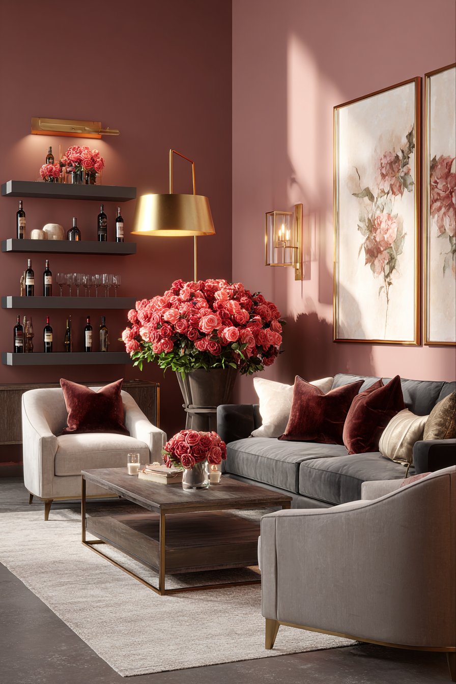
From a design perspective, dusty rose serves as an excellent bridge between warm and cool palettes. It can lean warmer when paired with terracottas and woods, or cooler when combined with grays and blues. This adaptability makes it suitable for various design aesthetics from minimalist to maximalist.
- Use as an all-over wall color for enveloping warmth
- Pair with charcoal gray and cream for sophisticated contrast
- Incorporate through upholstery on a statement sofa or chairs
- Layer with deeper burgundy and wine tones for richness
- Combine with brass fixtures and warm wood tones
- Balance with plenty of white or cream to prevent excessive sweetness
7. Earthy Chocolate and Espresso Browns
Rich brown tones are experiencing a major renaissance in 2026, moving away from the cool grays that dominated the previous decade. Deep chocolate and espresso shades create luxurious, grounding environments that feel substantial and enduring. These colors work particularly well in larger living rooms where they can make expansive spaces feel more intimate.
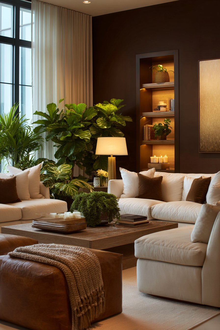
The return to brown reflects a broader cultural shift toward natural, authentic materials and a rejection of overly processed aesthetics. These warm neutrals pair beautifully with leather, wood, stone, and other organic materials, creating cohesive, harmonious spaces. They also serve as excellent backdrops for displaying colorful art and accessories.
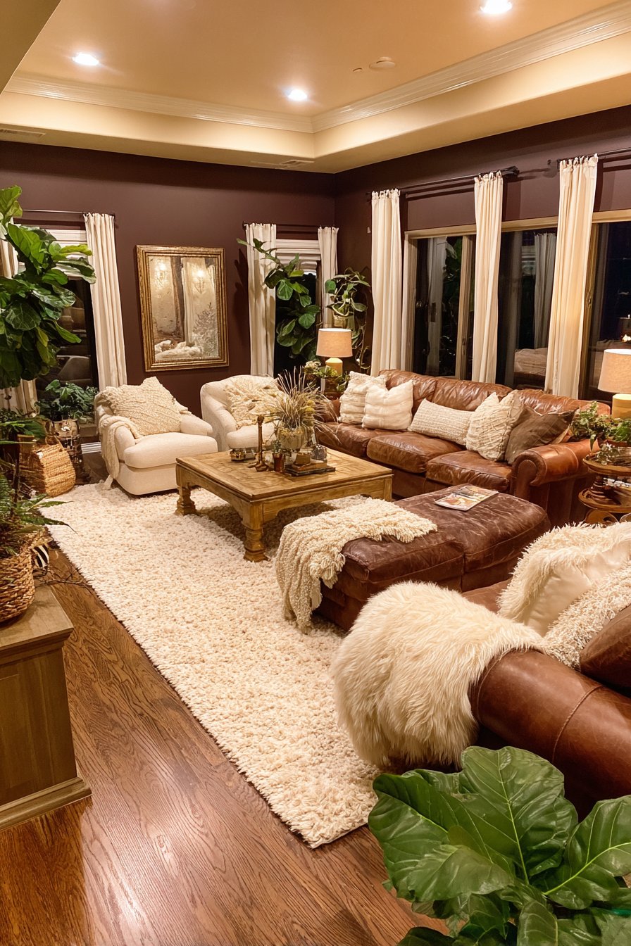
Brown’s psychological associations include stability, reliability, and comfort—all desirable qualities in living spaces. Modern browns often include subtle undertones of red, orange, or even purple, adding complexity and preventing the color from feeling flat or dated. Strategic lighting is crucial for preventing these dark shades from appearing too heavy.
- Balance dark walls with light-colored upholstery and window treatments
- Incorporate varied textures to add visual interest and depth
- Use warm white or soft white bulbs rather than cool lighting
- Pair with cream, ivory, or warm beige for contrast
- Add plants to introduce freshness and prevent stuffiness
- Consider using brown on a feature wall rather than all surfaces
8. Soft Lavender and Periwinkle Blues
Gentle purple and blue tones are emerging as unexpected favorites for 2026 living rooms, offering serenity and sophistication. These soft lavenders and periwinkles create dreamy, peaceful atmospheres while maintaining enough color interest to prevent blandness. They work beautifully in both modern and traditional settings.
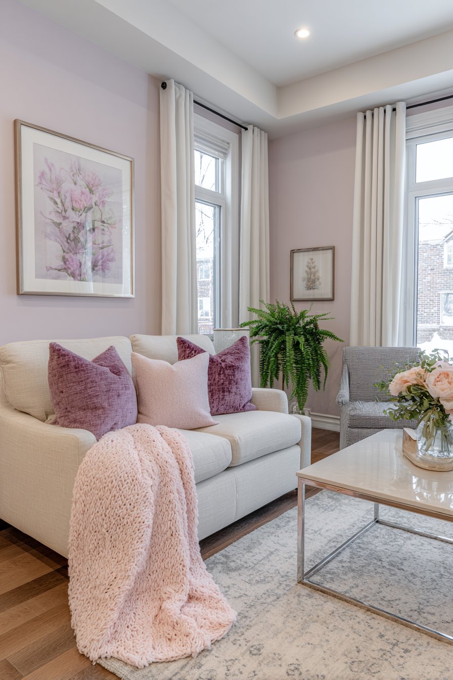
The appeal of these colors lies in their dual nature—they’re cool enough to feel fresh and calming but contain enough warmth to prevent coldness. Lavender in particular has been shown to promote relaxation and reduce anxiety, making it ideal for spaces dedicated to unwinding. These shades also pair beautifully with a wide range of accent colors.
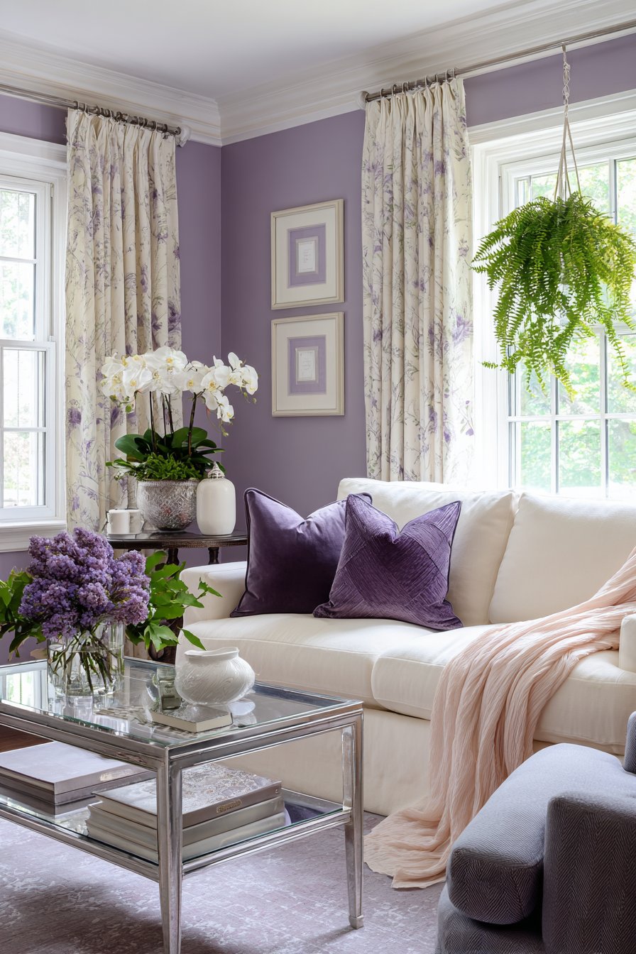
These purple-blue tones offer a sophisticated alternative to more common neutrals while remaining versatile enough for long-term enjoyment. They photograph exceptionally well and work beautifully with both silver and gold metallics, providing flexibility in accessorizing and updating spaces over time.
- Layer different shades from pale lilac to deeper purple for depth
- Pair with crisp white trim and light wood furniture
- Incorporate gray and silver accents for contemporary sophistication
- Use in bedrooms that double as sitting areas for cohesive flow
- Combine with soft pink or peachy tones for romantic warmth
- Add greenery through plants to prevent the color from feeling too cool
Conclusion
The living room color trends of 2026 reflect our collective desire for authentic, comfortable spaces that nurture wellbeing while expressing personal style. From grounding earth tones to sophisticated neutrals and unexpected accent colors, these palettes offer something for every aesthetic preference and lifestyle. The common thread among all these trends is their emphasis on warmth, naturalness, and timeless appeal.
As you consider refreshing your living room, remember that the best color choice is one that resonates with your personal style and supports how you actually use the space. Don’t be afraid to test samples extensively, observing how colors shift throughout the day and interact with your existing furnishings. With thoughtful selection and implementation, any of these trending colors can transform your living room into a space that feels both current and enduringly beautiful.