Floating shelves offer remarkable versatility for storage and display, yet they present unique styling challenges that leave many homeowners frustrated. The delicate balance between functional storage and aesthetic appeal proves elusive when shelves become dumping grounds for miscellaneous items. Understanding how to curate and arrange objects transforms floating shelves from chaotic eyesores into sophisticated focal points that enhance your entire space.
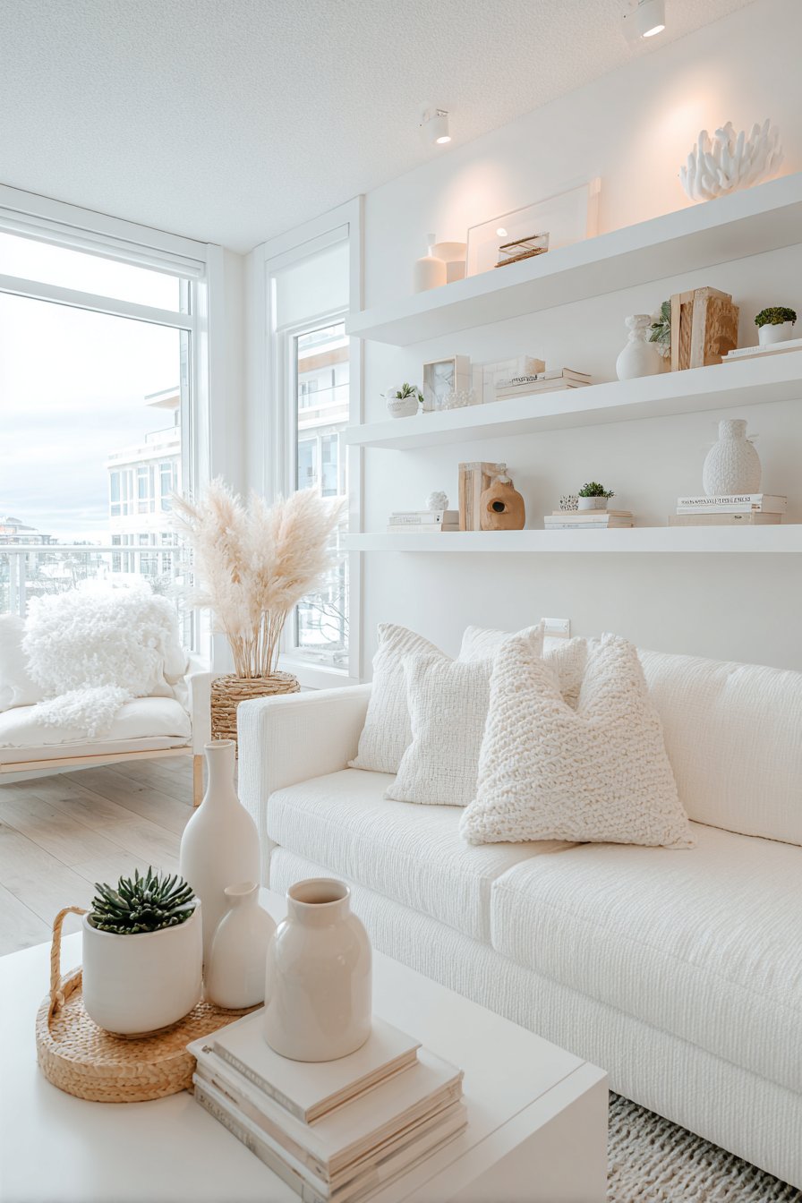
Thoughtful interior design recognizes that open shelving requires more intentional curation than closed cabinets. Your floating shelves represent permanent displays visible to everyone who enters your room, making their styling crucial to overall aesthetic success. Whether you prefer minimalist simplicity, maximalist abundance, or collected eclecticism, mastering clutter-free shelf styling elevates your space from ordinary to exceptional.
This comprehensive guide explores six essential strategies for styling floating shelves with professional polish and visual clarity. From the rule of three to strategic negative space, these proven techniques help you create balanced, beautiful displays that serve both practical and decorative purposes. These principles work across all design styles, ensuring your shelves enhance rather than detract from your carefully designed interiors.
1. Follow the Rule of Three and Odd Numbers
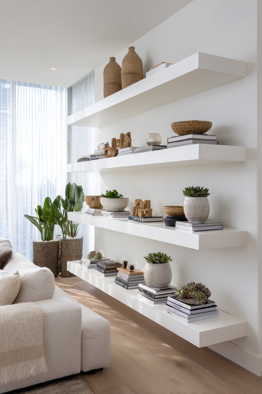
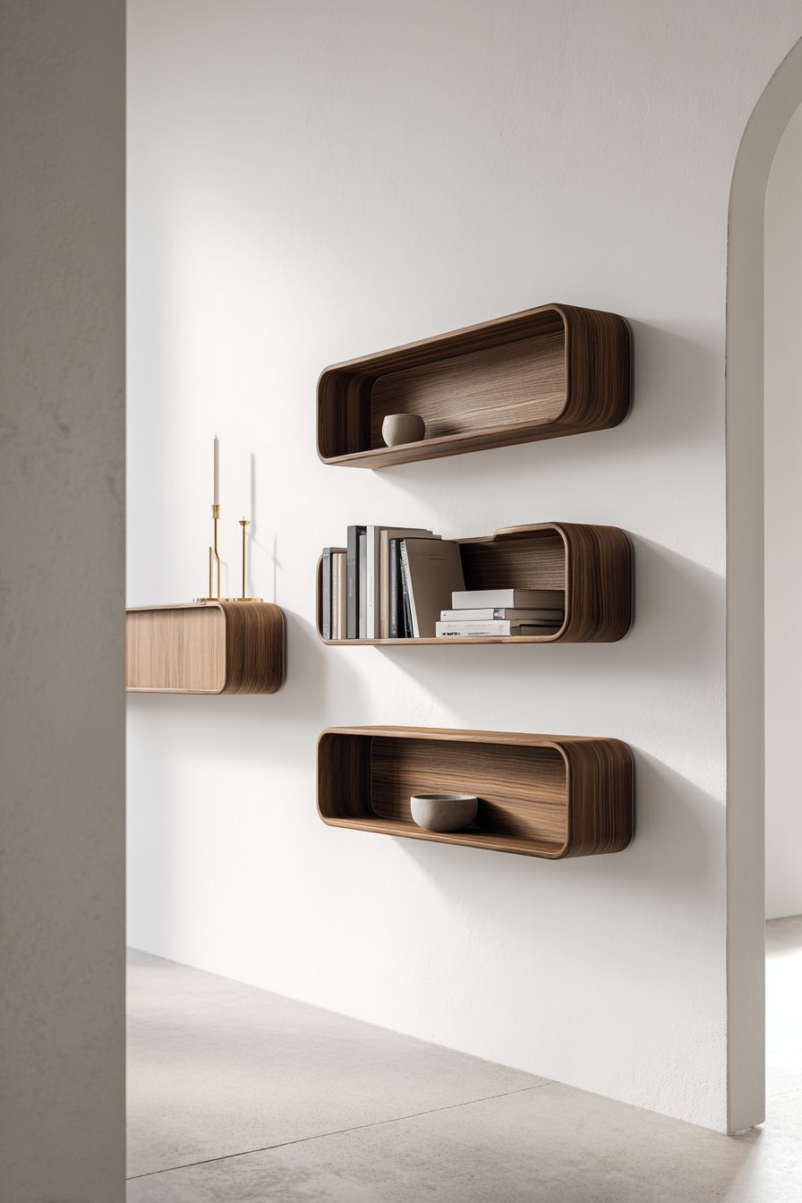
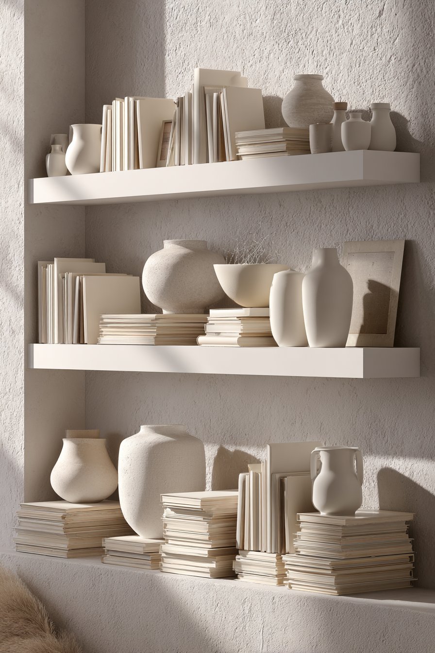
The rule of three leverages visual psychology that makes odd-numbered groupings inherently more pleasing and dynamic than even numbers. Three objects create natural triangular compositions that guide eyes through displays while maintaining interest. This principle applies whether you’re arranging books, decorative objects, or mixed collections on your floating shelves.
Odd-numbered groupings prevent the static symmetry that even numbers create, which often appears forced or overly formal. Five or seven items work equally well for larger shelves, while single statement pieces suit narrower spaces. The asymmetrical balance achieved through odd numbers feels collected and intentional rather than rigidly designed or accidentally cluttered.
Varying object heights within your three-item groupings adds dimensional interest that flat, uniform arrangements lack. Combine tall candlesticks with medium vases and low bowls to create dynamic elevation changes. This height variation prevents monotonous horizontal lines while guiding eyes vertically through your display, creating movement and visual engagement.
- Group decorative objects in clusters of three, five, or seven items
- Vary heights dramatically within each grouping for visual interest
- Use the tallest item as an anchor with progressively smaller pieces
- Leave space between groupings to prevent overwhelming visual density
- Apply the rule of three to color, texture, and material variety
- Avoid pairs unless creating intentional symmetrical bookends
2. Embrace Strategic Negative Space
Negative space represents the empty areas surrounding your displayed objects, and it’s just as important as the items themselves. Professional designers know that what you don’t display matters as much as what you do. Strategic emptiness allows each object to breathe, commanding proper attention rather than competing with neighboring items for visual dominance.
The 50/50 rule suggests that roughly half your shelf surface should remain empty for optimal visual balance. This doesn’t mean literally measuring every shelf, but rather ensuring substantial breathing room exists between groupings. Overcrowded shelves appear cluttered regardless of how carefully you’ve curated individual items, making restraint your most valuable styling tool.
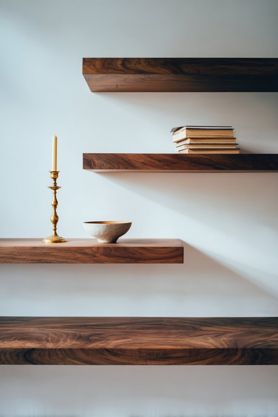
Negative space creates visual resting points that prevent eye fatigue and cognitive overwhelm. When every inch of shelf space contains objects, viewers don’t know where to focus, creating anxiety rather than pleasure. Empty spaces guide attention to your chosen focal points, allowing star pieces to shine while supporting items play complementary roles.
- Leave at least 50% of each shelf surface empty for breathing room
- Create distinct groupings with clear space between them
- Use empty space to frame and highlight your favorite pieces
- Avoid filling every corner or covering the entire shelf lengths
- Consider negative space as an active design element, not a wasted opportunity
- Edit ruthlessly, removing items until displays feel spacious and intentional
3. Vary Heights, Depths, and Textures
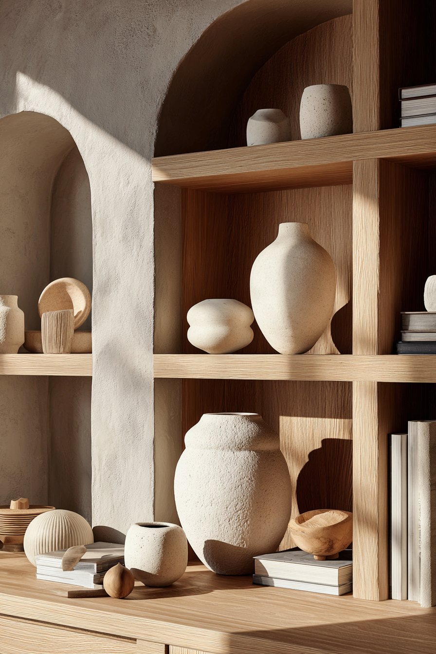
Dimensional variety creates visual rhythm that makes shelf displays dynamic and engaging rather than flat and boring. Combining objects of different heights establishes vertical interest that draws eyes upward and throughout your arrangement. Low bowls, medium vases, and tall sculptures create elevation changes that prevent horizontal monotony across your shelving.
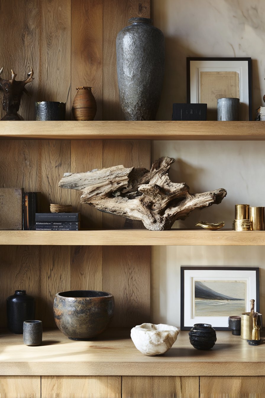
Depth variation adds three-dimensional complexity that single-plane arrangements cannot achieve. Place larger objects toward shelf backs with progressively smaller items forward, creating layered depth. This front-to-back positioning establishes a perspective that makes displays feel collected over time rather than arranged all at once from a single shopping trip.
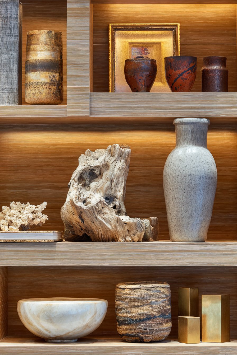
Textural diversity engages multiple senses while adding visual richness that uniform surfaces lack. Combine smooth ceramic with rough wood, shiny metal with matte stone, and soft textiles with hard glass. This material variety prevents visual boredom while creating sophisticated, curated appearances that suggest worldly collections rather than matched sets from department stores.
- Mix smooth, rough, shiny, and matte surfaces within displays
- Layer objects from back to front for three-dimensional depth
- Include items ranging from 2 inches to 12 inches in height
- Lean artwork or mirrors behind objects for added dimension
- Incorporate both organic and geometric shapes for variety
- Touch and feel textures while arranging to ensure true diversity
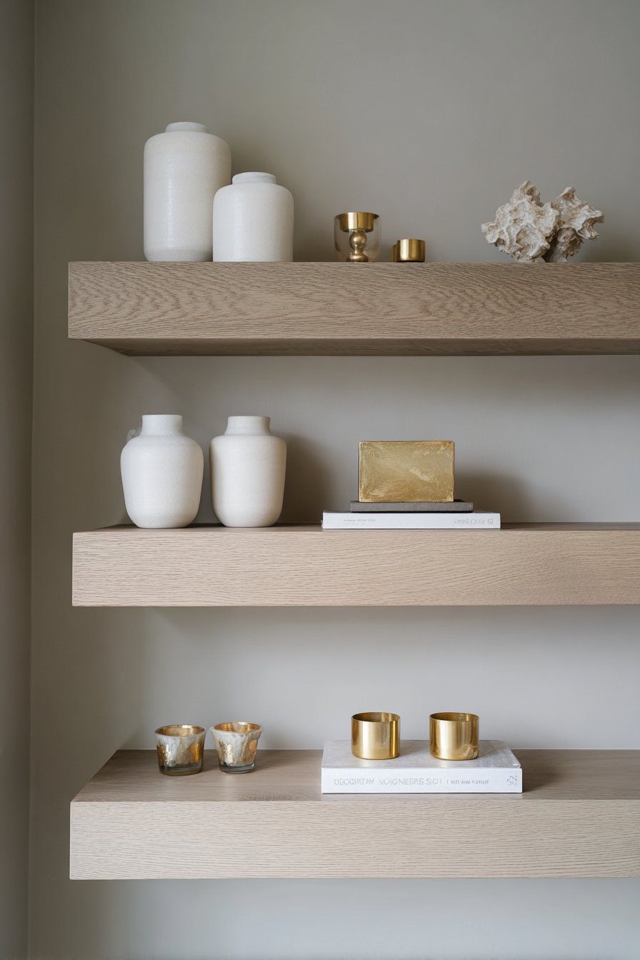
4. Create Color Cohesion Through Limited Palettes
Color cohesion transforms random object collections into unified compositions that appear intentionally designed. Limiting your palette to three to five colors creates harmony while allowing sufficient variety for interest. This restraint prevents the rainbow effect that makes shelves look chaotic, even when individual items remain attractive and well-spaced.
The 60-30-10 color rule provides proportional guidance for balanced displays. Choose one dominant color for approximately 60% of objects, a secondary color for 30%, and an accent color for the remaining 10%. This professional formula ensures variety without chaos, creating cohesive displays that feel collected rather than randomly assembled from disparate sources.
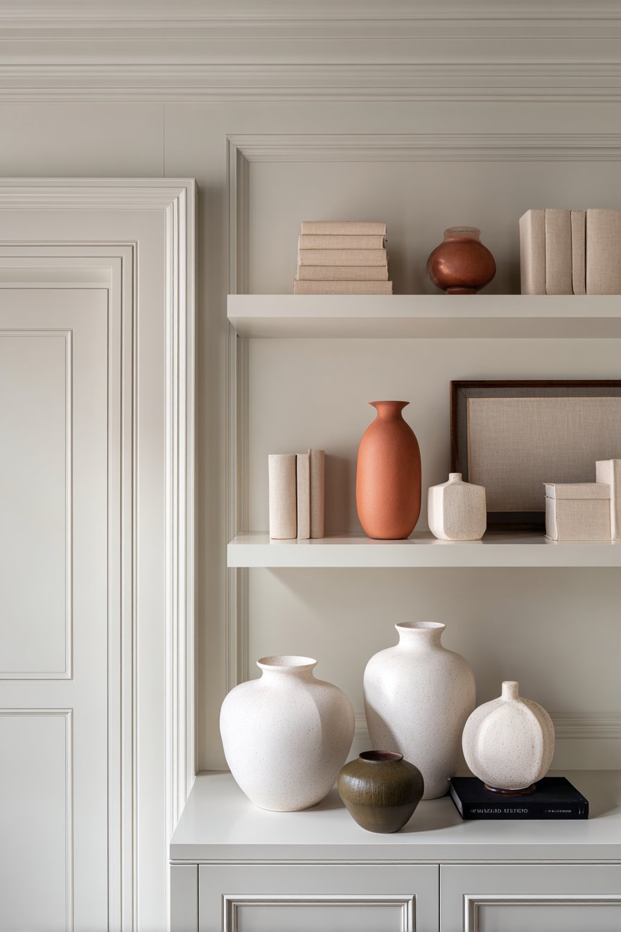
Monochromatic schemes offer sophisticated simplicity for those seeking serene, uncluttered aesthetics. Varying shades and tones within a single color family creates subtle depth while maintaining calm uniformity. This approach works particularly well in minimalist or Scandinavian-inspired spaces where restraint and tranquility take precedence over bold statements and eclectic energy.
- Select 3-5 colors maximum for each shelving unit’s entire display
- Use neutral colors as your dominant 60% for versatile foundations
- Introduce accent colors sparingly in small, impactful objects
- Consider your room’s existing palette when selecting shelf colors
- Group similar colors together for intentional color blocking effects
- Avoid using every color in your home’s palette on single shelving units
5. Balance Function with Form
Floating shelves must serve dual purposes as both storage and decoration, making the function-form balance critical for success. Beautiful displays lose value if you can’t access frequently needed items, while purely practical arrangements ignore aesthetic potential. Strategic planning ensures your shelves look intentional while remaining genuinely useful for daily life.
Incorporate functional items through attractive alternatives that serve practical needs without compromising visual appeal. Store coffee table books horizontally to create elevation platforms for decorative objects. Use beautiful boxes or baskets to conceal less attractive necessities while contributing pattern and texture. This approach maintains visual clarity while accommodating real-life storage requirements.
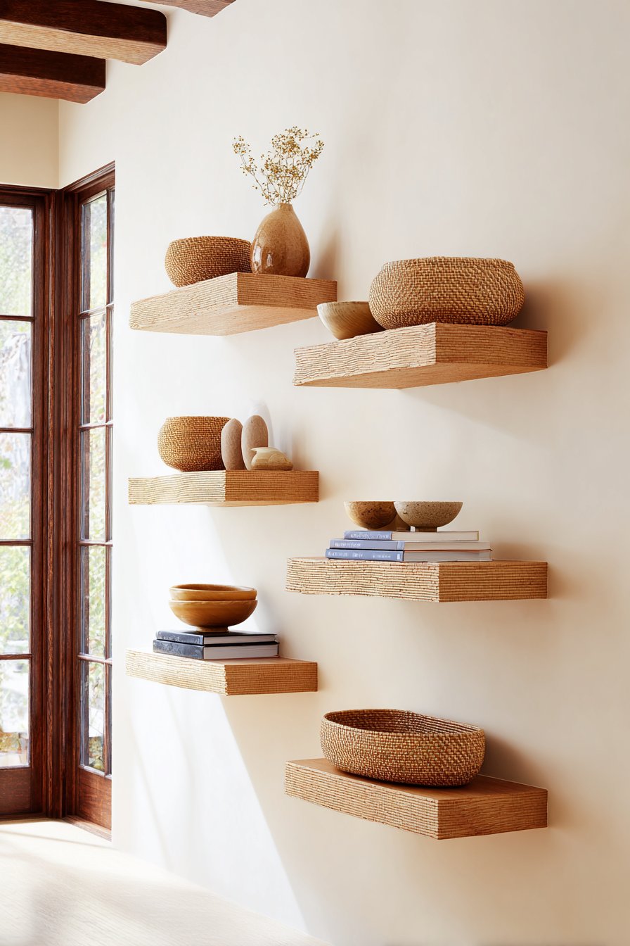
The “one functional, two decorative” ratio creates practical beauty that serves daily needs without appearing utilitarian. For every useful item like a basket or book collection, include two purely decorative elements like vases or sculptures. This balance prevents shelves from becoming purely ornamental while avoiding the cluttered appearance that excessive functional items create.
- Use attractive storage boxes to hide everyday items within displays
- Store frequently used items on lower, more accessible shelves
- Display beautiful functional objects like ceramic bowls or wooden boxes
- Keep one shelf completely decorative for pure aesthetic impact
- Rotate seasonal functional items to maintain fresh, current displays
- Choose functional pieces in colors and materials matching your aesthetic vision
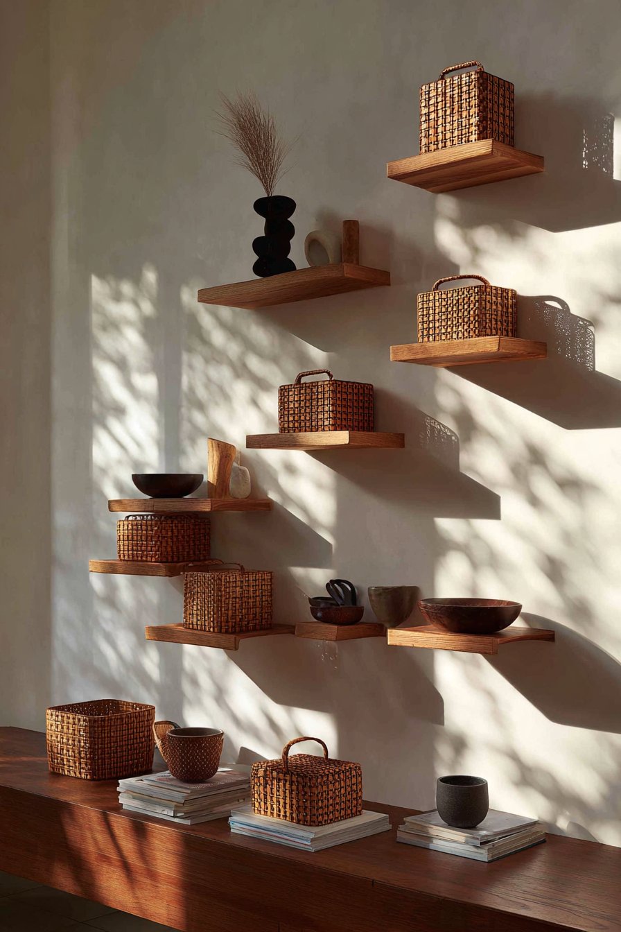
6. Implement the Triangle Principle
The triangle principle creates visual stability by arranging objects in actual or implied triangular compositions. Your eye naturally seeks geometric patterns, and triangles provide dynamic balance without rigid symmetry. This professional technique works across single shelves or entire multi-shelf units, creating cohesive flow that guides viewers through your displays systematically.
Creating triangles involves placing objects at three points with varying distances and heights between them. On single shelves, this might mean a tall vase on the left, medium bowl in center-right, and low object on the far right. Across multiple shelves, ensure tall items on different shelves create diagonal lines rather than vertical columns that appear rigid.
The triangle technique prevents the common mistake of arranging all tall items together and all short items together. This creates awkward visual weight distribution that makes displays feel unbalanced and poorly planned. Instead, distributing heights strategically across triangular patterns creates professional polish that appears effortless while requiring thoughtful planning and intentional placement decisions.
- Identify three points on each shelf or across multiple shelves for object placement
- Create implied triangle shapes through object height and positioning
- Avoid placing the tallest items directly next to each other
- Use diagonal lines created by varying heights to guide eye movement
- Ensure triangles point in different directions across multiple shelves for variety
- Step back frequently while arranging to assess the overall triangular balance
Conclusion
Styling floating shelves without clutter requires intentional curation and adherence to proven design principles rather than random object placement. These six strategies—odd-numbered groupings, negative space, dimensional variety, color cohesion, functional balance, and triangular composition—work synergistically to create sophisticated displays that enhance rather than overwhelm your spaces. The key lies in restraint, planning, and editing ruthlessly until only the best pieces remain.
Start implementing these techniques gradually, perhaps focusing on one shelf or principle at a time before tackling entire wall units. Remember that successful styling evolves over time as you acquire new pieces and refine your aesthetic vision. Your floating shelves hold tremendous potential to showcase personality while maintaining visual calm—unlock that potential through thoughtful curation that celebrates what truly matters while eliminating everything that doesn’t. Create displays you’ll love seeing every single day.